Search analytics and insights training - search analytics
Search analytics reports provide valuable insight into the users of a website and the information they seek.
The reports not only tell you what information users expect to find on a website, but also the language that they expect it to describe it and the language they use to describe it.
The key to managing the success of your website is to understand these users - who they are, and what they expect to find on the site.
The analytics reports also provide other insights that help to understand the users in more detail - demographic information that is inferred from the user’s IP address.
This provides information on the where users are located and also information about the user’s industry in many circumstances.
It is also worth noting the added value provided by search analytics when compared with web analytics. Web analytics reports on pages visited by a user, but there is no real way of knowing what the user was looking for based on this. Search analytics provide the actual search terms used as well as the links clicked on - providing a much better picture of what a user seeks.
The search analytics are available via the left-hand menu of the insights dashboard and consists of five different reports:
-
Search analytics overview
-
Searches
-
Clicks
-
Location
-
Trends
Search analytics overview
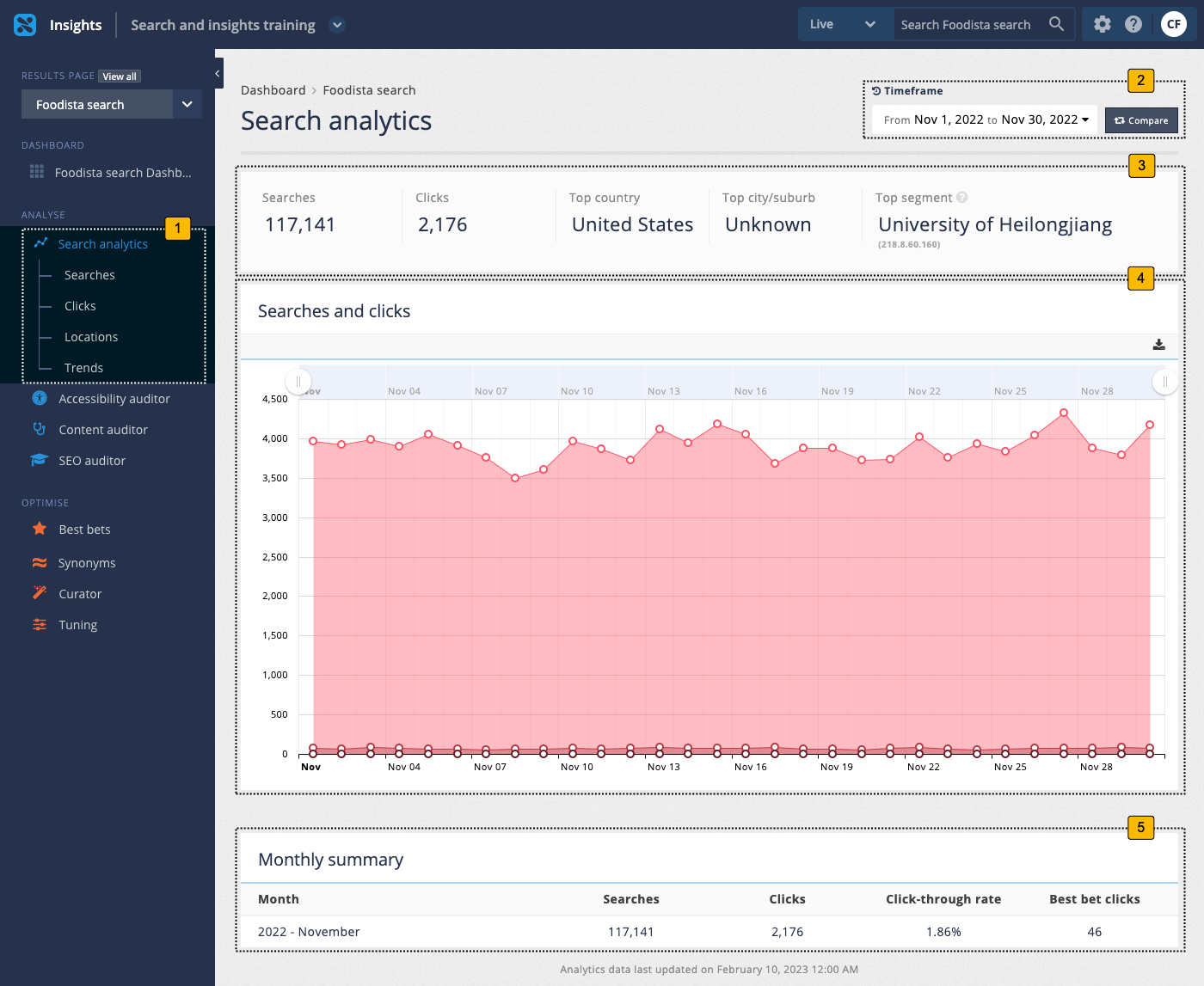
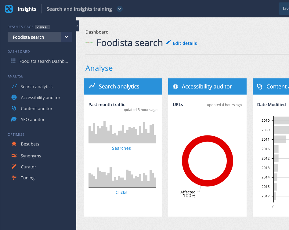
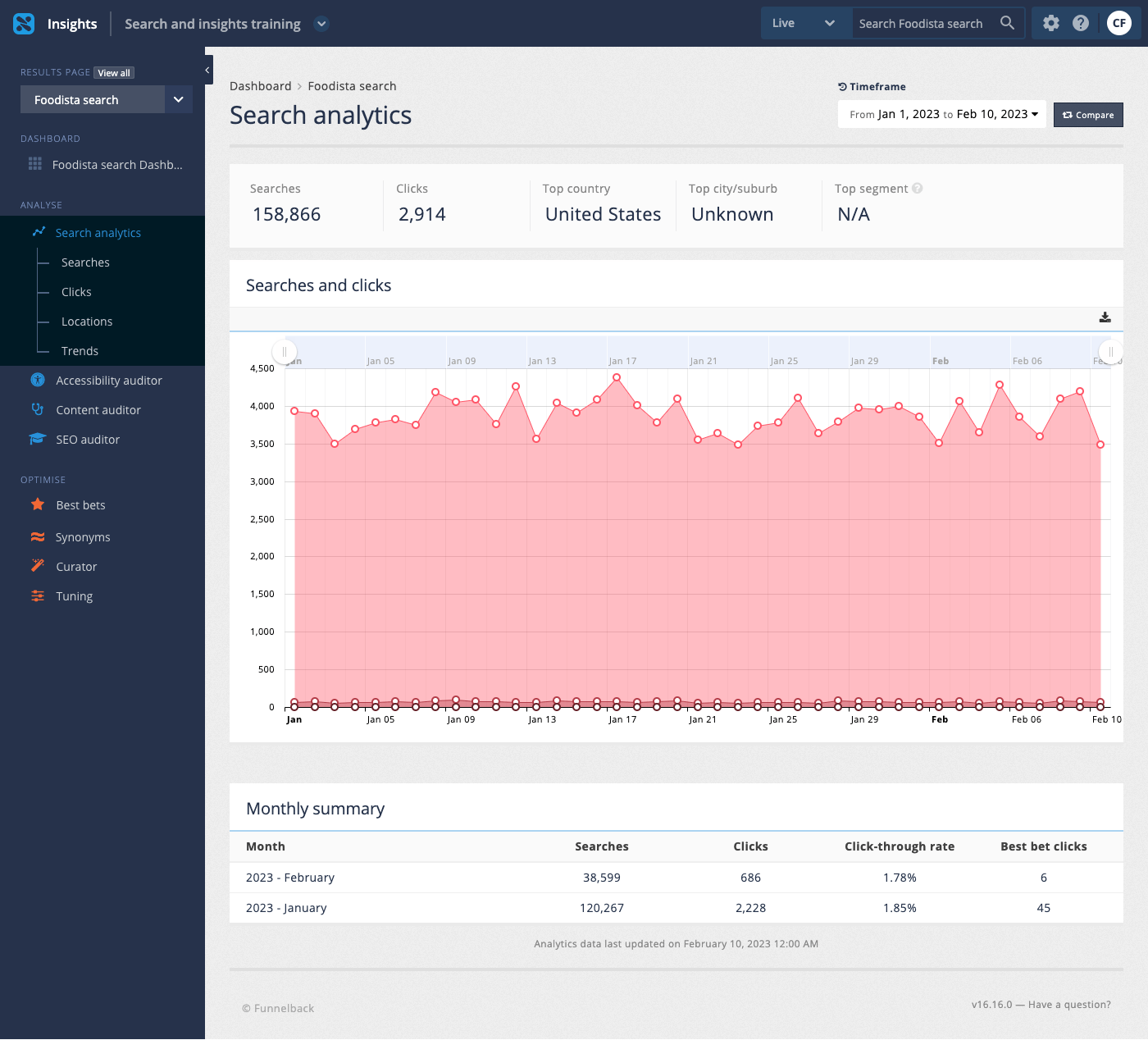
The main search analytics screen provides a summary of search activity on the current service for the specified time frame.
-
Analytics reports sub-menu: Access to the analytics reports.
-
Timeframe and comparison controls: Sets the report and comparison periods.
-
Analytics summary: High level summary for the current timeframe.
-
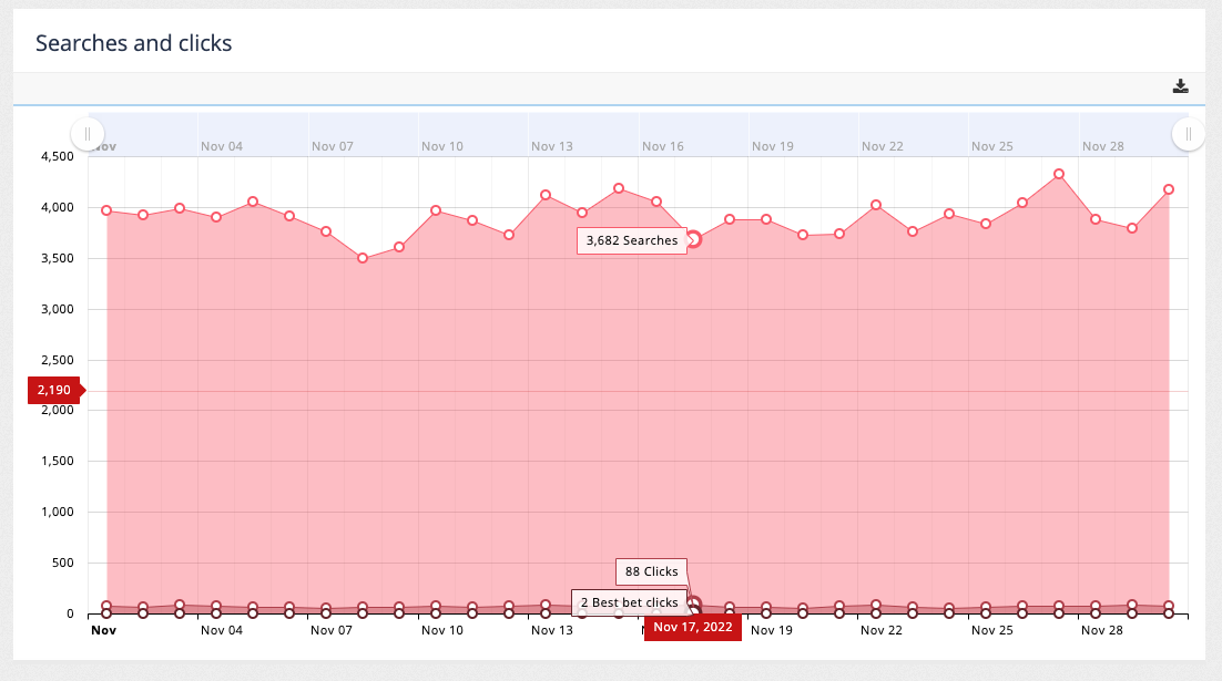
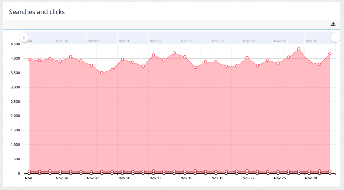
Over-time chart: Day-by-day total searches and clicks.
-
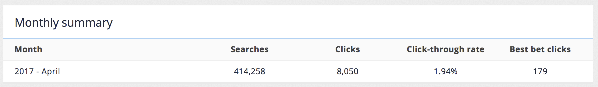
Monthly summary: Month-by-month breakdown of current timeframe(s).
Hovering over the chart provides additional information on the number of searches, clicks and best bets clicks for the given day.
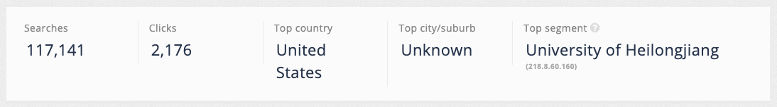
Analytics summary
A summary of the main analytics metrics is displayed at the top of the page. The numbers presented reflect the data for the currently selected time period.
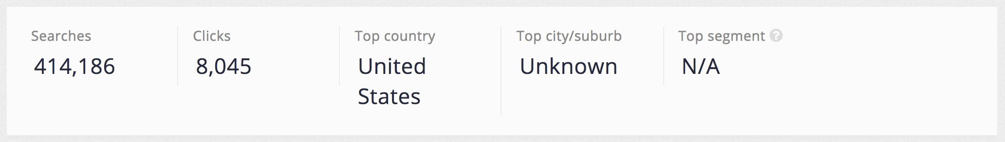
The metrics included in the summary are:
-
Number of searches recorded within the current timeframe.
-
Number of result clicks made during this period.
-
The top country where the most searches originated.
-
The top city/suburb where the most searches originated.
-
The top segment where the most searches originated. The segment is inferred from the user’s IP address, which is compared with a database of public information known about IP addresses. The segment information can include information such as the derived organisation name and industry segment (such as higher education or finance).
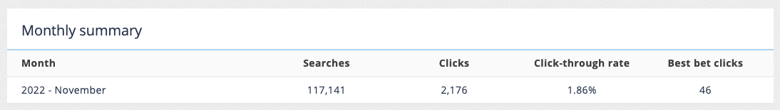
Monthly summary
The monthly summary is displayed at the bottom of the page detailing the number of searches, clicks and best bet clicks by month for the current timeframe.
Tutorial: Analytics dashboard
| The analytics data is auto-generated for the training session and will differ from what is shown in the screenshots. |
-
Log in to the insights dashboard and select the Foodista search service.
-
The dashboard displays a search analytics tile that shows the search and click activity for the analytics demonstration over the last month. Load the analytics dashboard by clicking on the search analytics tile, or by clicking on the search analytics link in the sidebar.
-
The analytics dashboard is displayed. Summary data for the current month is displayed by default.
-
Observe the overview summary that provides the main counts for the current report period (the current month).
-
The searches and clicks chart displays day by day totals for searches, search result clicks and best bets clicks.
-
The monthly summary displays a month by month breakdown of searches and clicks.
-
Update the report timeframe to show analytics for this year.
-
Observe that the overall summary, graph and that the monthly summary update with data covering the new timeframe (this year).
Reporting period and comparisons
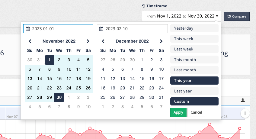
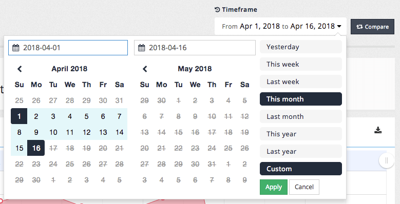
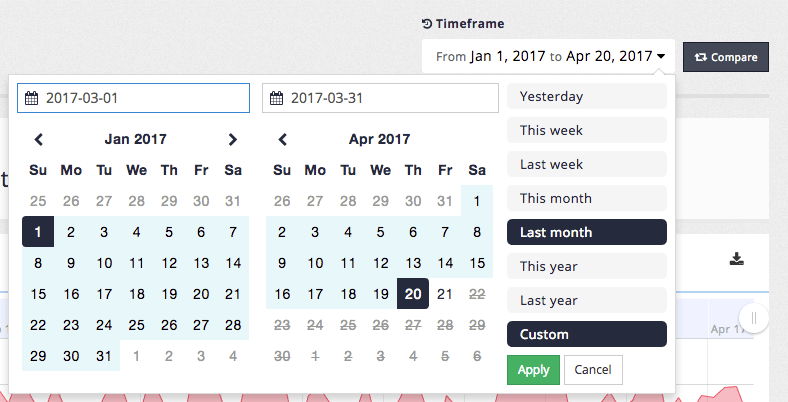
The period of time covered by the analytics reports can be adjusted using the timeframe control located at the top right hand corner of the screen.
The menu allows selection from set a of pre-defined relative time frames, or specification of a custom time period.
The analytics updates automatically when the time frame is changed.
Clicking on the compare button allows you to define a second time frame. This allows for graphs to be produced that compare the analytics over the different time frames.
Tutorial: Analytics comparison
| The analytics data is auto-generated for the training session and will differ from what is shown in the screenshots. |
| When comparing time periods ensure that the time periods selected make sense. For example, a comparison of last month vs last year probably doesn’t provide a valid comparison because the time periods are vastly different in size. |
-
Access the search analytics then change the current timeframe to correspond to show searches for last month by selecting last month from the timeframe menu. Observe that the timeframe updates after the selection is made.
-
Add a second timeframe clicking on the compare button. Define a custom timeframe for the previous month (i.e. two months prior to the current month) by selecting custom and selecting a start and end date using the calendar controls then apply the timeframe. The report changes to display two sets of analytics side by side:
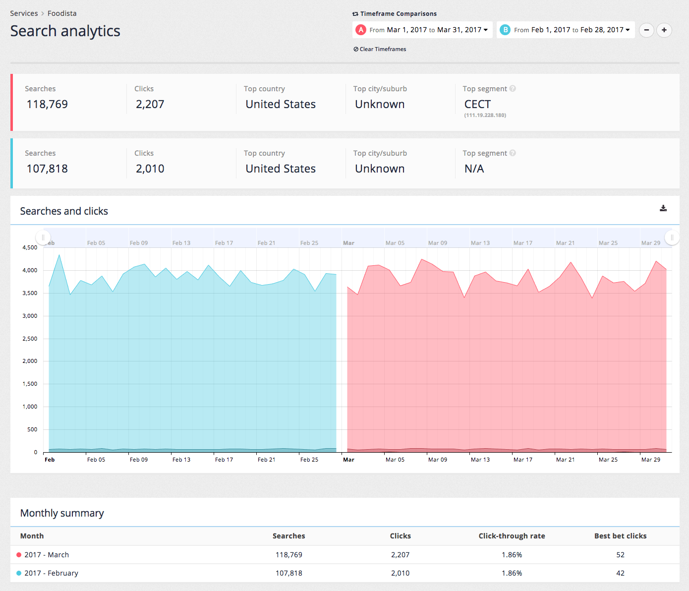
-
All the analytics screens can be viewed and exported with comparisons being displayed on all the tables and charts.
Additional timeframes can also be defined by clicking the + button.
-
Remove the second timeframe by clicking the - button, leaving only a single timeframe showing.
Searches report
Clicking on the searches item in the menu opens the searches report. The searches report provides information on searches conducted by users of the service.
The searches report covers the most commonly searched keywords, which provides an insight into what the information site users seek and find most important.
The report also examines the top searches that returned no fully matching results. This information is a vital source of information that can be used to improve the experience of users of the search service.
| The counts presented reflect the number of search sessions for the keyword. This ignores any searches for page 2 and above of the search results. |
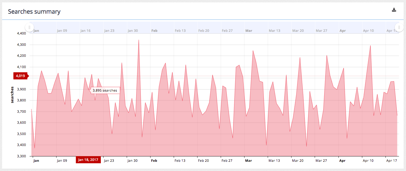
Searches summary
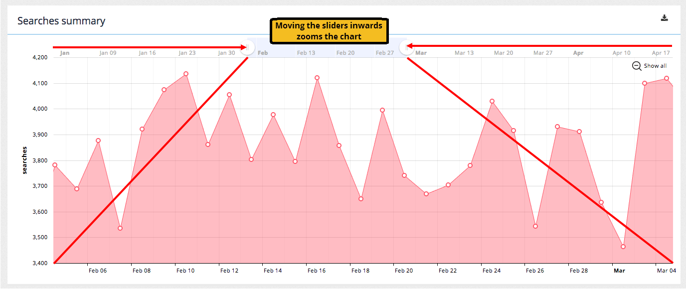
The searches summary provides a day-by-day graph of the number of searches run by users of the search service.
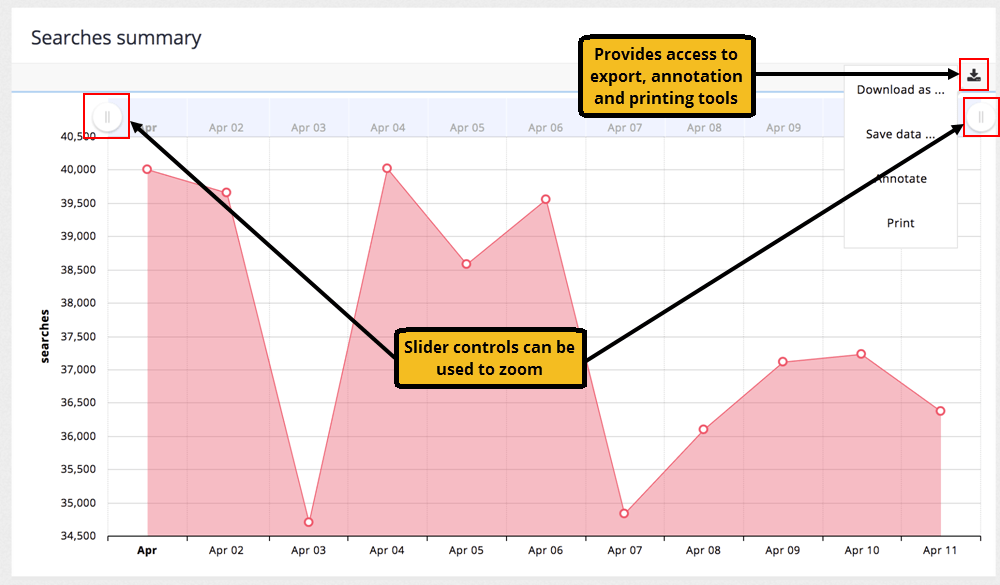
The time period covered can be narrowed (or zoomed) by adjusting the slider controls to the left and right of the header bar on the graph. This provides the ability to zoom in to a smaller period within the graph without changing the time period covered by the report.
Hovering over the data points provides a popup containing the count for the data point.
A control at the top right hand corner of the graph provides a drop down menu containing options to export, annotate or print the graph.
The annotation feature allows you to draw / mark the line graph with notes and annotations that you can then save / export out as necessary.
| The charts can be exported in the following image formats: (PNG, SVG, JPG, or PDF) or data formats (CSV, XLSX or JSON). |
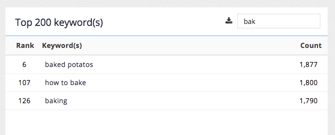
Top keywords
The top keywords report displays the top search terms for the selected period ordered by the number of searches. The filter control allows filtering of the list by a substring.
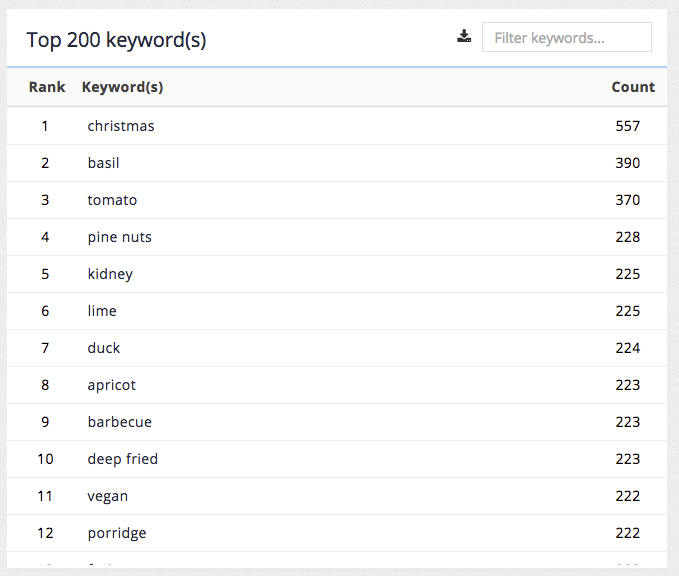
The top keywords report provides the following insights:
-
Popular content topics: The report provides an insight into the topics of most interest to users of the site for the given time period. Over time this can provide a picture of the most important content to maintain on a site.
The data presented here can also be downloaded as a CSV file.
| The analytics report shows the top 200 keywords. If you require more keywords, this can be obtained programmatically via the analytics API. |
Top unanswered keywords
The top unanswered searches report displays popular searches for the selected time period that did not return any fully matching results ordered by the number of searches.
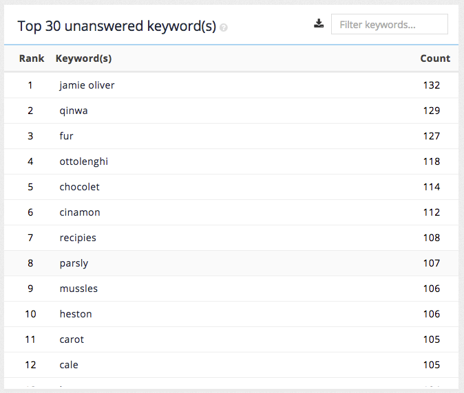
The unanswered keywords report provides the following insights:
-
Words that users of the search commonly misspell: These represent valid searches (if correctly spelled). This information can be used to create a synonym to auto-correct a misspelling.
-
Different terminology to describe content: These represent valid searches, but fail to match any content within the site because the user’s terminology differs from that used in the site content. This information can be used to create synonyms that equate the user terminology to that used on the site.
-
Searches for content that isn’t covered by the site: This can represent valid searches - and can be used to identify information gaps in the site content. Alternatively this can indicate a gap in expectations of what a user perceives should be present on the site. In this case a best bet could be created that presents a result item that directs the user to a website that contains the content for which they are searching.
|
You will sometimes see keywords listed in the unanswered keywords report that also appear in the top keywords report. This can happen if the keyword was previously unanswered in your search results and then the content (or search configuration) was amended to match the keywords. The content of both reports is also affected by the selected reporting time period. This can also happen if the query is really popular but doesn’t actually return any results, or if a multi-word query is popular but only partially matches within the search index as the top keywords report. |
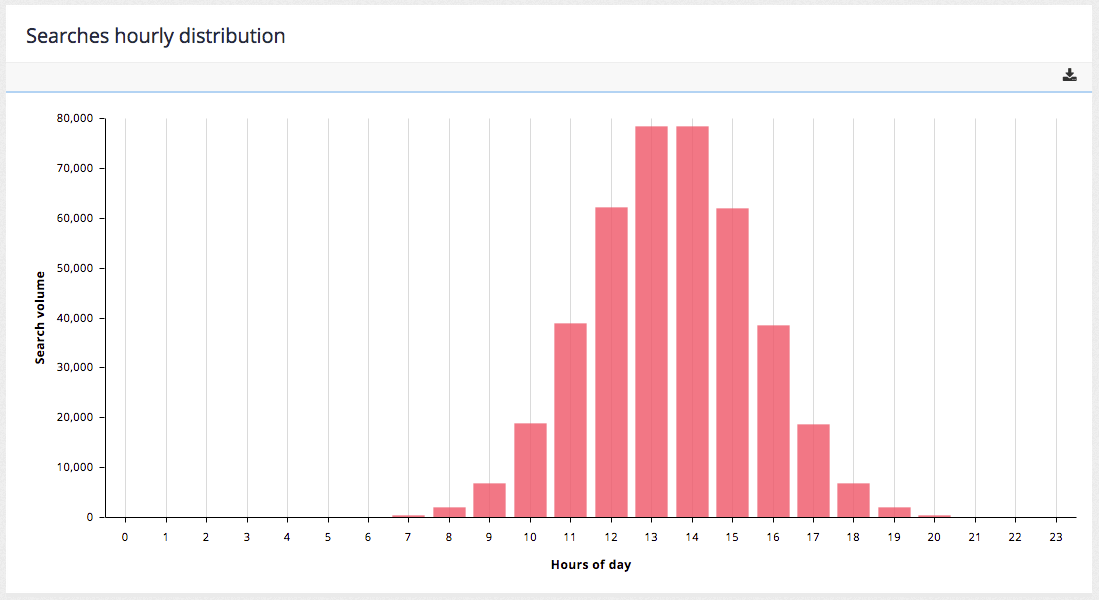
Searches hourly distribution
The searches hourly distribution chart shows the total number of searches conducted during the time period broken down by hour of the day. This report provides an indication of when the search load is the greatest and can assist in both capacity and maintenance planning.
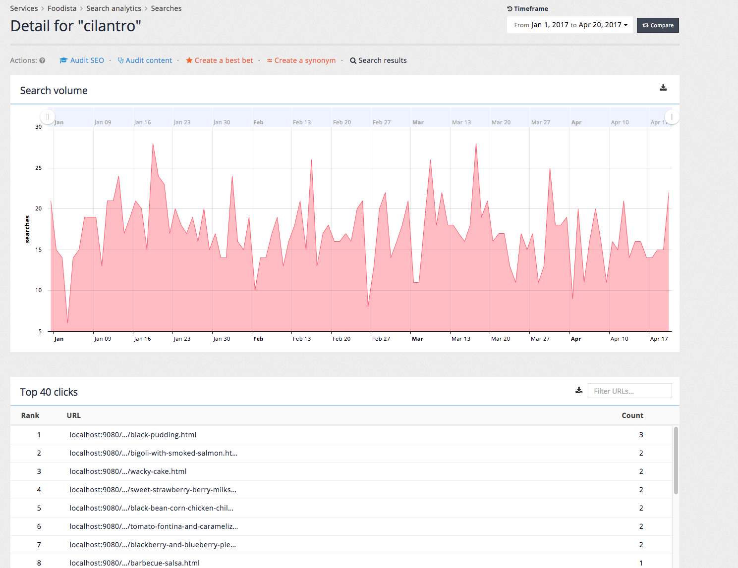
Search keyword details screen
Clicking on a keyword from the top keywords or top unanswered keywords tables opens the details screen for the search keyword.
The search keyword details screen provides the daily search volume for the search keywords and a table of the top result clicks for the keyword.
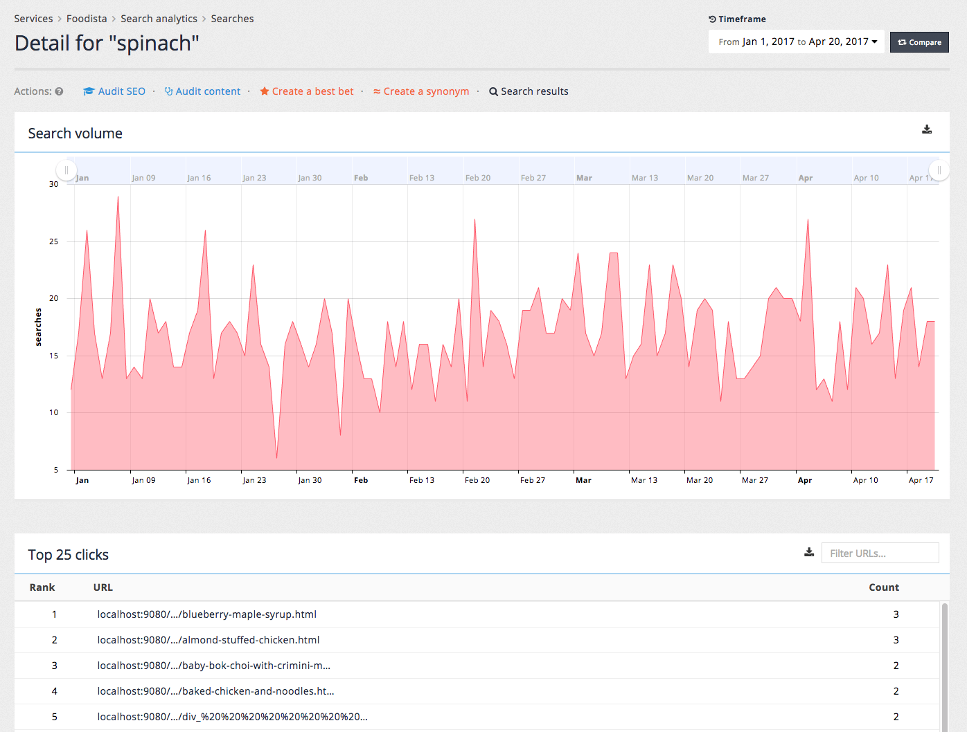
A toolbar providing a set of actions that can be run using the keyword is also applied.

-
Audit SEO: opens the SEO auditor with the keyword pre-entered.
-
Audit content: opens the content auditor report searching for the keyword.
-
Create a best bet: enables quick creation of a best bet using the keyword as the trigger.
-
Create a synonym: enabled quick creation of a synonym using the keyword as the trigger.
-
Search results: returns the current set of search results for the keyword.
Tutorial: Searches report
| The analytics data is auto-generated for the training session and will differ from what is shown in the screenshots. |
-
Select the searches item from the sidebar of the analytics dashboard, or click on the searches count from the summary bar that appears at the top of the analytics dashboard above the monthly summary table.

-
The searches report is displayed. Change the time period to this year. Observe the searches summary which provides a day by day graph of search volume.
-
Zoom in on the searches summary by adjusting the slider controls above the graph.
-
Click the show all button at the top right hand corner of the graph to zoom back out.
-
Filter the top keywords by entering a keyword into the filter searches input box.
-
Export the graphs and tables by clicking on the download button associated with the relevant item.

-
Tables can be exported as CSV and charts as a variety of formats. The chart export function also provides the ability to annotate the graphs before exporting.
-
Investigate a specific search further by clicking on a keyword from the list of top keywords. A search detail screen loads providing an over time graph of search volume for the selected keyword and a table containing the top clicks from searches this term.
Clicks report
The clicks report provides insight into what users are viewing or clicking on as a result of using the search feature of your site.
A click is registered when a user clicks on a search result, noting not only the URL of the result item clicked on but the position of the item in the result set and the search query that was used to obtain the results.
The click information is also used by Funnelback to influence the ranking of search results. For example if lots of users run a search for the term avocado and consistently click on the second result on the results page then this result will eventually get pushed up in the rankings.
Clicks summary
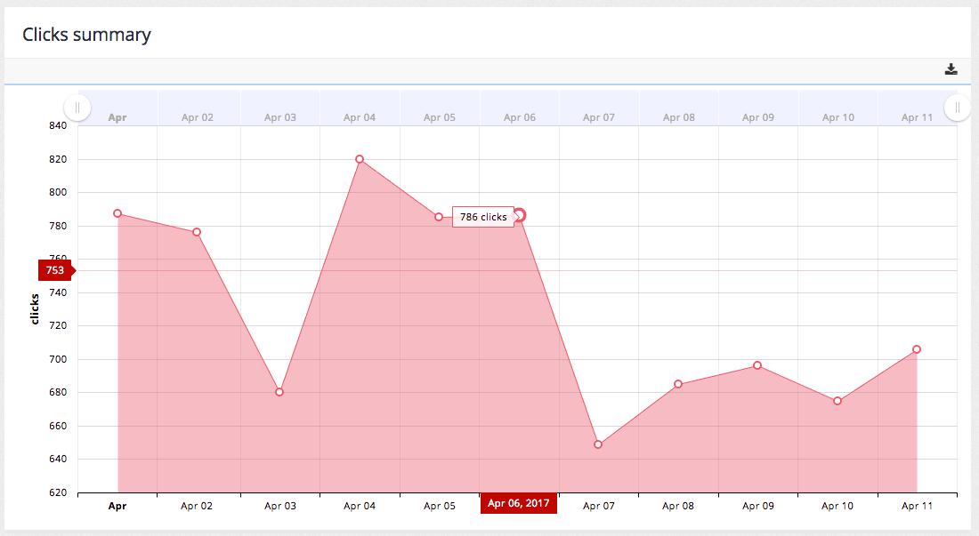
The clicks summary graph plots the number of clicks per day over the selected time period. The chart includes the same zoom and export controls as the searches summary.
Top clicks
The top clicks table lists the URLs of pages that were most frequently clicked on ordered by the number of clicks.
Top best bets clicks
The top best bets lists the best bets that were most frequently clicked on ordered by the number of clicks.
Top faceted navigation clicks
The top faceted navigation table lists the most frequently applied filters. This can provide an insight into how users narrow their searches.
Top contextual navigation clicks
The top contextual navigation clicks table lists clicks on related search categories.
Tutorial: Clicks report
| The analytics data is auto-generated for the training session and will differ from what is shown in the screenshots. |
-
Select the clicks item from the sidebar of the analytics dashboard, or click on the clicks count from the summary bar that appears at the top of the analytics dashboard above the monthly summary table.
-
The clicks report is displayed. The displayed data maintains the date range that was previously set. The clicks report is broken up into five sections. A click is registered when a user clicks on a search results (if click logging is enabled).
Locations report
The locations report provides information on the location and demographics of users of the search.
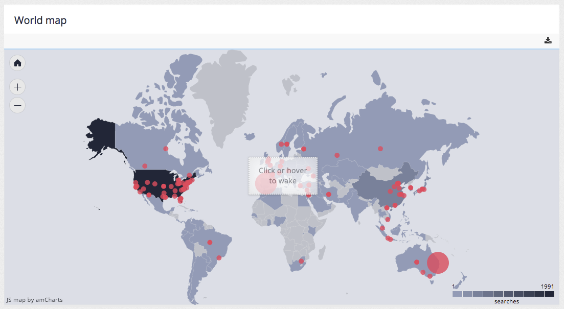
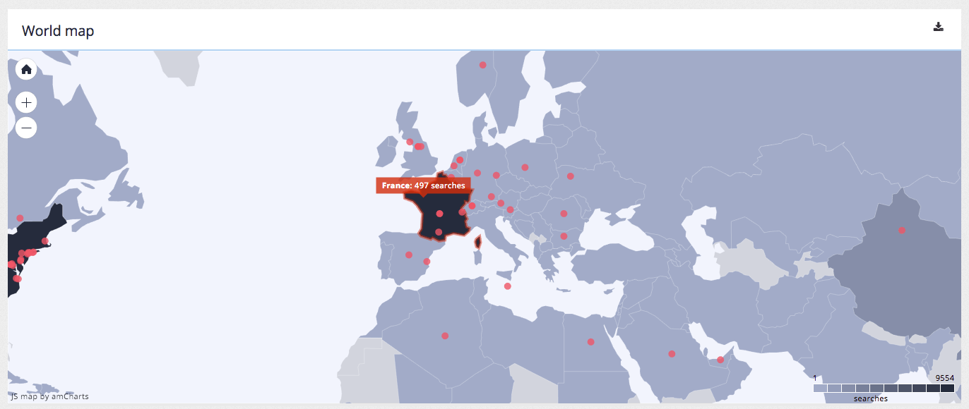
World map
The world map chart plots the location of users of searches onto a map where a location can be determined. The interactive map allows zooming and presents additional information when hovering over countries or points of interest.
A user’s location is inferred from their IP address.
Similar controls for zooming and also for export, annotation and printing of the data are provided.
Top countries
The top countries table lists the top countries based on the origin of search requests. An unknown value indicates that a country could not be inferred from the IP address.
Top cities/suburbs
The top cities and suburbs table lists the top cities / suburbs based on the origin of search requests. An unknown value indicates that a city or suburb could not be inferred from the IP address.
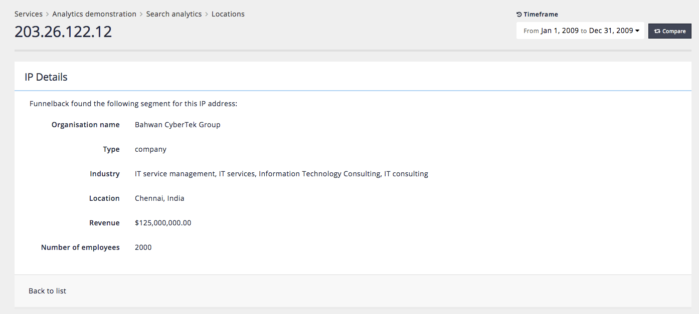
Top IP addresses
The top IP addresses table lists the IP addresses recorded as the origin of searches ordered by the number of searches.
Clicking on an IP address in the table will display the demographic information that is inferred by looking up the IP address in a public database of information recorded about the IP address. The level of information displayed will depend on the available data about the IP address.
For example, inspecting 206.26.122.12 shows the following information:
-
Organisation name
-
Type of organisation
-
Industry
-
Location
-
Revenue
-
Number of employees
Tutorial: Locations report
| The analytics data is auto-generated for the training session and will differ from what is shown in the screenshots. |
-
Select the locations item from the sidebar of the analytics dashboard, or click on the top country from the summary bar that appears at the top of the analytics dashboard above the monthly summary table.
-
The locations report is displayed. The displayed data maintains the date range that was previously set. Investigate the map by using the zoom controls and hovering over countries and points of interest.
-
Observe the top countries, cities/suburbs and IP addresses reports. Investigate further demographic information about an IP address by clicking on an address in the top IP addresses table. Select a few IP addresses that have a known location to get any available demographic information for the address. The available information will vary depending on the address chosen.
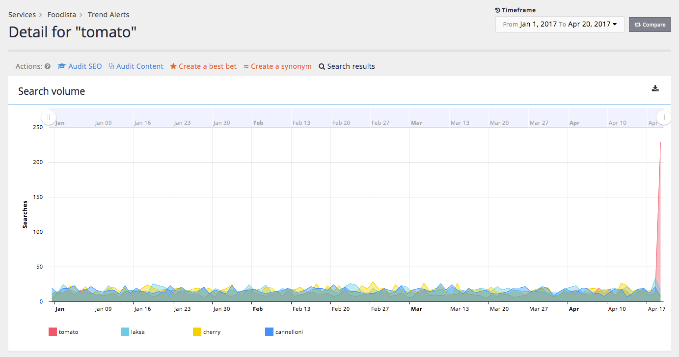
Trends report
The trends report provides information on the search trends by listing search keywords that have seen a significant increase in query volume in a short space of time.
These increases, or query spikes, can alert an administrator to topics that have suddenly become popular among users. This could indicate reaction to a news story that has broken, or a report that was recently released.
These trend alerts can be used to enable an organisation to react with greater speed to the changing needs of users.
When a trend alert is raised an administrator can check the query and verify that the results returned are appropriate, or take steps (such as adding best bets or synonyms) to ensure that users are directed to appropriate information.
Trends overview
The trends overview screen summarises spikes in specific search keywords that were detected in the selected timeframe.
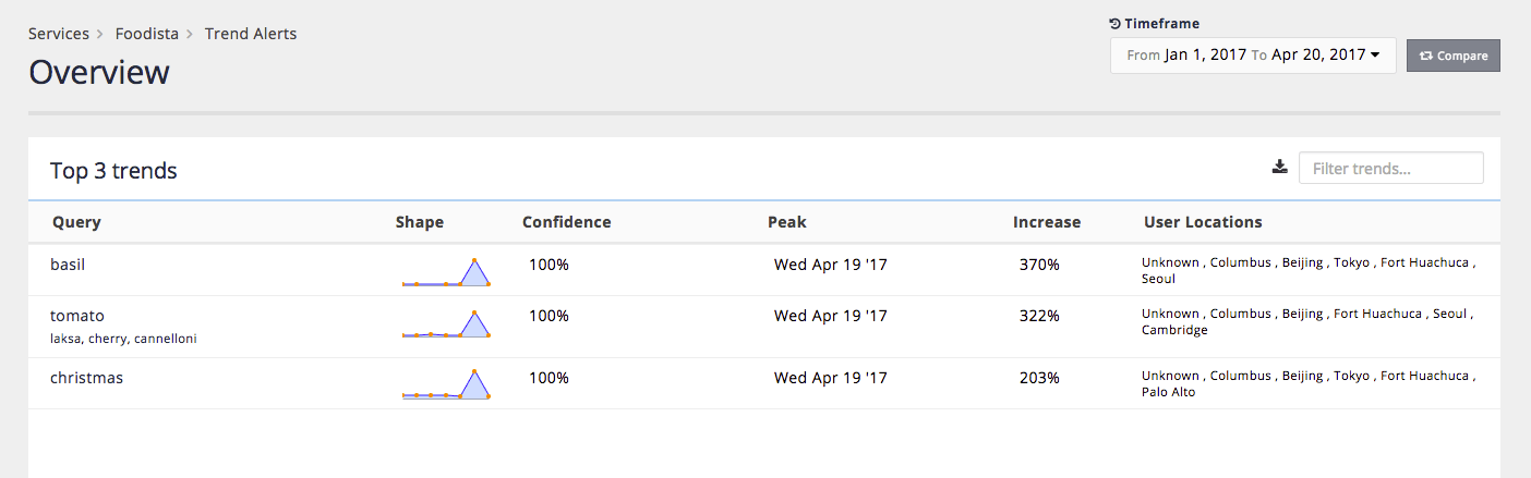
The overview provides the following information:
-
Query: the search keyword that has seen a significant increase in volume. Smaller related search keywords are displayed below the main keyword.
-
Shape: a line graph of the query volume for the keyword over time.
-
Confidence: The system confidence that this is a query spike.
-
Peak: When the peak occurred for the keyword.
-
Increase: The percent increase that was detected in search volume for the keyword.
-
User locations: The locations from which the searches for the keyword originated.
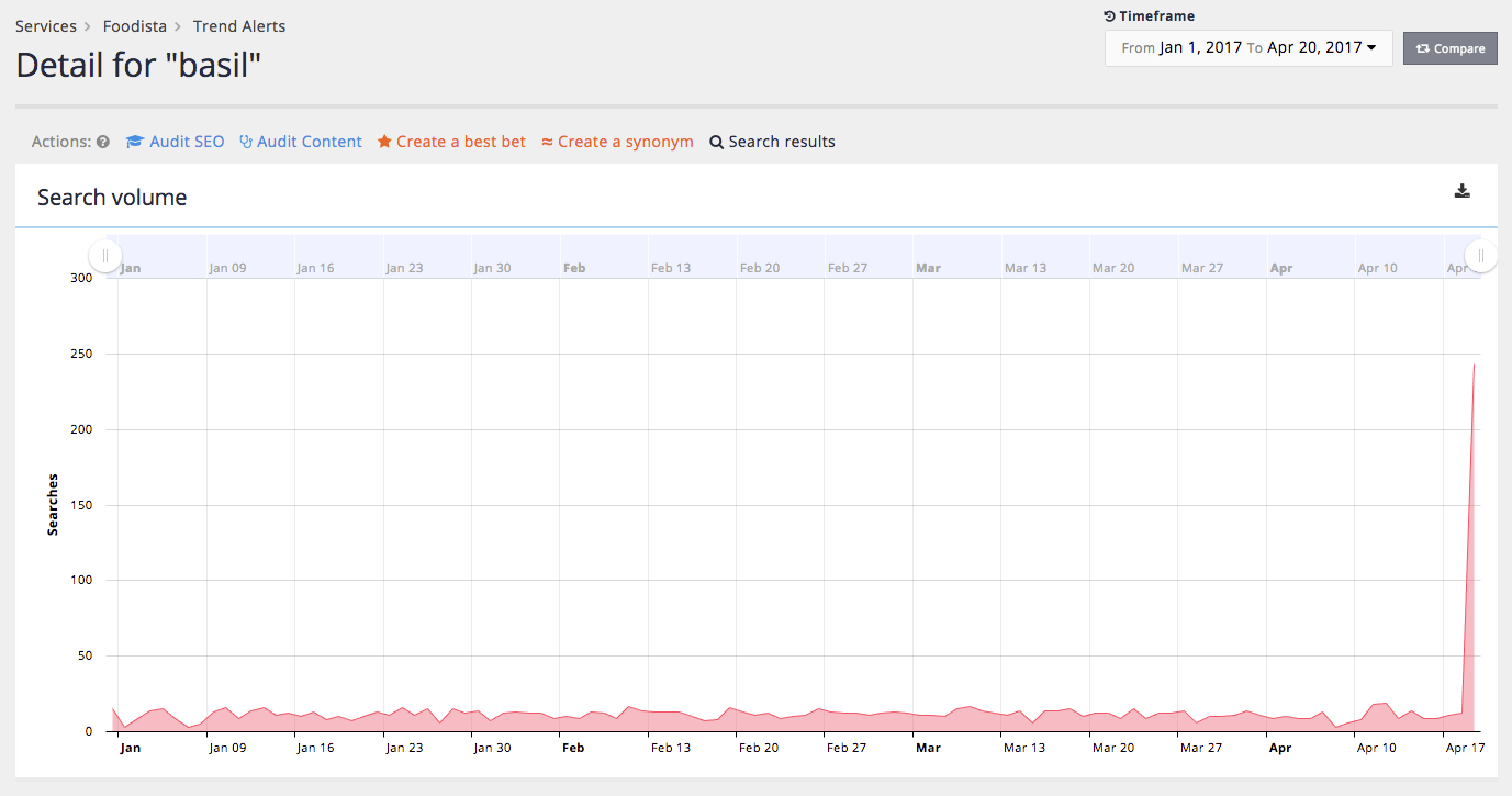
Trends detail
Clicking on a query or graph on the overview screen opens up a detailed screen showing the daily query volume for the selected keyword.
Tools for inspecting the keyword in SEO and content auditor as well as running a search and creating best bets and synonyms are also available from this screen.
Tutorial: Trends report
| The analytics data is auto-generated for the training session and will differ from what is shown in the screenshots. |
-
Select the trends item from the sidebar of the analytics dashboard to open the trends report.
-
The trends report overview opens showing query spikes detected during the current time period. Observe that some results include related query terms below the query. (for example, see the tomato query in the example below). Note: the related queries in the analytics training example are based on randomly generated analytics so the relationships detected don’t have any true relationship and will appear random.
-
Investigate one of the queries by clicking on the query term or chart. The details screen is displayed showing the day by day number of searches for the search term and any related terms.