6.0 release notes
August 17, 2020
This page describes release information relating to all Matrix 6.0 versions including patch releases.
New features
New backend UI
This version of Matrix features a newly designed and improved backend UI that aims to improve the usability and intuitiveness of the overall application.
New design
A new design theme is applied that follows the new Squiz Design System used by all products in the Squiz DXP.
The new design theme improves the overall visuals of all UI elements such as fonts, colors, backgrounds, buttons, menus, and more.
The system default sign-in and password change screen also reflect the new design system.
Finally, backend notices, warnings, and errors are visually improved to be easier to read and understand.
New toolbar
The Matrix application toolbar has a couple of new improvements to it. You can see your Content Management system name in the toolbar so that you can quickly identify it if you have access to multiple ones.

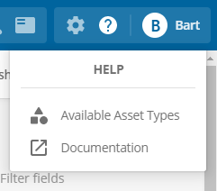
A new help menu option gives you quick access to the product documentation and a link to the asset type reference screen.
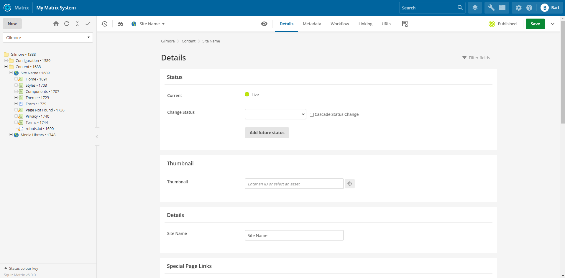
New screen header
The new screen header aims to make it easier to do everyday actions such as navigating asset screens, seeing asset information, saving, acquiring editing locks, and changing status.

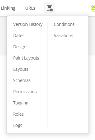
Navigating between screens is now much easier and faster because you can access common screens from the tabbed navigation. You can find additional screens within the Settings drop-down menu.
The new screen header also features a brand new status switcher. This feature lets you quickly change the asset status from any screen without having to always navigate to the details screen to do it.
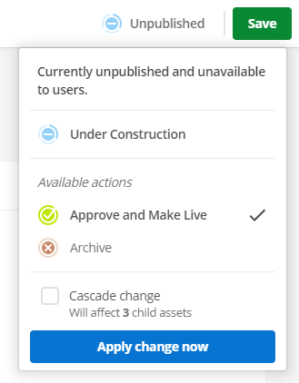
You can cascade the current status while also seeing how many child assets would be affected by the status change.
You can also add a workflow comment when requesting approval of an unpublished or draft asset.
New main panel
The main panel area of the UI has been improved in layout and design to offer a more visually appealing and user-friendly experience.
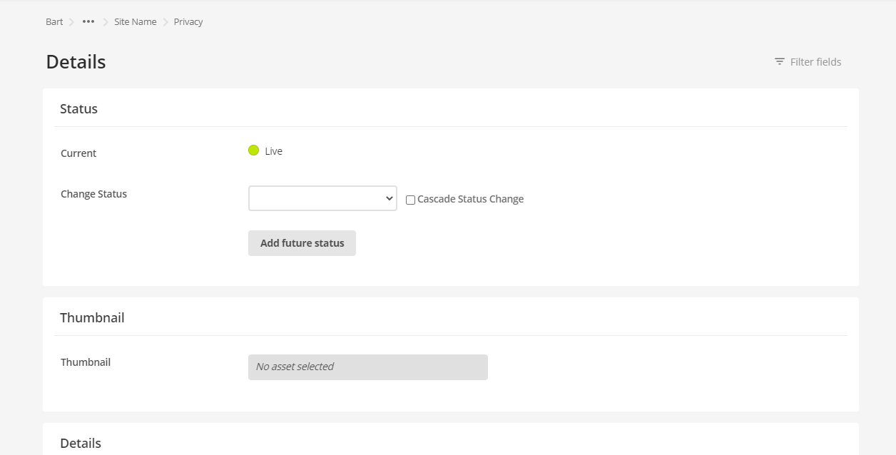
Sections on screens now have a maximum width so that content within them is easier to read. Some screens, such as code editing screens, still have a fluid 100% width applied.
The main panel now also features an asset lineage that tells you the full hierarchical location of the current asset you are editing.
Furthermore, the name of the current screen is also now a heading on top of the main panel, together with the filter field tool being available to the right-hand side.
Dynamic and bookmarkable backend URLs
Your browser’s URL address bar updates automatically to represent the area or asset you are currently on, and which screen you have active.
For example, navigating to the metadata screen of an asset with ID #1234 will result in the following URL: https://www.example.com/_admin?screen=metadata&asset_id=1234
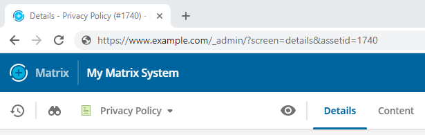
Dynamic backend URLs are useful for when you want to share a backend location quickly with another user or if you want to bookmark that location to return to it later.
The <title> tag is also dynamically updated to identify which asset and screen the bookmark refers to quickly.
Terminology changes
Several terminology changes are present in Matrix 6 to support the new backend UI.
| Matrix 5.5 | Matrix 6 | ||
|---|---|---|---|
Authentication terms:
|
Authentication terms:
|
||
Content Container |
Component Read Content components to learn more. |
||
Content Template |
Component Template Read Component templates to learn more. |
||
Content Types Example: “WYSIWYG Content type”. |
|||
Raw HTML Content Type |
Code Component Type Read Code component to learn more. |
||
Link types:
|
Link types:
Read Linking assets to learn more.
|
||
Asset navigation history |
Recently viewed list |
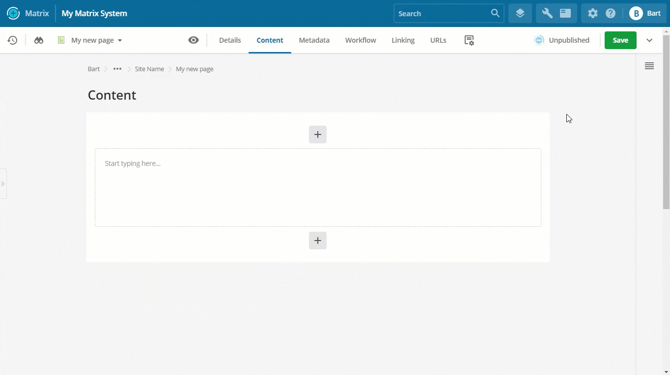
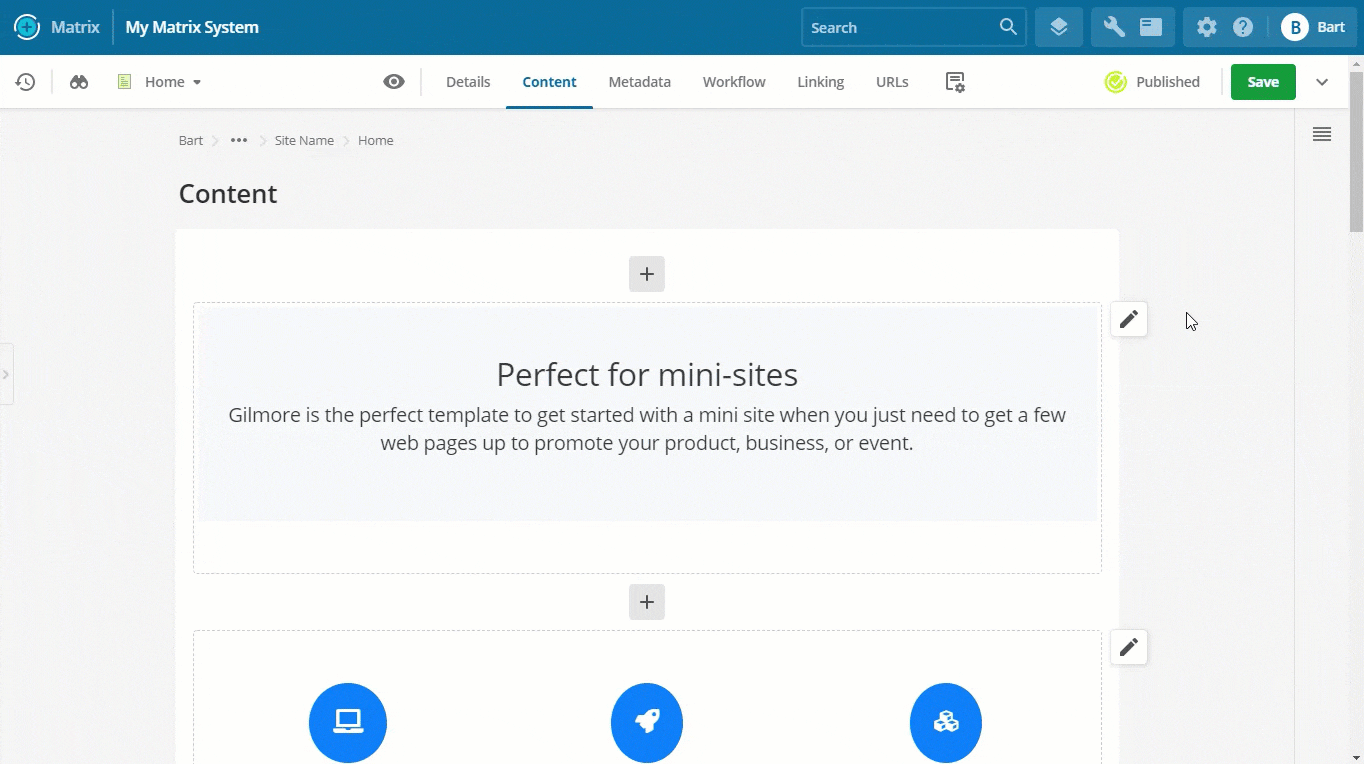
New page builder
A new page builder has been introduced to make it easier, faster, and more enjoyable to create, edit, and publish new page content with Matrix.
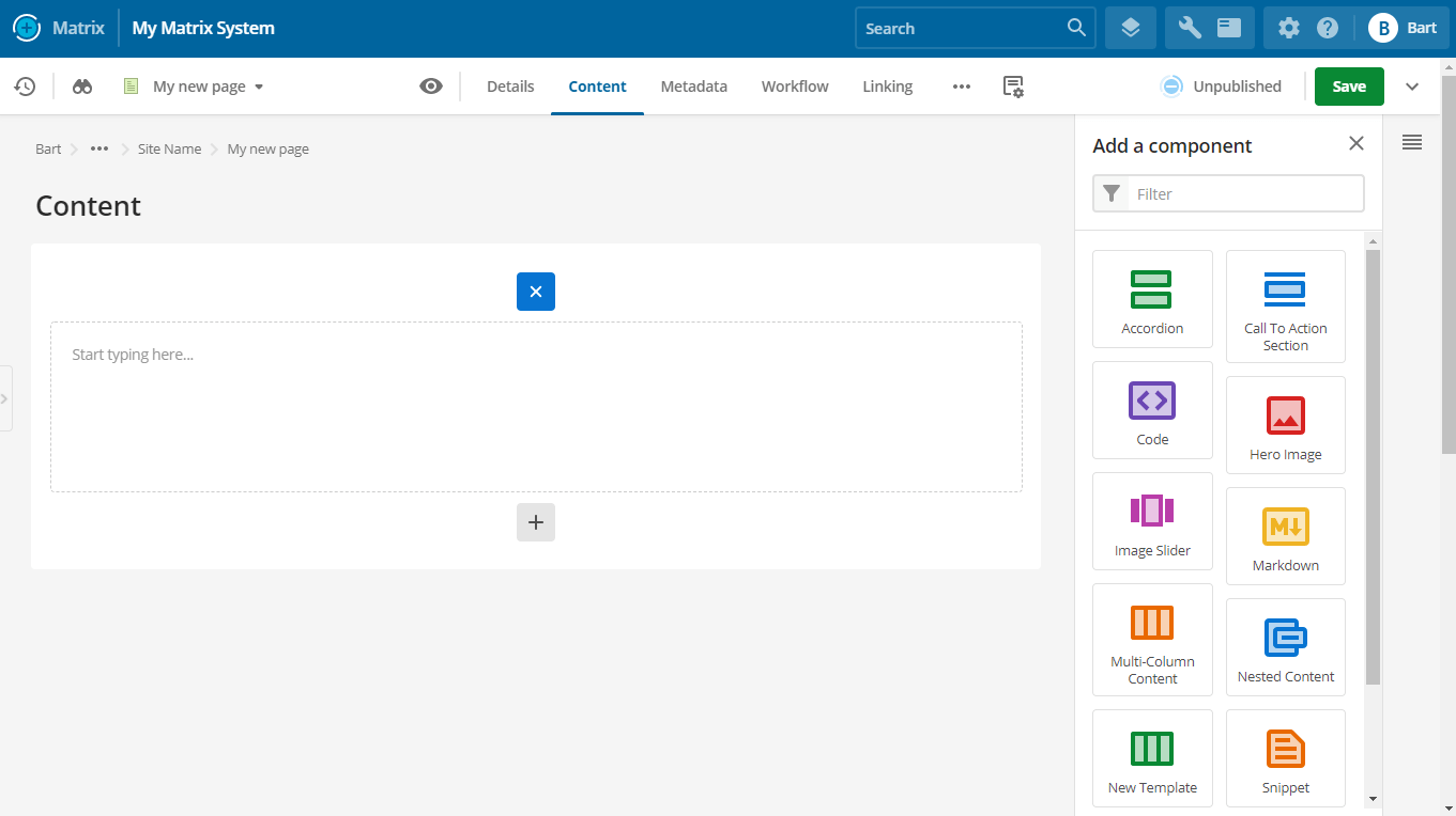
Access the new page builder by navigating to the “Content” screen of any asset that supports components. Content assets such as standard pages, custom forms, and layout assets like paint layouts and inline editing layouts support this screen.
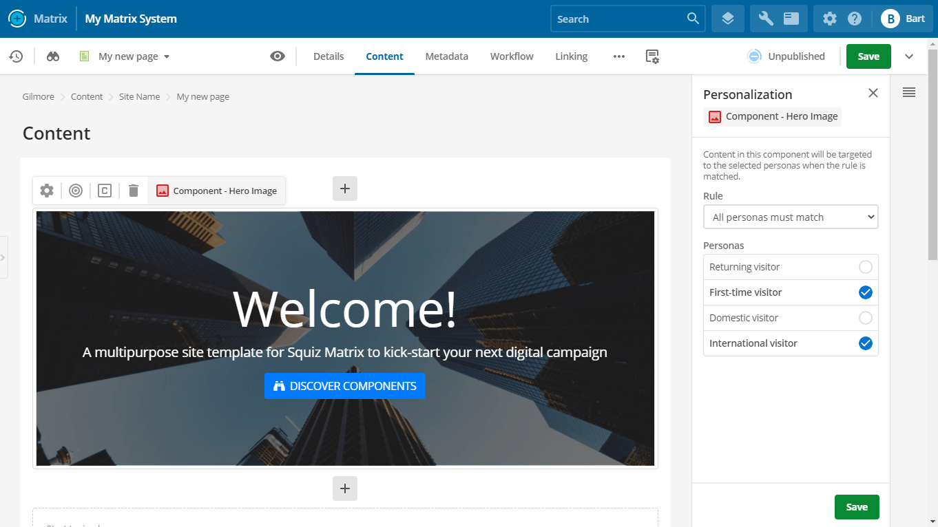
Add new component
Adding a new component now opens a brand new panel that makes it easier to add new components by selecting from a unified list of core and custom components.
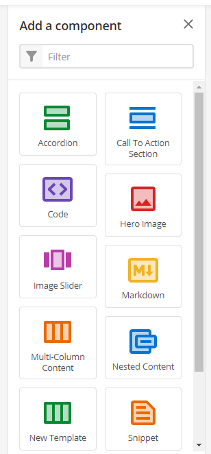
If the list of components is large enough, a filter tool will be available to find the component you want to add quickly.
Each component can have a colored icon and a description that tells the user more information about that component.
Component redesign
Components on the page are less cluttered when you view multiple components on a single page.
Hovering over a component displays the new component toolbar, which gives you access to all settings and tools of a component.
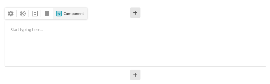
Edit component properties
The design of the component properties panel is improved.
Advanced settings are now hidden from view until you need them.
Improvements
Icon selection for component templates
You can apply a colored icon to a component template that displays when you view the list of components to add to the page builder.
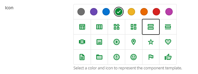
The icon helps users quickly find and identify component templates in the list and visually separates them from core components.
Dynamic usage conditions for component templates
You can apply a usage condition to a component template that, when met, makes it conditionally appear in the page builder.
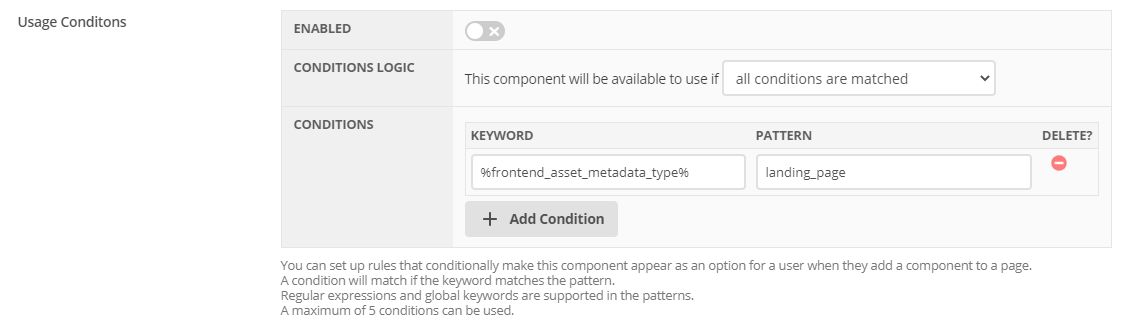
You can use any keyword combination to create custom and flexible conditions. For example, you can base a condition on the user, the page, or anything you can get from keyword values.
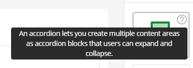
Component template descriptions used in page builder
The description field of component templates now displays as help text in the new page builder.
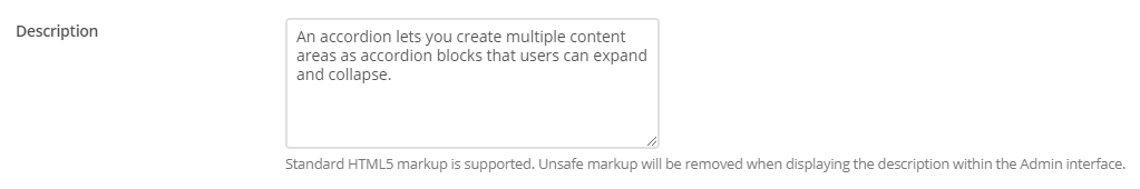
Any description added to the field appears when a user hovers over the “?” icon when viewing the components they want to add to the page.
Some basic HTML styling is supported, such as bold, italics, and links.
Improved asset right-click context menu
When you right-click on an asset in the asset tree, you get a better-grouped list of asset screens from which to select.
The new menu layout makes the menu less cluttered when you first open it with the most commonly-used asset screens readily accessible to you.
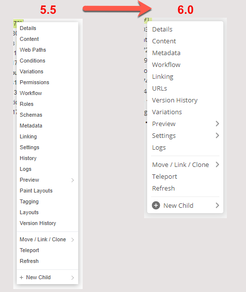
Improved screen groupings
Settings screen removed
This screen no longer exists, and its functionality moved to other screens.
- Dates
-
This functionality is now available from the new “Dates” screen.
- Versioning
-
This functionality is no longer available from asset screens.
- Morphing
-
This functionality is now available on the “Details” screen.
Read the asset settings documentation for more information about the new structure.
New Dates screen
This new screen lets you configure the date values of an asset.
Read the Asset dates screen documentation for more information about this new screen.
Improved recently viewed list
Previously known as the “Asset Navigation History”, the recently viewed list has been improved with a new design and more functionality.
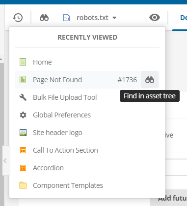
The way that this list generates has also changed to be more efficient, where the list shows you the last ten viewed assets or screens.
This list now also includes system configuration, maintenance, and tool screens.
Each asset listed now shows the asset ID and a shortcut for finding it in the asset tree.
Improved handling of the content screen on standard pages
Navigating to the “Content” screen of a Standard Page no longer redirects you to the dependent child bodycopy asset.
This change improves screen navigation when editing standard pages. You can use the screen switcher to easily switch between screens without ever leaving the top-level standard page asset.
Important changes
New password rules default
The default password rules now contain the following settings:
-
The minimum password length is 12 characters.
-
Disallow User Info defaults to Yes.
-
The character rule Numeric Digits is active and set to 1.
-
The Password History Enforcement value is now 999.
-
The default blocklist now includes a broader range of insecure passwords.
Furthermore, the term “blacklist“ changed to “blocklist“.
Search manager: minimum word length decreased
The default minimum word length for search term indexing is set to 3.
Deprecations
Stage one deprecations
The following features are now deprecated and are no longer supported or expected to function. You can still make changes to these deprecated features if they exist in your system. However, Squiz recommends that you consider migrating functionality built with these features away to another supported feature. The features in this section will be removed in a future version release of the product.
-
Cart
-
Checkout Page
-
Product
-
Donation
-
Promotional Code
-
PayPal Express Checkout Payment Gateway
Stage two deprecations
These features have been removed from Matrix and can no longer be used.
-
Internet Explorer 11 browser support for the backend UI
-
Edit+
-
Classic WYSIWYG Editor
-
Bulkmail
-
Upcoming Events List
-
Restricted-Period Calendar Page
-
Rolling Calendar Page
-
Rollback
-
Force Secure Setting
-
Design areas
-
Access History Design Area
-
Colourise Image Design Area
-
Constant Button Design Area
-
Custom Image Design Area
-
Cart Design Area
-
Datetime Design Area
-
Linked CSS Design Area
-
Head Design Area
-
Menu Stalks Design Area
-
Request Vars Design Area
-
Search Box Design Area
-
-
XML User Bridge.
Removed preferences
The following user preferences are no longer available:
-
Admin Mode WYSIWYG Type
-
Raw HTML Content Type Preferences
-
Save Button Position
-
Assets in Navigation History
-
Asset Map Font Size.
Removed system configuration
The following system configurations are no longer available:
-
Editing Interface Settings.
For more information on all previous and upcoming deprecations, visit the Deprecated Assets and Features page on Matrix Manuals.