Custom form contents
When you create a custom form, Matrix creates a form contents asset automatically.
You set most configuration through this asset, including adding sections and fields, setting up emails, and viewing the submission logs.
This page describes the functionality of the Form contents screen of the form contents asset.
The Form contents screen allows you to define the sections and fields of the form.
It also allows you to change various settings for the form, including whether to use the page contents and thank you bodycopies, what text to show on the buttons, and whether to use client-side validation.
How to access the form contents screen:
-
Right-click on the custom form asset in the asset tree.
-
Select Edit contents.
Form fields (not attached to a section)
This section lists the fields added to the form and allows you to add new fields.
The fields that are listed in this section are not contained within a section.
Form fields that are not created in sections cannot be cloned or linked to other forms.
To add a field:
-
Select the field type in the add fields field.
-
Select how many fields to add of this type (for example, select
2from the list to add two fields) . -
Click Save.
The fields will be listed in the current fields section. A field asset also appears in the asset tree for each field added.
For each field listed, the following information is shown:
- Form field
-
This shows the name of the field.
When you click on the field name, the Details screen will be displayed to modify that field’s settings.
The content of the Details screen will vary depending on the type of field you have selected.
For more information about each field type’s Details screen, refer to the field type chapters in this manual.
- Type
-
This shows the field type that has been added.
- Delete
-
This field allows you to delete a field from the form. To do this:
-
Select the box.
-
Click Save.
Alternatively, to delete all fields on the form:
-
-
Select the box at the top of the column.
-
Click Save
- Move
-
This field allows you to re-order the fields for the form.
-
Click on either the
 icon or
  icon to move the field.
 -
Click Save once you have re-ordered the fields.
You can add additional fields to the form by using the Add fields field.
Sections
This section lists the sections added to the form and allows you to add new sections.
By default, no sections have been added.
To add a section:
-
Enter the section’s name in the Add sections section.
-
Click Save.
The section displays in the current section list.
A section asset also appears in the asset tree. You can add as many sections as you want to the form.
For each section added, the name of that section is listed in Current sections.
The Details screen displays when you click on the section name. You can add fields to that section.
For more information about the Details screen, refer to the Sections chapter in this manual.
Formatting
This section allows you to customize the format of your form.
The fields that are available in this section are as follows:
- Accessible format
-
This field allows you to output accessible HTML content on the form in compliance with WCAG2.0 standards.
If the accessible format option is disabled, fields will be presented in a non-accessible, semantic format. By default, this field is enabled.
Form fields and CAPTCHA errors will be displayed next to their corresponding fields when the accessible format option is enabled.
General form errors, however, will continue to be displayed on this keyword.
- Required field mark
-
This field allows you to define the HTML included in the label of a required form field.
By default, this value is:
<abbr class="sq-form-required-field" title="required">*</abbr>. - Required field note
-
This field allows you to configure the note displayed at the top of your form, indicating the required field mark’s usage.
By default, this message will read: Required fields are marked with an asterisk (
<abbr class="sq-form-required-field" title="required">*</abbr>). - Use confirmation page
-
This field allows you to select whether your form will contain a confirmation page.
This confirmation will allow the user to ensure they have correctly completed the form before submitting it.
The confirmation page can be used for both single and multiple page forms.
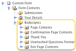
- Use bodycopy
-
This field allows you to select whether to change the form’s default layout.
The available bodycopies are listed below:
- Page contents bodycopy
-
This is used to define the form’s initial layout where the user fills out the fields.
- Confirmation page contents bodycopy
-
This is used to define the layout of the confirmation page.
This bodycopy is only used when the use confirmation page field is set to
Yes. - Thank you bodycopy
-
This is used to define the page’s layout once the user has submitted the information.
- Unattached fields format bodycopy
-
This is used to define the page’s layout with fields that are not attached to a particular section when dealing with a form with multiple pages.
- Exit page contents
-
This is used to define the page’s layout once the user has saved and exited the form.
This bodycopy enables the use of the Save and exit button.
You can choose to change any number of bodycopies. If you wish to change a default layout:
-
Select which bodycopy you want to change.
-
Click Save.
A bodycopies folder containing the bodycopy assets will be added under the asset tree’s form asset.
For more information on how to use these assets, refer to the Formatting the custom form chapter in this manual.
-
- Submit button text
-
Enter the text to be used for the Submit button, for example, Send or Apply.
By default, the text that appears on this button is Submit. This button can have added HTML attributes.
For more information, see the Simple formatting section of this chapter.
- Reset button text
-
Enter the text to be used for the Reset button, for example, Revert.
By default, the text that appears on this button is Clear form. This button can have added HTML attributes.
For more information, see the Simple formatting section of this chapter.
- Note text size
-
Enter the size of the text to be used for the field notes.
These notes appear under the field’s title and are specified on each field’s Details screen.
The text’s size is a percentage of the text size used in the rest of the screen.
By default, this value is
80%. - Form extra attribute
-
This field allows you to enter extra attributes to add to the form’s HTML tag.
For example, the
autocomplete="off"attribute can be added to prevent the form from storing a user’s previous values and displaying them as an autocomplete option when the user next visits the page.
Validation
This section allows you to choose the validation method used for the custom form.
The fields that are available in this section are as follows.
- Client-side validation
-
Select whether to turn on client-side validation.
If it is turned on, the form is validated before being submitted to the server.
This process can be more efficient as it means that a user will be informed if something is wrong before they send the information back to your server.
However, some older browsers do not support client-side validation, so you may choose to use server-side validation.
Server-side validation is used by default to trap invalid input after the form is submitted.
Turn on client-side validation to provide an extra layer of validation.
By default, client-side validation is
Off. - Error message format
-
This field allows you to modify the message that appears when the keyword replacement error message is used on the page contents bodycopy.
To edit the message, click on the
 icon.
icon.A WYSIWYG editor will appear.
Format the message to show to the user.
Submission limit
This section allows you to set a limit on the number of submissions allowed on the custom form.
+ The fields that are available in this section are as follows:
- No. of submissions allowed
-
Enter the number of submissions that will be allowed to be logged on the custom form asset.
For example, if this field is set to
5, once five submissions have been logged on the form, no more submissions will be made.By default, this field is set to
0, meaning that the option is disabled and that no limit has been applied to the form submissions.If a set submission limit is exhausted, an error message will be displayed to users who attempt to complete the form.
The format of this message is defined on the submission limit reached bodycopy.
For more information, refer to the Formatting the custom form chapter in this manual.
- Error text
-
Enter the error message displayed to users if the set submission limit is exhausted while completing the form.
By default, this message in this field will read:
Submission limit has been reached on this form.
No more submissions will be accepted.
Submission access
This section allows you to restrict access to the submissions of the form.
In the restrict submission access field, specify whether to restrict access to the form submission assets created by the form.
If this field is enabled, submissions will only be accessible by users with admin permission on the form.
Users with read or write permission will not be able to view or edit any form submissions.
Multi-page form options
This section allows you to modify the form to contain multiple pages and customize the multi-page features.
A multi-page form is useful for forms with many fields and multiple sections. The fields that are available in this section are as follows:
- Multi-page?
-
Select whether to use a multi-page form.
If you select
Yes, then each section of your form will become a separate page, ordered as ordered in the asset tree.Any fields that have not been created under a section will appear at the beginning of the form.
- Next page button text
-
Enter the text to be used for the Next page button, for example, Continue.
This button replaces the submit keyword on all but the last page of the form. By default, the text that appears on this button is Next page.
- Previous page button text
-
Enter the text to be used for the Previous page button, for example, Back.
This button is only compatible with forms that have either multi-page or use confirmation page enabled.
By default, the text that appears on this button is Previous page.
- Save button text
-
Enter the text to be used for the Save button, for example, Keep.
This button saves the information entered on the current page of the form.
The save button is displayed on the form when the keyword replacement
%save_button%is used on the page contents bodycopy.By default, the text that appears on this button is Save.
- Save and exit button text
-
Enter the text to be used for the Save and exit button, for example, Save for later.
This button saves the information entered and then exits the form.
The Save and exit button is displayed on the form when the keyword replacement
%save_and_exit_button%is used on the page contents bodycopy.This button is only available with forms that are using the exit page content bodycopy. By default, the text that appears on this button is Save and exit.
- Page list entry format
-
Enter one of the following keywords to choose how the page list is displayed on the form:
- %page_name%
-
The page list will be displayed by the asset name of the corresponding section, unattached field, or confirmation page.
- %page_number%
-
The page list will be displayed numerically.
- %total_pages%
-
The page list will be displayed as the total number of pages in the form.
By default, this field is set to
%page_number%. This page list is displayed on the form when the keyword replacement%page_list%is added to the page contents bodycopy.
- "Unattached fields" page name
-
Enter the text to be used for the unattached fields page in the page list, for example, Other.
This field is only used when a form contains fields not attached to a particular section, and the page list entry format is set to
%page_name%.By default, this is set to Unattached fields.
- Confirmation page name
-
Enter the text to be used for the confirmation page in the page list; for example, Confirm your details.
This field is only used when the use confirmation page field is set to
Yes, and the Page list entry format field is set to%page_name%.By default, this is set to Confirmation.
- Save confirmation text
-
Enter the text to save confirmation message, such as Save successful.
This message will be displayed when the user saves the information entered on the form.
By default, the message that will appear is Your progress has been saved.
The save confirmation message is displayed when the keyword replacement
%save_confirmation%is added to the page contents or page format bodycopies.
Public user incomplete submission
This section allows you to enable and configure the saving of incomplete submissions for public users.
The fields that are available in this section are as follows:
- Allow public incomplete submission
-
Select whether to allow public users to save incomplete forms for completion later.
- Public user email field
-
Select the form field to source the public user’s email address from, for example, the email field on your form.
- Submission retrieval email format
-
Configure the format of the email sent to public users after saving an incomplete submission.
The following keyword replacements are available for use in the body of the email:
%form_submission_password%-
The password required to regain access to the incomplete submission.
%form_total_pages%-
The total number of pages on the form.
%return_to_form_URL_current%-
The URL directing the user back to the page of the form that they were previously viewing.
%return_to_form_URL_latest%-
The URL directing the user back to the furthest page of the form that they had reached.
- Submission retrieval message format
-
Enter the text to use for the submission retrieval message.
This message is displayed when the
%submission_access_info%keyword replacement is used on the page contents or page format bodycopies.It is displayed when a public user clicks the Save button.
- Password verification form format
-
Define the format for the password verification form.
This form is displayed when a public user attempts to retrieve their previously saved incomplete submission.
- Submit button text
-
Enter the text to be used for the Submit button, such as Send or Apply.
By default, the text that appears on this button is Submit.
- Incorrect password message
-
Enter the error message to display when a public user incorrectly enters their password when attempting to access their incomplete submission.
If this field is left empty, the default message invalid password will be used.
Simple formatting
This section allows you to customize the widths for various parts of your form.
These settings will only apply if you do not use the page contents bodycopy or use the keyword replacement form contents on the page contents bodycopy.
The fields that are available in this section are as follows:
- Form width
-
Enter the width for the form when displayed within your site.
Select Pixels from the list to specify an absolute value for the width, or Percent, to specify the width as a percentage of the window width.
If you select Percent, the form will resize if the user resizes their browser window.
If you select Pixels, the form will not resize.
- Form field width
-
Enter the width of the column used for the title of the fields.
Select Pixels from the list provided to specify an absolute value for the width, or Percent, to specify the width as a percentage of the window.
This setting will only apply to the fields not contained within a section such as fields added on the Form contents screen.
To modify the title column’s width for fields within a section, go to the Details screen of that section.
- Answer width
-
Enter the width of the column used for the answer fields for the fields.
Select Pixels from the list provided to specify an absolute value for the width, or Percent, to specify the width as a percentage of the window.
This setting will only apply to the fields that are not contained within a section such as fields added on the Form contents screen.
To modify the width of the answer field’s column for fields within a section, go to the Details screen.
- Submit button extras
-
This allows you to add extra HTML attributes to the Submit button for custom styling.
Any HTML attributes added to this field will override the default styling for the Submit button.
- Reset button extras
-
This allows you to add extra HTML attributes to the Reset button for custom styling.
Any HTML attributes added to this field will override the default styling of the Reset button.
Complex formatting
Matrix allows you to define a more complex layout for the form by positioning the fields and responses individually rather than in a single block.
The fields are positioned on the page contents bodycopy, and the responses are positioned on the thank you bodycopy.
Click on the appropriate link to view the keyword replacements used for the page contents and thank you bodycopies.
Security enhancement
This section allows you to enhance the form’s security by disabling the replacement of any keywords present in a user’s form inputs.
When keywords are replaced, users might retrieve information that they otherwise would not have permission to view. By doing so, this may cause a potential security risk.
To prevent keywords from being replaced in user form inputs, select Yes in the Disable keyword replacements field.
If this field is enabled, keywords are not replaced in the user’s form inputs.
For example, %globals_asset_attribute_xxx:100% will be output as globals_asset_attribute_xxx:100 rather than the attribute value.
By default, this field is set to yes.
Advanced settings
This section allows you to set the submission URL of the form page.
In the form submission URL field, select whether to set the submission URL of your form to either the current URL or this page’s URL.
When the current URL option is selected, the form will submit to the current URL that the user is visiting.
On the other hand, when the This page’s URL option is selected, the form will submit to the URL of the custom form page.
This option can be useful when your form is nested within another page. You want your form to submit to the original form’s URL instead of the current nesting page’s URL.
Basic CAPTCHA
This section allows you to change the CAPTCHA field settings that can be shown on the form.
A CAPTCHA field is a method of ensuring that a human makes the submissions made on the form rather than an automated system.
The fields that are available in this section are as follows.
- Require CAPTCHA
-
Select whether the CAPTCHA field must be filled in by the user to submit it.
If you select
Yesand use the page contents bodycopy, the CAPTCHA keyword replacements need to be added to the form.If you do not include these keyword replacements, the user can not fill out the CAPTCHA field and not submit the form.
By default, this field is set to
No. - Provide accessible CAPTCHA
-
Select whether the CAPTCHA field will have an accessible CAPTCHA option.
If you change this option to
Yes, users can choose to use accessible validation.This process involves the user inputting their email address and then clicking a validation link sent to their email account.
- CAPTCHA key length
-
Enter the number of characters in the image for the CAPTCHA field.
By default, this is set to
4. - CAPTCHA character zoom
-
Enter the maximum size that the characters in the image can appear.
Each character will be randomly zoomed between
1and the figure entered into this field.By default, this figure is
1. - CAPTCHA regen link text
-
Enter the text to use when the Keyword replacement CAPTCHA regeneration link is used.
The user will click on this text to regenerate the characters that appear in the CAPTCHA image.
By default, this text is Regenerate security key.
- Use CAPTCHA colors
-
Select whether the CAPTCHA color options for background, text, and border will be used.
- CAPTCHA background color
-
Select the background color for the CAPTCHA.
This field will only be used when the Use CAPTCHA colors field is set to
Yes. - CAPTCHA text color
-
Select the text color for the CAPTCHA. This field will only be used when the Use CAPTCHA colors field is set to
Yes. - CAPTCHA border color
-
Select the border color for the CAPTCHA. This field will only be used when the Use CAPTCHA colors field is set to
Yes. - Use CAPTCHA font
-
Select whether the CAPTCHA font options will be used.
- CAPTCHA font
-
Select the font file to be used as the CAPTCHA font.
This field will only be used when the Use CAPTCHA font field is set to
Yes. - CAPTCHA font size
-
Enter the size to be used on the CAPTCHA font.
- CAPTCHA width
-
Enter the width of the CAPTCHA image.
By default, this is set to
200. - CAPTCHA height
-
Enter the height of the CAPTCHA image.
By default, this is set to
36. - CAPTCHA min angle
-
Enter the minimum angle that will be used for the CAPTCHA text.
By default, this is set to
-20. - CAPTCHA max angle
-
Enter the maximum angle that will be used for the CAPTCHA text.
By default, this is set to
20. - CAPTCHA X start
-
Enter the X-position on the CAPTCHA. The X-position will determine where the characters begin in the CAPTCHA.
By default, this is set to
10. - CAPTCHA min distance
-
Enter the minimum distance between each character.
By default, this is set to
10. - CAPTCHA max distance
-
Enter the maximum distance between each character.
By default, this is set to
20. - Use CAPTCHA arc
-
Select whether to use arced lines across the text in the CAPTCHA.
This feature is an additional security measure.
This field will only work if you set the CAPTCHA font field to
Yes, and a CAPTCHA font is manually selected. - CAPTCHA arc color
-
Select the color of the arced lines across the text in the CAPTCHA.
This field will only work if you set the CAPTCHA arc field to
Yes, the Use CAPTCHA font field is set toYes, and a CAPTCHA font is manually selected. - Include uppercase letters in CAPTCHA text
-
Select whether the CAPTCHA will include uppercase letters.
If this option is set to
Yes, at least once uppercase letter will appear in the CAPTCHA. - Include numbers in CAPTCHA text
-
Select whether the CAPTCHA will include numbers.
If this option is set to
Yes, at least one number will appear in the CAPTCHA. - CAPTCHA invalid error message
-
Enter the text to be used for the CAPTCHA invalid error, such as invalid security key.
This message will be displayed when the user inputs an incorrect CAPTCHA key.
By default, the message that will appear is Security key incorrect.
The CAPTCHA invalid error is displayed when the keyword replacement
%form_errors%is added to the page contents or page format bodycopies. - CAPTCHA required form error message
-
Enter the text to be used for the CAPTCHA required form error; for example, CAPTCHA is required but does not appear on the form.
This message will be displayed when the required CAPTCHA field is set to
Yes, but the form does not contain the CAPTCHA input field to enter the CAPTCHA key.By default, the message that will appear is valid CAPTCHA is required, but none is found in this form submission.
The CAPTCHA required error is displayed when the keyword replacement
%form_errors%is added to the page contents or page format bodycopies. - CAPTCHA label text
-
Enter the text to label the CAPTCHA input box on the form.
By default, this message will be: Type the characters you see in the picture above.
This message is shown when the keyword replacement
%form_CAPTCHA_label%is used on the page contents bodycopy.
Google reCAPTCHA
This section allows you to implement Google's free reCAPTCHA anti-bot service.
|
The fields available are as follows:
- Use reCAPTCHA
-
Specify whether to use Google's reCAPTCHA service.
Use this field when you customize the form contents using the
%form_reCAPTCHA%keyword replacement so the reCAPTCHA fields print on the form. - Theme
-
Select the theme to use for printing the reCAPTCHA fields. The options available are light (default) and dark.
- Box size
-
The size of the reCAPTCHA box that will be used. The options available are Normal (default) and Compact.
- Error message
-
A custom error message to display to users if the reCAPTCHA validation fails.
If you are configuring a custom form layout using the Page Contents bodycopy, the two keywords available are:
- %form_recaptcha%
-
This will display the Google reCAPTCHA fields.
- %form_recaptcha_errors%
-
This will display the default or custom error associated with the Google reCAPTCHA fields.
hCaptcha
This section allows you to set up the hCaptcha anti-bot service on your system for use on the custom form, password reset, account manager, and asset builder assets.
|
To use hCaptcha you will first need to create an account and configure the API keys on the External tools configuration screen. Read the hCaptcha migration guide to learn more about obtaining the site and secret keys. |
The fields available are as follows:
- Use hCAPTCHA
-
Specify whether to use the hCaptcha service.
Use this field when you customize the form contents using the
%form_hcaptcha%keyword replacement so the hCaptcha fields print on the form. - hCaptcha theme
-
Select the theme to use for printing the hCaptcha fields.
The options available are Light (default) and Dark.
- hCaptcha widget size
-
The size of the hCaptcha box that will be used.
The options available are Normal (default) and Compact.
- hCaptcha error message
-
A custom error message to display to users if the hCaptcha validation fails.
If you are configuring a custom form layout using the Page Contents bodycopy, the two keywords available are:
- %form_hcaptcha%
-
This will display the hCAPTCHA fields.
- %form_hcaptcha_errors%
-
This will display the default or custom error associated with the hCAPTCHA fields.
Spam prevention: honeypot field
The Honeypot field spam prevention method allows you to create a honeypot (or dummy) field to identify spambots who fill in the field, otherwise left blank.
The fields available are as follows:
- Field name
-
Enter a name for the honeypot field input field.
Please note that if a honeypot field has been configured, the
%form_honeypot_field%keyword replacement should be included in the form’s content to print the honeypot field. This field should be hidden from regular users through CSS.Alternatively, a clear warning informing users not to complete this field should be displayed.
- Field ID
-
Enter an ID for the honeypot field input field.
- Field class
-
Enter a CSS class name for the honeypot field input field.
- Error message
-
Enter the error message to display to users if they complete the honeypot field and, as a result, had their form submission denied.
Spam prevention: submission time threshold
The submission time threshold spam prevention method allows the custom form page to identify possible spam based on the elapsed time between form load and form submission.
The fields available are as follows:
- Time period
-
Enter the time (in seconds) as the minimum time required by a user to complete the form.
If a form submission does not meet this minimum time threshold, the form is not accepted.
If you estimate that legitimate submissions should take at least two minutes to complete, entering
120seconds into this field will prevent any submissions completed in under two minutes from being accepted.By default, this field is
0, meaning that this option is disabled. - Error message
-
Enter the error message to display to users if they do not meet the minimum time threshold specified in the Time period field.