Custom form field types
Learn about the available form field types and their available options.
Generic form field type functionality
The following fields are generic across all form field types where they appear.
Form field options
- Title
-
The name of the form field. This title will be used as the label of the field on the frontend.
- Note
-
A note to be displayed alongside the title. This text can be used to provide information to your users about the form field and the expected form of the response.
- Default value
-
The default value for the form field. This value will be displayed within the answer field on the form. The user can then override this value. You can use the keyword replacement
%globals_user_name%as the default value. The replacement will default the user’s name into this field if they are signed-in to your site. - Placeholder
-
A placeholder value, a short hint that describes the expected value of the input field. The value entered into this field will be displayed in the input field before the user enters a value.
- Input type
-
The input type of the response field. When used, the input field will provide specific interfaces to suit the specified field type. By default, the input type will be set to
text. - Width
-
The width of the text field.
- Height
-
The number of rows for the form field. By default, this value is
1, meaning that the field on the form will be one row. If2or more is entered, the text field changes into a multiple line box. - Maximum length
-
The maximum number of characters that can be entered by the user. If this value is higher than the width, the visible portion scrolls as the user types into the field.
- Tab index
-
The tab index for the field. This index is referenced when the Tab key is pressed. This function is useful when you have laid out each form field individually on the page contents bodycopy. Consider a scenario where the form field is the first form field on the custom form, but you have put it last on the page contents bodycopy. You can enter the tab index so that when the user presses the Tab key, it will be the last form field to which the cursor goes.
- Extras
-
Any additional HTML attributes to be added to the tag used to display the field’s answer field. For example, you may wish to specify a CSS class that defines the form field text formatting.
Simple and complex validation rules
Each form field type has both simple and complex validation rules that can be added. Based on the type, the list of validation rules might be different. For example, a File upload form field will have validation rules based on the field’s file.
You can read more about each type’s unique validation rules in their specific sections below.
Text
The Text form field type allows the user to enter text for the form field. You can use this field to either create a single line text field or a multi-line textarea.
This type features the same fields as documented in the generic Form field type functionality section above.
File upload
The File upload form field type allows the user to upload a file to the form. This file is stored as an asset within your system.
| Matrix may alter filenames to suit storage requirements. The original filename is stored in the asset title. |
Form field options
- Create location
-
Each file uploaded through this form field type is stored as an asset. This field allows you to select where in your system, you want these assets stored. For example, you could create a folder under the custom form and store the files in there. If no create location has been set, uploaded files will be stored in the form submission’s data directory. Uploaded files can be downloaded through the Details screen of a submission. This screen can be accessed through the submission logs screen.
- Attach to emails
-
Select
Yesto attach the file uploaded to the emails that have Include file attachments selected. This option is set on the Email options screen of the Form contents asset. For more information on the Email options screen, refer to the Form contents chapter in this manual.
Simple validation rules
- Overwrite rule
-
This field allows you to select the action to be taken if a file of the same name already exists in the upload location you have specified. If no create location is specified, the Overwrite rule is disabled. The available options are:
- Raise a submission error
-
When the user tries to submit the form, show them an error notifying them that the file already exists. The error message will be similar to:
There was an error uploading the file for file upload form field "Upload CV" - file already exists in path.
- Rename uploaded file
-
Automatically rename the file being uploaded by appending a number to the filename. For example, if you try to upload the file
test.doc, which already exists, it will automatically be renamed totest2.doc. - Overwrite existing file
-
Overwrite the existing file with the new file being uploaded.
- Condition
-
This field allows you to add a condition on the validation rule. Read the Custom form fields documentation for more information about conditions.
Complex validation rules
- Uploaded file size
-
This rule allows you to limit the file’s size to be uploaded by the user. For example, if you do not want the user to upload a file bigger than
1 MB, selectMust be no larger thanin the operator field and enter1 MBin the file size field. When the user tries to submit a file larger than1 MB, they will receive an error message. The fields that can be set up are as follows:- Operator
-
Select from
Must be no larger thanorMust be no smaller than. For example, if the PHP configuration says2 MBand you enter10 MB,2 MBwill be used instead of10 MB. - File size
-
Specify the size of the file. For example, if the user cannot upload a file bigger than
1 MB, enter1into the first field and selectMBfrom the second field. The available units includebytes,KB,MB, orGB. - Condition
-
This field allows you to add a condition on the validation rule. Read the Custom form fields documentation for more information about conditions.
- Custom error text
-
Enter a customized error message to show if the rule fails. If you do not enter an error message, a default message will appear similar to:
File uploaded at form field "Upload CV" must be no larger than `1 MB`.
- Delete?
-
To delete this validation rule, select the Delete checkbox and then click Save.
- Uploaded file type
-
This rule allows you to limit the type of file uploaded by the user. For example, if you only want to allow them to upload Microsoft Word documents, select
Must match one of these extensionsin the operator field and enter.docin the extension list. When the user tries to submit a file that is not a Microsoft Word document, they will receive an error message.The fields that can be set up are as follows:
- Operator
-
Select from
Must match one of these extensionsorMust not match one of these extensions. - Extension list
-
This section shows the extensions you have added, allows you to add new ones and delete existing ones. To add an extension to the list:
-
Click within a blank box.
-
Enter the extension, for example
.docordoc. -
Click Save
You can add as many extensions as you want simultaneously, and there is no limit to the number of options you can add to the list.
-
To delete an extension from the list: click on the
 icon to the box’s right.
- Enforce MIME check
-
Select whether to use the MIME type check on uploaded files. If this field is selected, uploaded files will be checked to ensure that the file data matches that expected by the file extension. For example, an uploaded image file could be checked to verify that it is an image and not just a file with an image type extension. By default, this field is selected.
- Condition
-
This field allows you to add a condition to the validation rule. Read the Custom form fields documentation for more information about conditions.
- Uploaded file virus check
-
This rule allows you to prevent files from being uploaded should the virus checker detect a virus. The virus checker will detect that a file is infected and not allow it to be uploaded to the system. The fields that can be set up are as follows:
- Enable virus checking
-
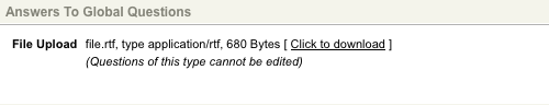
Select this field to enable virus checking for uploaded files. A virus checker must be configured for this system to use this field. If no virus checker is configured, an error message will appear, as shown in the figure above. For more information on configuring the virus checker, refer to the [System configuration] manual’s [External tools] chapter.
- Custom progress indicator text
-
Enter a customized message to indicate to a user that their uploaded file is in the progress of being checked for viruses. If you do not enter a progress indicator message, a default message will appear.
- Custom progress indicator class
-
Enter a customized CSS class to define the format of the progress indicator. If you do not enter a CSS class, the default format will appear.
- Condition
-
This field allows you to add a condition on the validation rule. Read the Custom form fields documentation for more information about form field conditions.
The progress indicator can only be displayed and customized when the client-side validation field is set to On.
Select
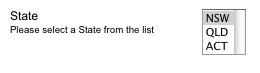
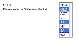
The Select form field type allows a user to select a value from a drop-down list.
Form field options
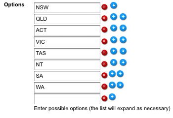
- Options
-
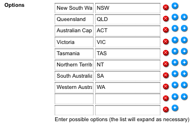
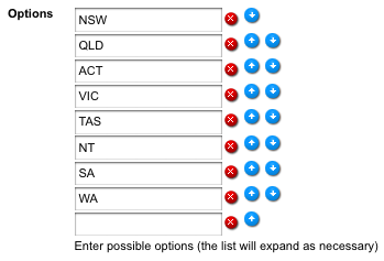
This section shows the values added to the list and allows you to add new ones, delete existing ones, or re-order the list. To add a new value to the list, click within a blank box, enter the value, and click Save. For example, enter
NSW,QLD,ACT,VIC,TAS,NT,SA, andWAand click Save. You can enter as many options as you want simultaneously, and there is no limit to the number of options you can add to the list. To delete an option from the list, select the icon.To re-order the list, click on the up and down arrows and click Save.
- Default
-
Select a default value for the list on the custom form. You can only select a default value once you have specified the list options and saved the screen.
- Upload from CSV file
-
Select a comma-separated values (CSV) file from your computer to automatically input the Select form fields' options. This feature is useful for batch uploading several options or importing an existing Select form field’s options. The CSV file can have up to three fields, with the first determining each option’s key, the second determining the value of each option. The third indicates if the option is the default value (
1for yes,0for no). An uploaded CSV file will overwrite any current options already inputted.
- Height
-
The height for the list. This height determines the number of rows that are visible at a time. For example, if
3were entered for the height, three rows will be visible on the custom form.
- Multiple
-
Whether to allow users to select multiple values from the list. If you select
Yes, a box will appear on the custom form where the user can hold down the Shift key or Ctrl key to select multiple values. If you selectNo, the user can only select one value from the list.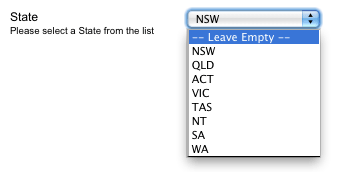
- Use empty option?
-
Whether to display an empty option on the list. If you select
Yes, by default-- Leave empty --will appear in the list. You can change this in the empty text field below. - Empty text key
-
The key for the empty option in the list. By default, this will be empty. This option will only be applied if the Use empty option is
Yes. - Empty text
-
The text to show for the empty option in the list. By default, this option will say
-- Leave empty --. This option will only be applied if the Use empty option isYes. - Allow empty option to be selected?
-
Whether users can submit the empty option selection on this field. If this field is disabled, users will be forced to select a valid answer. This option will only be applied if the Use empty option is
Yes. - Empty option selected error
-
The error text to be displayed when the Allow empty option to be selected? field is disabled, and the user attempts to submit their form, having selected the empty option on this field. By default, this will read:
Please select a valid option.
This setting will only be applied if the Allow empty option to be selected? field is disabled.
Complex validation rules
- Selection limit
-
This rule allows you to validate how many options the user must select from the list. To make a user select two options from the list, select
Must select more than this many optionsin the operator field and enter2into the number of options. When the user fills out the custom form, they will receive an error message if they have not selected two options. The fields that are available for this rule are shown:
The fields that can be set up are as follows:
- Operator
-
You can select from:
-
Must select exactly this many options
-
Must not select exactly this many options
-
Must select more than this many options
-
Must select less than this many options
-
Must select at least this many options
-
Must select no more than this many options.
-
- Number of options
-
Enter the number of options that must either be selected or not selected for the rule.
- Condition
-
This field allows you to add a condition on the validation rule. Read the Custom form fields documentation for more information about conditions.
Tickbox table
The Tickbox table field type allows you to set up a table of options where the users can select the values.
Form field options
- Form field contents
-
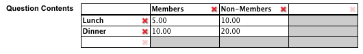
These fields allow you to specify the rows and columns of the tickbox table. Initially, one blank row and two columns are available for you to add the values. A second blank row or column is added for the following values as you type into a row or column.
The first row you enter is the columns' headings, and the first column you enter is the headings for the rows. A checkbox will be created for every cell that you create in the body of the table. For example, for the form field contents shown in the figure below.
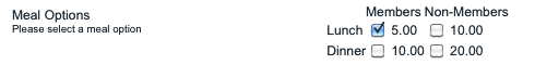
The tickbox table shown in the figure below will appear on the custom form.
Please note that you need to enter a value into the first cell of the first column for the second row to appear in the table. However, once the row appears, you can delete that value if you don’t want to show it.
Tickbox list
The Tickbox list form field allows the user to select more than one option from a list of values. Users can see all options on the form and can tick the box next to their choice. Tick-boxes can have a default setting of selected or cleared.
Form field options
- Options
-
This section shows the values added to the list and allows you to add new ones, delete existing ones, or re-order the list. To add a new value to the list, click within a blank box, enter the value, and click Save.
For example, enter
NSW,QLD,ACT,VIC,TAS,NT,SA, andWAand click Save. You can enter as many options as you want simultaneously, and there is no limit to the number of options you can add to the list.To delete an option from the list, select the
icon.To re-order the list, click on the up and down arrows and click Save– if you do not click Save, the new order will not be saved.
- Default
-
A default value for the list on the custom form. You can only select a default value once you have specified the list’s values in the options field. This value will be selected within the answer field on the form. The user can then override this value.
Complex validation rules
- Selection limit
-
This rule allows you to validate how many options must be selected from the list. For example, if you want the user to select two options from the list, select
Must select more than this many optionsin the operator field and enter2into the number of options. When the user fills out the custom form, they will receive an error message if they have not selected two options. The fields that are available for this rule are shown: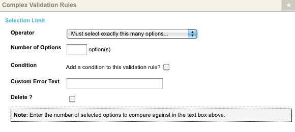
The fields available are as follows:
- Operator
-
You can select from:
-
Must select exactly this many options
-
Must not select exactly this many options
-
Must select more than this many options
-
Must select less than this many options
-
Must select at least this many options
-
Must select no more than this many options
-
- Number of options
-
Enter the number of options that must either be selected or not selected for the rule in the text box.
- Condition
-
This field allows you to add a condition on the validation rule. Read the Custom form fields documentation for more information about conditions.
Date / time
The Date/time form field allows the user to enter a date and time.
Form field options
- Options
-
This section allows you to specify which parts of the date and time to show and change their properties. The fields that are available in this section are as follows:
- Show
-
Select which date and time options to display on the form. For example, if this form field is for the user’s date of birth, the time fields would generally not be required. In this case, you would clear the hour, minute, and second options. Selecting the
circaoption will display an additional field on the form field, giving users the ability to affixcirca. On the form date/time response.This function allows users to indicate that the response is an approximate date/time value. Selecting the
12 houroption will display an additional AM/PM field on the form field. This option allows users to input their response in a 12-hour time format.By default, the
day,month,year,hour,minute, andsecondoptions will be selected. - Allow blank
-
Select which parts of the date and time can be left blank by the user and which parts are mandatory. By default, allow blank is not selected for all date and time fields; therefore, they are mandatory. To make a field optional, select the Allow blank field.
- Display as text box
-
Select which parts of the date and time should be displayed as a text box on the form rather than a list. This option means that the user can type in the value rather than selecting it from a list. By default, this option is not selected for all date and time fields. Therefore a list is shown for each part. To show a text box for a field, select the
Display as text box.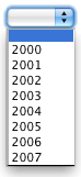
- Minimum
-
The minimum date and time that the user can enter on the form. You do not need to enter a value into every field. For example, if you want to have a minimum year value of 2000, enter
2000into the year part of the minimum field. The list in the year field on the form will now start from 2000. By default, no minimum date and time is entered into this field. - Maximum
-
The maximum date and time that the user can enter on the form. You do not need to enter a value into every field. For example, if you want to have a maximum year value of 2007, enter
2007into the year part of the maximum field. The list in the year field on the form will now have a maximum value of2007. By default, no maximum date and time are entered into this field. - Default
-
The default date and time. You must enter a full date and time for this to display on the form. For example, if you enter a default date of
20 Dec 2005, it will be shown on the form, but it will not be displayed if you only enter 2005. The user will be able to override any default value that is shown. - Print format
-
The format of the date and time shown wherever the response keyword replacement is used on the thank you bodycopy. This value is in PHP date format. For more information, visit the PHP: date manual.
Country
The Country form field type allows the user to select a country from a pre-defined list of values.
Form field options
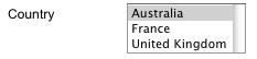
- Available countries
-
By default, all countries shown in this list will appear on the form. This field allows you to narrow down the list and only show certain countries, such as Australia, the United States, the United Kingdom, and France. To select multiple countries, hold down the Ctrl key on the keyboard, and left-click on the country.
- Default
-
A default value for the list on the custom form. If you have narrowed down the list of available countries, this list will only show the countries that you have selected. The value selected in this field will appear within the answer field on the form. The user can then override this value.
- Height
-
The height for the list. This height determines the number of rows that are visible at a time. For example, if
3was entered for the height, three rows will be visible on the custom form, as shown in the figure to the right.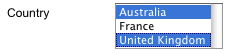
- Multiple
-
Whether to allow users to select multiple values from the list. If you select
Yes, a box will appear on the custom form where the user can hold down the Shift key or Ctrl key to select multiple values. If you selectNo, the user can only select one value from the list.
Email address
The Email address form field type allows a user to enter an email address. When you use this form field type, the system will automatically check that the entered value is a valid email address.
Option list
The Option list form field type allows a user to select one value from a list of values.
Form field options
- Options
-
This section shows the values added to the list and allows you to add new ones, delete existing ones, or re-order the list. To add a new value to the list, click within a blank box, enter the value, and click Save. For example, enter
NSW,QLD,ACT,VIC,TAS,NT,SA, andWAand click Save.You can enter as many options as you want simultaneously, and there is no limit to the number of options you can add to the list. To delete an option from the list, select the
icon.
To re-order the list, click on the up and down arrows and click Save.
Numeric
The Numeric form field type allows the user to enter a numeric value only.
Form field options
- Input type
-
Specify the input type of the response field. When using a HTML5 compatible browser, the input field will provide specific interfaces to suit the specified field type.
The input types available are:
-
Number
-
Text
-
By default, the input type will be set to 'text'.
Simple validation rules
The Enforce integer field allows you to specify whether the value that the user enters needs to be an integer (for example, 3) rather than a floating-point value (for example, 3.99).
Complex validation rules
- Force integer
-
This rule allows you to specify that the entered number must be or must not be an integer. The fields that are available for this rule:
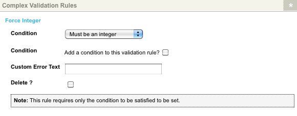
The fields that can be set up are as follows:
- Condition
-
This field allows you to add a condition on the validation rule. Read the Custom form fields documentation for more information about conditions.
- Custom error text
-
Enter a customized error message to show on the form if this rule fails. If you do not enter an error message a default message will appear.
- Delete?
-
To delete this validation rule, select the Delete checkbox and then click Save.
Password
The Password form field type is a text entry field that allows users to enter passwords.
When a character is entered, it is displayed as *.
| You should only use this field if you are capturing and processing passwords securely. Data captured with this field is not stored securely on the server and should not manage users' credentials. |
Form field options
- Requires verification
-
Select whether you want the user to confirm the password. If you select
Yes, two text fields will be shown on the custom form, where the user will have to enter their password twice. Should the two passwords entered not be the same, an error message will appear on the form similar to:The password field "password" was entered differently on each try.
If you select
No, only one text field will be shown on the custom form. The user will only have to enter their password once.