Content components
Content components (or components for short) let you add different types of content into your web pages.
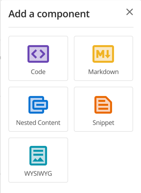
Core components
Squiz Content Management offers the following core components you can use to add a variety of content types into your web pages.
You may also see other components appear in addition to the core components. These additional components are templates based on these core components. Component templates provides more information about configuring and using component templates to help you improve your content creation process.
Managing content components using the component toolbar
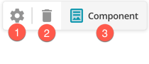
Each component has its own toolbar that appears when you mouse over or click into a component.
You can change properties of each component through the component toolbar.
-
Edit component properties opens the Properties panel where you can change the name of the component to something other than its default value. You can also select from available component templates and switch between the available component types. Advanced settings are also available from this panel.
-
Delete component sends the component to the trash.
-
The name set in the Properties panel displays in the component name area of the toolbar.
Setting a custom name on components can help you identify the component asset in the asset tree when you are linking to the asset or using the Nested content component.
Read Page contents and components for more information about adding, editing, and conditionalizing content stored in components.