Create a component template to embed an image listing
This tutorial shows you how to create a basic Component Template that lets users in Edit+ embed an image listing using a metadata field and a nested Asset Listing page.
Before you start
The guide assumes you have already read up on the Component template feature in the Manuals and are familiar with basic Squiz Content Management concepts as well as Metadata and Asset Listings configuration.
Create the template assets
Create the component template in the same area where you store your design assets for your site.
-
In the Paint Layouts section (or the area where you keep your design assets) create a component template asset.
-
Click .
-
Enter a name for the asset and select Save. For example, "Image Listing".
-
Create the following associated template assets as child assets of the Image Listing content template using the same "Image Listing" name for consistency:
-
Image Listing - Paint Layout
-
Image Listing - Asset Listing
-
Nest the Asset Listing under the Paint Layout because this is where the listing displays when published. -
Image Listing - Custom edit layout
-
Image Listing - Metadata Schema
-
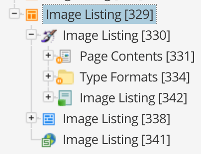
You should now have all the required assets for our template, and your asset structure should look similar to this:
Configure the component template
The next step associates each of our supporting assets to the template asset itself and also configure some template options.
-
Start by going to the Details screen of the Component Template asset.
-
Acquire the locks and configure the following fields:
- Allowed Root Nodes
-
Select the root node of your Asset Tree where the template should be used. Because we don’t want our template to be used by authors just yet, set this to a test Standard page asset temporarily for now.
- Metadata Schemas to Apply
-
Select our previously created "Image Listing - Metadata Schema" asset.
- Paint Layout to Apply
-
Select our previously created "Image Listing - Paint Layout" asset.
- Custom edit layout to apply
-
Select our previously created "Image Listing - Edit Layout" asset.
- Enable Simple Edit Interface In Admin Mode?
-
Leave this as "No" as we’ll just focus on making our template available in the Edit+ interface.
Next, we’ll configure each asset component of the template.
Configure the metadata schema
We’ll start by configuring our Metadata Schema so we can use these fields in both the Custom edit layout and the Paint Layout.
Because our template is pretty straight forward, we won’t have to use many metadata fields. We need fields with the following capabilities:
-
select a root node to source the images from
-
set a limit of how many images to show.
To create these fields, do the following steps:
-
Go to the Details screen of the Metadata Schema and get the locks.
-
Create a new Section called "Settings".
-
In this section, create the following Metadata Fields:
-
A Related Asset Field field called "source".
-
A Select field called "max".
-
-
Edit the Source screen field settings:
-
Go to the Details screen of it and just give it a friendly name of "Source"
-
Restrict the asset type selection to Folder and Page (select Inherit for both).
-
-
Edit the Details screen field settings:
-
Go to the Details screen of the max field and give it a friendly name of "Max Images".
-
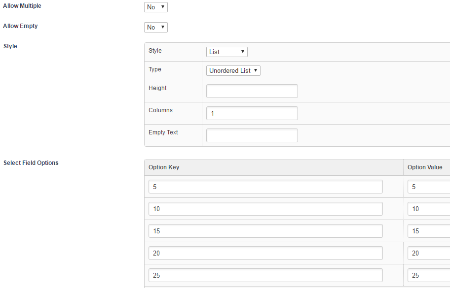
Configure the select field so that it has 5 possible options of increments of 5 with "5" being the default value. It should look similar to the example below:
-
That should do it for our Metadata Schema setup. Next, we’ll look at configuring the Custom edit layout.
Configure the custom edit layout
Using the custom edit layout that we created previously, we can customise the editing experience for the Edit+ interface. Because we only have two fields, we can rely on the default output of these metadata fields that Squiz Content Management prints for the editing interface using some Simple Edit Keywords.
-
Open the Edit Contents screen of the Custom edit layout and grab the locks.
-
If it isn’t already, convert this component from a WYSIWYG component to Code.
-
We still want to let the user to input free content into this container in addition to the new metadata fields we created, so the first keyword we’ll put in is %__custom-contents%. This keyword prints the standard editing area of the component. So for example, if the container is a WYSIWYG type, that keyword is replaced by a WYSIWYG content editing area.
-
Then we’ll want our metadata fields to follow underneath the editable content, so we’ll just add a keyword to print all editable metadata from the Metadata Schema we are applying: %metadata-F_metadata_values%. This keyword prints the editing fields for all of our metadata fields defined in our Metadata Schema.
That’s all we need to do for the editing layout, which should now only have the following content inside it:
%__custom-contents%
%metadata-F_metadata_values%
For our last component, we’ll look at configuring our Paint Layout, which takes care of the presentation of the template content on the front end.
Configure the paint layout
Our Paint Layout is configured in pretty much the same when applied to front end assets directly, such as a Standard page. Our presentation format is pretty straight forward as well where we just print the raw asset contents first and then the Asset Listing of our images.
-
Go to the Edit Contents screen of the Default Format component located under the Type Formats folder of the Paint Layout.
-
If it isn’t already, convert this component from a WYSIWYG component to Code.
-
In this first container, we just want to print the raw contents of the asset (the component to which the template is applied). So all we’ll put here is the asset contents keyword:
%asset_contents% -
Now we’ll nest our Asset Listing in, so insert another component after our first one and make it a Nested content type.
-
Select our Asset Listing asset we created previously as the asset to nest.
That’s our Paint Layout done. Now we’ll just need to configure our Asset Listing slightly so that it can pick up on the dynamic root node controlled by the Related Asset metadata field.
Configure the asset listing
Other than the usual setup of things like assets to list and the type format, we’ll also need to configure the dynamic root node to pass to the Asset Listing.
-
Go to the Details screen of the Asset Listing and select Edit.
-
Set Asset Types to List to Image. No need to select Inherit.
-
Set Root Nodes to the area where your images are stored. Or you can set it to 1 to list images from anywhere in the system (remember that the root node is dynamic), but only as long as If dynamic root not found is set to Return empty result.
-
Scroll down to Assets Per Page and enter
%globals_asset_metadata_max^empty:5%. This keyword grabs the metadata value from the max field we created in our Metadata Schema. The^empty:5keyword modifier also gives us a fall back in case the value is empty for some reason. -
In the Dynamic Parameters section, add a new parameter of type Replacement Root node for the listing and set the source to Set Value.
-
Select Save and scroll down to the Dynamic Parameters section again.
-
In the Set Value field enter
%globals_asset_metadata_source%. This keyword gets the metadata value from our source field in our Metadata Schema.
We can use the globals_ keyword format here as the context of "globals" is evaluated against the asset that is nesting in the Asset Listing, which in our case is the component asset to which the Content Template is getting applied.
|
That’s pretty much it. We won’t configure the type format of the Asset Listing in this tutorial. Still, it’s something you should do as a follow on from setting the template configurations up.
Test the template
Let’s give our Content Template a quick test run to see that everything has been configured correctly and works OK.
In our test case, we’ve got a Standard page asset located under the allowed root nodes setting of the template as well as a Folder asset with some Image assets underneath it.
-
Go to the test standard page in Edit+ and view the Contents screen.
-
Click to open the Edit component properties popup of the component and in the Template field select our Image Listing template.
-
Select Save and wait for the screen to reload. We should now have our template applied and see our Simple Edit Interface in effect, similar to this:
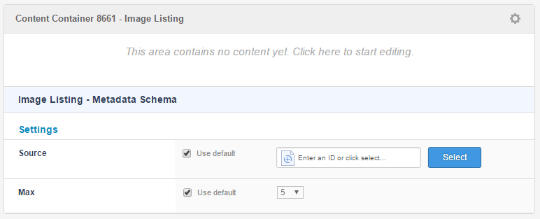
-
We can now enter some free text into the WYSIWYG area above, as well as interact with our 2 Metadata Fields (similar to how you do it on the Metadata screen). For example:
-
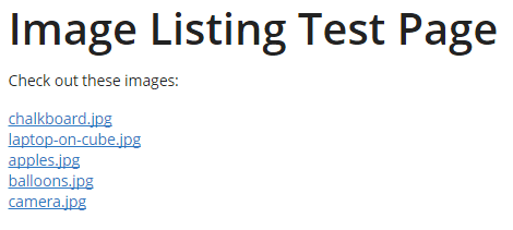
Save the screen and then review the page in Preview mode. The images in the example are listed as simple text links because we have not yet configured the type format of the Asset Listing.
You’ve now created a component template asset with associated configuration assets including customising the editing interface.
You can continue to improve this template by listing the images in <img/> tags and maybe adding some more configuration options such as allowing the user to select the size of the images to list.
| Don’t forget to make all your template asset Live and change the Allowed Root Nodes setting before releasing it to your editors. |