Improvements
The following improvements are available in the latest version of Squiz Content Management.
Icon selection for component templates
You can apply a colored icon to a component template that displays when you view the list of components to add to the page builder.
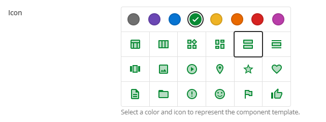
The icon helps users quickly find and identify component templates in the list and visually separates them from core components.
Dynamic usage conditions for component templates
You can apply a usage condition to a component template that, when met, makes it conditionally appear in the page builder.
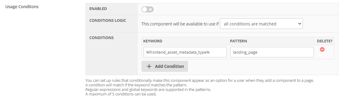
You can use any keyword combination to create custom and flexible conditions. For example, you can base a condition on the user, the page, or anything you can get from keyword values.
Component template descriptions used in page builder
The description field of component templates now displays as help text in the new page builder.
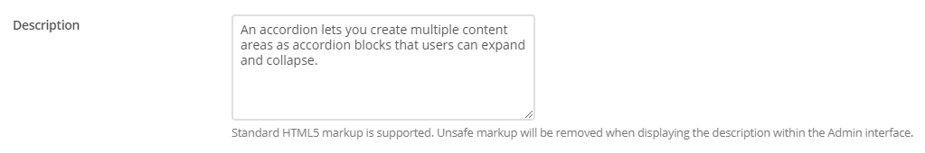
Any description added to the field appears when a user hovers over the “?” icon when viewing the components they want to add to the page.
Some basic HTML styling is supported, such as bold, italics, and links.
Improved asset right-click context menu
When you right-click on an asset in the asset tree, you get a better-grouped list of asset screens from which to select.
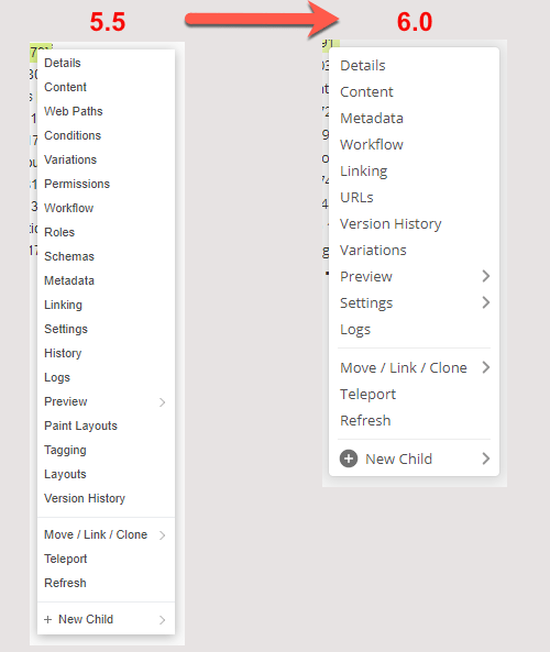
The new menu layout makes the menu less cluttered when you first open it. The most commonly-used asset screens are readily accessible to you.
Settings screen removed
This screen no longer exists, and its functionality moved to other screens.
- Dates
-
This functionality is now available from the new “Dates” screen.
- Versioning
-
This functionality is no longer available from asset screens.
- Morphing
-
This functionality is now available on the “Details” screen.
Read the asset settings documentation for more information about the new structure.
New Dates screen
This new screen lets you configure the date values of an asset.
Read the Asset dates screen documentation for more information about this new screen.
Web Paths screen renamed to URLs
The “Web paths” screen on all supported assets is now named “URLs” to make it more representative of what you can do on the screen. This name change also makes it consistent with the already named “URLs” screen on Site assets.
Improved recently viewed list
Previously known as the “Asset Navigation History”, the recently viewed list has been improved with a new design and more functionality.
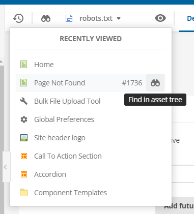
The way this list is generated has also changed to be more efficient, where the list shows you the last ten viewed assets or screens.
This list now also includes system configuration, maintenance, and tool screens.
Each asset listed now shows the asset ID and a shortcut for finding it in the asset tree.
Improved handling of the content screen on standard pages
Navigating to the “Content” screen of a Standard Page no longer redirects you to the dependent child bodycopy asset.
This change improves screen navigation when editing standard pages. You can use the screen switcher to easily switch between screens without ever leaving the top-level standard page asset.
Admin UI access for content editors
Content editors (previously known as Simple Edit Users) can now access the Admin UI (/_admin).
The /_admin interface was previously not allowed for this user type because content editors could only use the /_edit and Edit+ interface to edit content.
This restriction is now relaxed because of the significant improvements and changes to the backend UI.
This improvement also enables content editors to perform a similar list of actions they had access to in Edit+ back in Matrix 5. Some back-end features are unavailable for content editors, such as restricted access to specific tools, asset screens, and asset types.
Improved lock acquisition
Lock acquisition has been improved for content editing.
When you click Save (acquire locks) on either the Details, Content, Metadata, or Inline edit mode screen of an asset, you now also get the locks for the Attributes, Linking, and Metadata screens.
This improvement means that you no longer have to click Save multiple times to start editing content for each of these screens.
Improved image variety editing experience
The experience of editing image varieties has been improved.
Image varieties can now be edited directly on the details screen of image assets, making it faster and easier to add and edit image varieties.
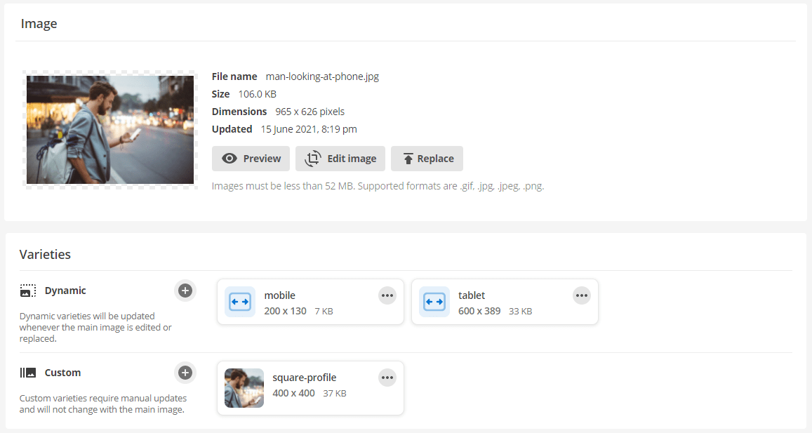
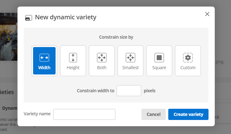
You can create multiple varieties at once, including using a new and intuitive interface for specifying dynamic image variety options.
Once created, each variety will be listed with information such as the name, dimensions, and file size with options to edit them further, preview them in a new window, or quickly delete them.
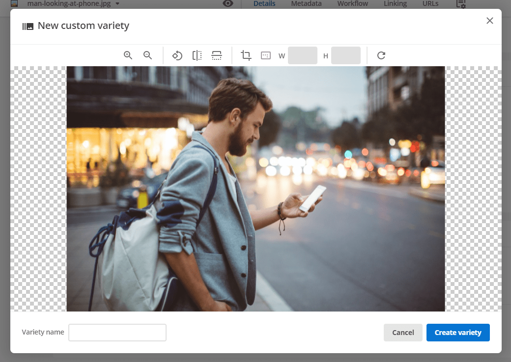
When creating or editing custom varieties, you can also use the new image editor to get the perfect image size and crop.
Read the Image asset documentation for more information on how to edit images.
Improved metadata screen enhancements
The following enhancements released in Content Management v6.37 improve usability aspects of the Metadata screen.
Metadata keyword links are now in the action bar
A new action bar is now available on the top of the Metadata screen. The Keyword replacements and Keyword Extractions links and popups have been moved into this action and now have refreshed icons.
Metadata output block improvements
The Metadata output block is now called Metadata code output. The block has been moved to the bottom of the Metadata screen from its previous location at the top and is collapsed by default.
Schema and Section accordions
An accordion has been added for each Schema and Section so they can be collapsed or expanded. The accordions are open by default unless otherwise specified in the config. They feature a new design that better supports the added features.
Expand and collapse all buttons
At the top of the Metadata screen are Expand all and Collapse all buttons. +Regardless of the current metadata accordion states, these buttons will collapse or expand all schemas and sections.
Configuration to expand and collapse schemas and sections by default.
Two configuration items are available in Metadata schemas and Metadata sections.
Expand this schema by default on the Metadata screen and Expand this section by default on the Metadata screen are selected by default.
Suppose you have a particularly long schema or section. In that case, you can consider clearing the checkbox so the section is collapsed by default. Doing so will help users interact more effectively with the Metadata screen.