User group manager page
A user group manager page allows users to link themselves into user groups. For example, you may want to allow staff members to update their position in the organization by adding themselves to various user groups.
Once your user group manager page is created, you can configure its settings on its associated asset screens. The majority of these screens are the same as a Standard page. This chapter will describe the Details screen, which is different for a user group manager page.
Additional dependant assets
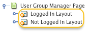
When you create a User Group ManagerPage, two assets are automatically created beneath it, as highlighted in the figure:
You can use these assets to define the contents and layout of the user group manager page.
- Logged in layout
-
This bodycopy is used to define the layout to display when the user is signed in. This layout should allow the user to select which user group they want to link.
- Not logged in layout
-
This bodycopy is used to define the layout to display when the user is not signed in. This layout should allow the user to log in.
Details screen
The Details screen of the user group manager allows you to set up the page. Read the Asset details screen documentation for more information about the Status, Future status, Thumbnail and Details sections of the Details screen.
Configuration
This section allows you to specify what user groups will be shown on the user group manager page. The configuration section of the Details screen is shown in the figure:
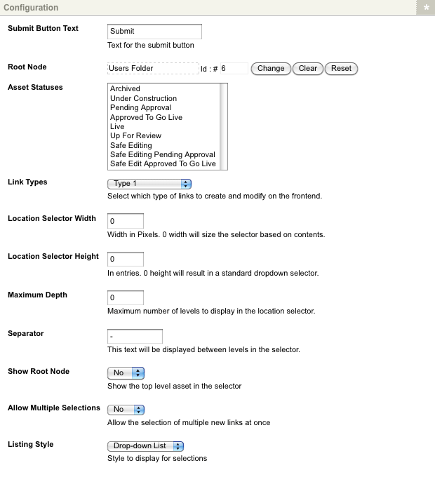
The fields available are as follows:
- Submit button text
-
Enter the text to show on the Submit button. By default, this text is Submit. This button is shown when the keyword replacement Save button is used on the logged in layout bodycopy.
- Root nodes
-
Select from which section of the system to get the list of user groups. For example, if you want to list all user groups under the Users folder, select the
Users folderin this field. - Asset statuses to list
-
Select the status the user group must hold for inclusion in the user groups list on the user group manager page. For example, if you want to include all assets with Under construction and Live statuses, select both of these statuses. To select multiple statuses:
-
Hold down the Ctrl key on the keyboard
-
Click on the statuses you want.
If no statuses are selected, the asset listing will work out which user groups to show based on the user’s permissions viewing the page. For example, if a public user is viewing the page, they can only see the live assets that have public read permission granted.
You can improve the user group manager page’s performance by not selecting anything in the Asset statuses to listfield. If no statuses are selected, the user group manager page will only have to filter the list based on the permissions. It will not have to perform a second filter on the status of the user group.
-
- Link types
-
Select what type of link to use for the user account when linked to a user group. For example, if you select
Hidden link, it will have a link type of hidden link when the user links their account into a user group. - Location selector width
-
Specify the width (in pixels) of the list shown on the user group manager page. You can specify 0 as the width to size the selector based on the longest user group name shown in the list.
- Location selector height
-
Specify the height of the list shown on the user group manager page. You can specify 0 as the height to size the selector based on the standard height.
- Maximum depth
-
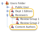
Specify the maximum number of levels to display in the selector. For example, if you specified
1as the maximum depth, the list would contain Dept 1 Editors, Reviewers, and Content Editors. The list would not contain Review Group 1 or Review Group 2 as they are Level 2 assets.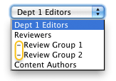
- Separator
-
Specify the text that will be displayed between the levels of assets in the list. The default value is
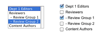
-. In the figure shown, Review Group 1 and Review Group 2 are Level 2 assets under the Reviewers user group. The-separator is placed in front of them to show this relationship. - Show root node
-
Select whether to show the root node in the list of values. The default value is
No. - Allow multiple selections
-
Select whether to allow the user to select multiple values from the list. If you select
Yes, depending on what value you have selected in the listing style field, the list’s format will change. If you have selectedDrop-down list, the list will appear in a box where the user can hold down the Ctrl key to select multiple values. If you have selected radio buttons, a check box list will appear to tick multiple values.Both of these formats are shown in the figure:
- Listing style
-
Select which style of list to use on the user group manager page. You can select either
Drop-down listorRadio buttons. Examples of each of these styles are shown in the figure: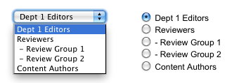
Logged in layout bodycopy
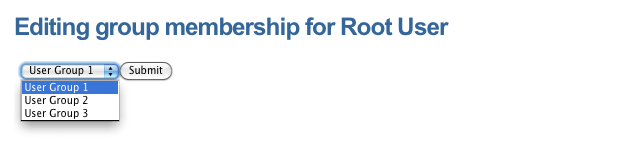
The logged in layout bodycopy asset is used to define the layout to display when the user is signed in. This layout should allow the user to select which user group they want to link. For example, for the user group manager page shown in the next figure, user groups' list is shown along with the Submit button. This layout has been defined in the logged in layout bodycopy.
To change what information is being shown:
-
Right-click on the logged in layout bodycopy in the asset tree.
-
Select Edit contents.
-
Click on the
 icon – the WYSIWYG editor will appear.
 -
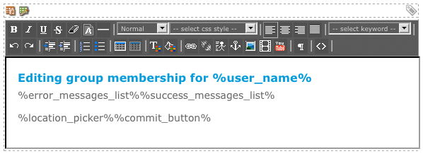
Use keyword replacements and formatting to layout the information to show on the page. By default, the information shown in the figure will appear in the WYSIWYG editor.
Keyword replacements on the logged in layout bodycopy
A list of keyword replacements is provided in the WYSIWYG editor toolbar on the Edit contents screen of the logged in layout bodycopy. You can use these keyword replacements in conjunction with text, images, and links to layout what to show on the page. The standard keyword replacements that are available include the following:
- Error messages list
-
This will show any error message that the user may receive when they try to link their user account into a user group.
- Success messages list
-
This will show the message that indicates that the user was successful when they linked their user account into a user group.
- Location picker
-
This will show the list of user groups to the user.
- User name
-
This will show the name of the user that is currently logged in.
- User short name
-
This will show the name of the user that is currently logged in.
- User email
-
This will show the email address of the user that is currently logged in.
- Save button
-
This will include the submit button on the page. This keyword replacement needs to be included so that the user can link their user account.
Not logged in layout bodycopy
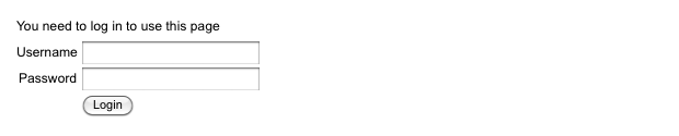
The not logged in layout bodycopy asset is used to define the layout to display when the user is not signed in. This layout should allow the user to log in. For example, for the user group manager page shown in the figure, the username and password fields are being shown to allow the user to login. This layout has been defined in the not logged in layout bodycopy.
To change what information is being shown.
-
Right-click on the not logged in layout bodycopy in the asset tree.
-
Select Edit contents.
-
Click on the
icon – the WYSIWYG editor will appear. -
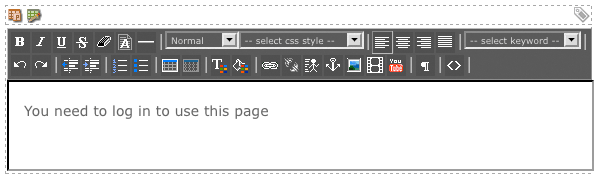
Use keyword replacements and formatting to layout the information to show on the page. By default, the information shown in the figure will appear in the WYSIWYG editor.
Keyword replacements on the not logged in bodycopy
A list of keyword replacements is provided in the WYSIWYG editor toolbar on the Edit contents screen of the not logged in bodycopy. You can use these keyword replacements in conjunction with text, images, and links to layout what to show on the page. The standard keyword replacements that are available include the following:
- Login form
-
This will show the login form with username and password fields. This keyword replacement needs to be included to allow the user to login.