Metadata field types
Metadata fields store additional custom values against assets. They appear within Metadata sections in a metadata schema.
Their primary use is for SEO, creating <metadata> tags added to <head> tags in a page’s source code, using either the metadata design area or the %asset_frontend_metadata% keyword in the design file.
However, they can also be used to control page functionality and page layouts.
Generic metadata field functionality
There are several different types of Metadata fields, but they share a lot of common and generic functionality.
This section will describe the generic functionality found on the Details screen of all metadata field types.
Details
- Field name
-
This is the field name (Asset name) and should be a unique identifier. Field names can only be alphanumeric characters. You should choose a name for your field that is unique across all metadata schemas in your system.
- Friendly name
-
The friendly name for the field, displayed as the field name on the Metadata screen of an asset. If the name of the field is complicated or does not adequately convey the field’s requirements, a friendly name can be of use. For example, if you have named your field DC.Keywords, you may want the label on the Metadata screen to show Keywords instead.
- Description
-
A brief description of the field and its purpose, displayed on the Metadata screen of an asset. It displays instructions to users about how to enter a sensible value into the Metadata field. For example, if your field is called Description, you may consider the following description: Please enter a brief description of this page’s content.
- Default
-
The default value for the field, applied to newly created assets, or existing assets when the metadata schema is applied. A user can then override the default value if it is editable. You can enter free text into this field as well as keyword replacements.
You can also reference the value of a different metadata field as the default for a metadata field. Use the following keyword format:
%metadata_field_<fieldname>%, where<fieldname>is the name of the metadata field you are referencing. You can also use keyword modifiers on this keyword. For example:%metadata_field_description^max_words:100%. - Scheme
-
The scheme to be used to interpret the value of the content attribute, for example,
DCTERMS.ISO8601. Entering a value here adds the scheme="{Scheme Value}" attribute to the metadata tag for this field. - Language
-
The language for this field, for example, en. Entering a value here will add the lang="{Language Value}" attribute to the metadata tag for this field.
- Text for name attribute
-
The text to use for the field name attribute of the metadata tag. If empty, name will be used as the attribute field name.
- Text for value attribute
-
The text to use for the field value attribute of the metadata tag. If left empty, “content” will be used as the attribute field name.
The metadata field uses the settings here to format the metadata tag when printing it on the frontend. For example, the template that Matrix uses to print the tag is in the following format:
<metadata {Text for Name Attribute}="{Field Name}" lang="{Language}" scheme="{Scheme}" {Text for Value Attribute}="Default or Custom Value">This might result in a metadata tag such as:
<meta name="DCTERMS.modified" lang="en" scheme="DCTERMS.ISO8601" content="2017-05-19T10:56:24+10:00" >
Options
- Editable
-
Makes this field editable on the Metadata screen of an asset. Set this value to
Noto prevent editing if you have a default value you do not want changed. - Allow cascading
-
Makes the Cascade checkbox option available for the field on the Metadata screen.
- Required
-
Makes the field a required field, meaning an asset will not be able to go Live without this field completed.
- Contextable
-
Makes the field context-aware, allowing it to take a different value for each context within the system. The default value of this field can also be set individually for each context. For more information, refer to the Contexts documentation on Matrix Manuals.
- Show on frontend
-
Controls if and when the system prints the field on the frontend as a
<metadata>tag using the Metadata design area or the%asset_metadata_frontend%keyword. The options you can select from include:- Always
-
Always show this field on the frontend.
- Only if filled
-
Only show this field on the frontend if it is complete.
- Never
-
Never show this field on the frontend. Use this option if the field is functional and not printed in the source HTML for SEO considerations.
- Meta tag format
-
This option lets you customize the output of the metadata field when printed on the frontend. This option is useful if your metadata name needs to include characters that are not allowed in the field name (such as colons), for example:
<meta property="og:title" content="%metadata_value^uppercase%">If empty, the system uses the standard default output format.
Text field
A metadata text field allows the user to enter text into the field. An example of a text field may be a description or title field.
Value components
Value components allow you to define a structure for the value of your field.
- New
-
The name of the new component you want to add. This option adds the component to the Current section.
- Current
-
This section shows the components added to the field. The adjoining textarea allows you to enter a default value for the component. For example, the Dublin Core DC.Creator metadata field has the following structure:
<meta name="DC.Creator" content="corporateName=MyCorporateName; jurisdiction=MyJurisdiction; email=MyEmail; address=MyAddress">You can represent this structure by adding the components corporateName, jurisdiction, email, and address as Value Components:
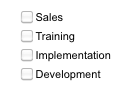
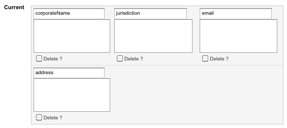 Figure 1. Value components for a text field
The user will then be able to enter a value for each component on the asset’s Metadata screen.
Options
The options available for a Text Field:
- Multi-line
-
Select whether to make this field a multi-line field (textarea). This option is useful for fields that may require more input, like a page description.
- Character limit
-
The maximum number of characters that a user can enter into the field. By default, this value is
0, meaning that there is no limit. - Width
-
The size="" attribute value of the Text Field. If the field is a Multi-line field, this setting will control the cols="" attribute of the textarea.
- Height
-
If the Multi-line field option is
Yes, this field controls the rows="" attribute of the textarea field.
Select field
A Metadata select field allows the user to select a value from a pre-defined list of values. This field can allow the user to select a single or multiple values from the list.
Details
- Allow multiple
-
Toggle the ability for the user to select multiple values from the list. The value selected in this field and the style selected for the list will change the style of the list displayed on the Metadata screen.
- Allow empty
-
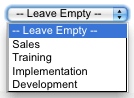
Select whether to allow the user to select an empty value from the list. If
Yes,the empty text field will appear under the Style field. You can enter a description of the empty text value in the Empty Text field, for example, -- Please Select --. - Style
-
This section allows you to change the list style displayed on the Metadata screen.
- Style
-
Select either List or Checkbox. The value selected in this field and the value selected in Allow multiple, will determine the list style displayed on the Metadata screen.
- Type
-
Select the type of list to use. You can select either table or unordered list.
- Height
-
The height of the list, in rows.
- Columns
-
The number of columns to use for the list. This field is only relevant if the list style is either a checkbox or a radio button list.
- Empty text
-
The text value for the empty selection option, for example -- Please Select --. This field will only show if Allow Empty is enabled.
- Select field options
-
This section displays a list of the options added to the Select field list. It allows you to add new options to the list and edit or delete existing options. If you have not added any options, no information will appear in this section. Options added appear in this section.
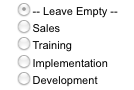
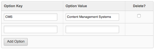 Figure 2. The options list for a select field
To add a new select field option, then select Add Option. This action will add a new option row where you can define the following information:
- Option key
-
The key for the option.
- Option value
-
The value for the option.
You can set which value is displayed in the HTML source code using the Frontend part field under the Options section.
- Default value
-
Select which value(s) should be the default selected for this field.
- Export to CSV file
-
Clicking this button will export all of the select field options to a
.csvfile. You can then open this file in an external editor, edit as required, and re-upload it using the Upload from CSV file tool to update the list of options. - Upload from CSV file
-
This field allows you to upload options from a CSV file, automatically inputting the Metadata select field options. This method can be useful when batch uploading many options or importing existing options.
CSV files specified in this field will overwrite any previously configured options on the Metadata Select Field. The CSV file to upload can have up to three fields:
-
The first specifying the key of each option.
-
The second specifying the Value of each option.
-
The third indicating whether the option is the default value for the Metadata Select Field (
1for yes,0for no).
-
- Column headings in CSV file
-
This field signifies to the system that the CSV file contains column headers, and to ignore these values.
Style of select field
The style of list used on the Metadata screen will depend on the options selected in the Allow Multiple and Style options discussed above. There are four styles of list:
- Drop-down list
-
This list style will be used if Allow multiple is No and Style is List. The user can only select one value from the list.
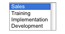
- Multi-select list
-
This list style will be used if Allow multiple is Yes and Style is List. The user can select one or multiple values from the list.
- Checkbox List
-
This list style will be used if Allow multiple is Yes and Style is Checkbox. The user can select one or multiple values from the list.
- Radio Button List
-
This list style will be used if Allow multiple is No and Style is Checkbox. The user can only select one value from the list.
Date field
A Metadata Date Field allows the user to enter a date and/or time into the field.
- Default value
-
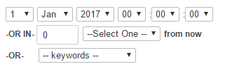
The default date and time for the field. You can enter a specific date and time by using the fields provided, for example, 1 Jan 2020 12:00:00.
You can also set future- or back-dates. For example, enter 2 weeks from now to set a future-date or -2 weeks from now for a back-date.
The Default Value can also be specified as a keyword replacement, using the keywords list. These keyword replacements include:
- Creation date
-
The date and time you created the asset.
- Last updated date
-
The date and time the asset was last updated.
- Last published date
-
The date and time that you last set the status to Live.
- Offset
-
You can set an offset to the date and time. For example,
-1 yearor+1 day. Relative date formats (such astomorrowandnext monday) are also supported. For a full list of relative formats, visit https://php.net/manual/en/datetime.formats.php. - Display format
-
This setting determines the format used to display the date and time in the HTML source code and within the site’s content. Click the View all the formatting keywords that can be used in this field link for a list of formatting keywords available when configuring the display format.
Options
- Editing style
-
This section allows you to define how the field appears on the Metadata screen:
- Allow "circa." list
-
Select blank or Allow "circa.". If you select Allow "circa.", a list will be displayed on the Metadata screen alongside the field. This option allows the user to indicate an indefinite date (circa) rather than a definite one. If you select the blank value, no additional list will appear on the Metadata screen.
- Show
-
The segments of the date and time shown on the Metadata screen. You can select Day, Month, Year, Hour, Min., or Sec. The system shows all of them by default. Clear the corresponding checkbox to remove a segment.
- Allow blank
-
Whether any segments of the date and time can be left blank. By default, all segments need to be filled in by the user. If you select a segment, for example, Day, that segment can be left empty for this field.
- Select box/text box
-
Whether to show a list or a text box for each part of the date and time. By default, a list of options is shown for all parts. To display a text box instead, select the text box option for that part. For example, to show a text box for the year, select Text Box under the Year part.
- Min
-
Set a minimum value for the date and time.
- Max
-
Set a maximum value for the date and time.
- Show keyword selector
-
Select whether to show the keyword replacement list on the Metadata screen. This option is Yes by default; the list will be visible. The user can select from the keyword replacements Creation date, Last updated date, and Last published date.
Related asset field
A Related asset field allows the user to select a related asset as a metadata value. Keyword replacements used within the content of the page can then dynamically retrieve this asset’s attributes.
You can retrieve the attributes and metadata values of related assets using the ^as_asset keyword modifier:
%asset_metadata_<related_asset_field_name>^as_asset:<asset_attribute/metadata>%
For example:
%asset_metadata_related-asset^as_asset:asset_url%
Will return the URL of the asset selected in the Related field.
Details
- Restrict asset types
-
Select which asset types are available for this field. Leave blank to allow any asset type.
- Default
-
Select a default asset to use as the default value for this field.
- Max selections
-
Enter a number value of the maximum number of asset selections available for this field. Any value higher than
1will make the field a multi-related field. Multiple related assets appear as a comma-separated list of asset IDs in an array. Press and hold Ctrl (or Cmd on macOS) to select more than one asset. - Restrict root nodes
-
Select which root nodes from which the user can select assets. Leave blank to allow assets from anywhere in the system to be picked.
WYSIWYG field
A Metadata WYSIWYG field allows the user to enter rich text into the field, through the WYSIWYG editor. Read the WYSIWYG component documentation for more information on the functionality of the WYSIWYG content component.
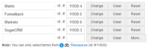
Thesaurus field
A Metadata Thesaurus Field allows the user to select one or more terms from a thesaurus in the Asset tree.
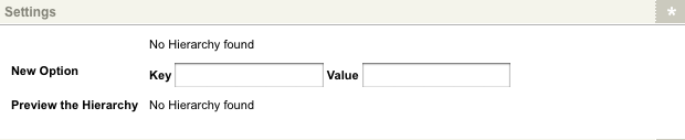
Hierarchy field
A Metadata hierarchy field is similar to a Select field where the user can select a value from a pre-defined list of values. This list, however, can show a hierarchy of information.
Settings
This section allows you to set up the list for this Metadata field. If you have selected Flat view in the Display type field, the fields shown in the example below will appear.
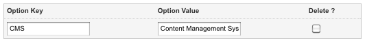
- Options list
-
This section shows the options added to the list. It allows you to change the key and value or delete an option from the list. If you have not added any options, no information will appear. When you add an option, it will appear in this section, as shown in the example:
- New Option
-
Add a new option to the list.
- Key
-
Enter the key for the option. By default, this is in the HTML source code of a page. When using the drill-down view display type, the option keys should maintain a constant character length (per level) to be displayed correctly in the hierarchy field. For example, the keys banana and orange will appear correctly, while banana and apple would not.
- Value
-
Enter the value for the option. By default, this is displayed in the list on the Metadata screen.
- Default value
-
Select a default value for the list. If you have not added any options, this field will not appear on the screen. When you add an option, a list will appear.
- Preview the hierarchy
-
This field shows a preview of what the list will look like on the Metadata screen. For the flat view, this preview will be a list of the values.
If you have selected drill-down view in the display type field, the fields shown in the figure below will appear.
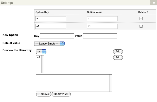
For more information on the options list, new option, and default value fields, refer to the information above.
The following fields are available:
- Preview the hierarchy
-
This section shows a preview of what the hierarchy will look like on the metadata screen. Each level in the hierarchy is shown, followed by the list of selected values. In the previous example, there are two levels in the hierarchy, followed by the list of selected values, which is empty. When you select the first Add button, an identifying "a" is added to the selected values. When you select the second Add button, "a.a1" is be added to the selected values.
View options
This section allows you to select which hierarchy view to use.
- Display type
-
The list type to use for the hierarchy field. By default, flat view is selected, meaning that a normal list, similar to a Select field, is used. To use the hierarchy list, select Drill-down view in this field.
Flat view options
This section will appear if you have selected flat view in the Display type field.
- Show structure
-
Whether to show the structure of the hierarchy in the list. By default, this is set to
No. - Allow multiple
-
Whether to allow the user to select multiple values from the list. By default, this value is
No, meaning that the values will appear in a drop-down list. If this value isYes, values will appear in a multi-select list where the user can select multiple values by holding down the Ctrl or Shift key. - Sort hierarchy
-
The value by which to sort the list of values.
Not sorted will be selected by default in this list.
You can choose to sort the list by the key or value.
To show the hierarchy in the list, select Yes in the Show structure field and Sort by key in the Sort hierarchy field.
Drill-down view options
This section will appear if you have selected drill-down view in the Display type field.
It allows you to label each level in the hierarchy. The number of fields shown in this section depends on the number of levels you have in the hierarchy. For example, in the previous figure, the list for this field has two levels; hence two fields appear in this section. The labels entered will appear in the Preview the hierarchy field and on the metadata screen beside each level in the list.
Printing metadata values on the frontend
When printing particular metadata values on the frontend, you can often use keyword modifiers to print the values in a different format to the one in which they are stored.
Field types such as the Multiple text field and the Select field store their text values with a semi-colon separating each value.
For example, if you have a Multiple text field called keywords, and the values entered into the field are:
Matrix; Funnelback, SugarCRM; Marketo
You can use the following keyword modifiers to print the value into an <ul> list:
%asset_metadata_keywords^replace:;:</li><li>^tagif:li^tagif:ul%
This would then print the value as:
<ul>
  <li>Matrix</li>
  <li>Funnelback</li>
  <li>SugarCRM</li>
  <li>Marketo</li>
</ul>
Read the Keyword replacements documentation for more information about keyword modifiers.
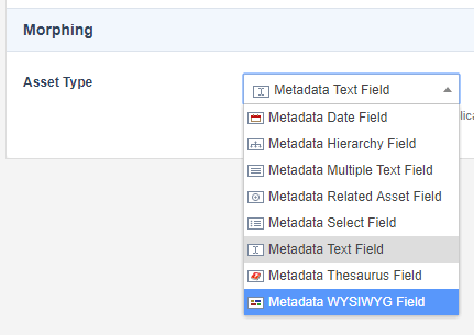
Morphing metadata fields
You can change (morph) a metadata field from one type to another using the Settings screen.
On the Settings screen, find the Morphing section and the Asset Type field. This section will show you the current type of the field.
Selecting a different type will first show you a warning that notifies you that you may lose some attributes and data due to the morphing process.
For example, if you change a Select field to a Text field, you will lose all the Select field options as a Text field does not use them.
Handling the default value
Matrix will also attempt to make sense of the default value when changing between different types. If the default value is not compatible with the new type, it will be blanked out to avoid any errors and will need to be re-configured on the Details screen.
The cases where it will try and handle the default value are:
Date field
Going from any other type to the Date field will attempt to create a valid timestamp of the default value. If this fails, the default value will be blank.
Related asset field
Going from any other type to the Related asset field, Matrix will attempt to validate that the default value is a (or multiple) valid asset ID(s).
In morphing from a Text field with a default value of 1234, and have an existing asset with Asset ID 1234, the metadata field will morph successfully.
Asset ID 1234 is set as the default value in this instance.
If the asset does not exist or if it is an invalid asset ID format, the value will be blank instead.
Morphs into this type will also accept formats including:
1111,2222,3333
[1111,2222,3333]
"1111","2222","3333"
'1111','2222','3333
Or a combination of the above, such as:
["11111", '2222', 3333]
If any of the values cannot be validated, the value will be blank.
Thesaurus field
Morphing into the Thesaurus field will accept values representing thesaurus term asset IDs or thesaurus asset IDs.
If it validates as a thesaurus asset ID, the source thesaurus will be configured. However, the default thesaurus term will not be, as the system cannot accurately determine the intended default.
If it validates as a thesaurus term, then both the source thesaurus and default thesaurus term will be set. Otherwise, the default value will be blank.
Select field
For most types, the default value will be set as both the key and value of a list option and set as the default option. If morphing from a Hierarchy field, the entire option set will port over. If morphing from Multiple Text Field, the select options will populate for each line as key/value pairs.