WYSIWYG component
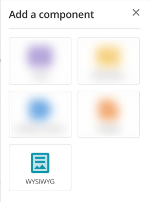
The WYSIWYG component lets you use a word-processor style editing interface to create and maintain content for your web pages.
The following sections outline the tools and settings unique to the WYSIWYG component. You can select one of the button types below to view the information for that tool.
Inline editing
The editor provides efficient and accessible content revision through inline editing. Clicking and selecting text within the content of a WYSIWYG will display the editing toolbars directly below the selected content, providing editing tools specific to that content-type:
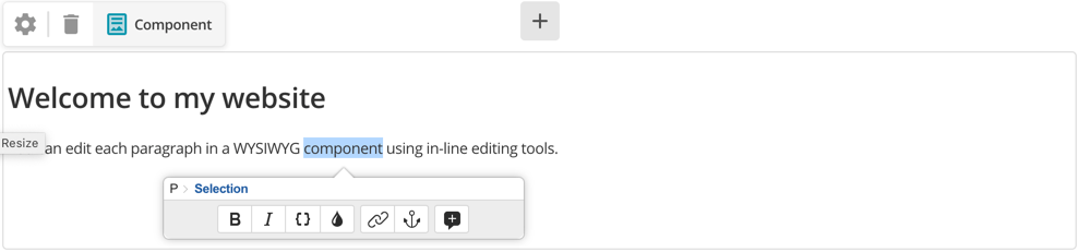
These inline toolbars allow you to edit the content of your assets within their immediate context, mitigating the need for constant referral back to the full WYSIWYG toolbar.
Inline toolbars also provide breadcrumb style navigation of the elements of your selected content, allowing you to specify precisely the content you are editing.
You can use the navigation tools to edit only selected content, all content within the bold tags of the selection, or all content within the paragraph of the selection.
Adding a comment to a WYSIWYG component
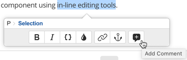
The tools available on the inline toolbar allow you to add comments to your content, aiding in content collaboration on pages with multiple authors.
| Inline comments are supported for assets with components in them, such as standard pages. News items and calendar events do not have inline comment support. |
To add a new inline comment:
-
Make a content selection, and select Add Comment.
-
Add your comment into the panel and select Comment.
-
Your comment displays as a speech balloon on the component border and in the component toolbar.
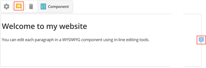
Click the component toolbar comment icon to move through each unresolved comment thread in order. -
As you add comments, the count increases in the speech balloon.
-
Once you have discussed the changes, select Mark as resolved to close the comment from further activity, as indicated by a greyed out color to the speech balloon.
You can edit and delete your own comment through the options menu in each comment.
The %asset_attribute_comments% keyword can also print all of the comment data from a Standard Page or component in a JSON array.
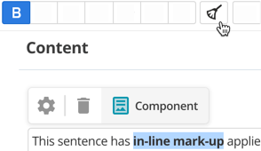
Applying basic formatting
The WYSIWYG editor provides the basic formatting tools to allow you to make your content bold or italicized, as well as strikethrough text.
To use these basic formatting tools, make a content selection, then click either the Bold, Italic, or Strikethrough buttons.
To remove this formatting, highlight the relevant content and click the highlighted button of the formatting you want to remove. Alternatively, you can use the Remove formatting tool.
<strong>Bold</strong>
<em>Italic</em>
<del>Strikethrough</del>
| You can use shortcuts for both bold and italic formatting. For Windows: Ctrl+B (bold) and Ctrl+I (italic). For Mac: ⌘+B (bold) and ⌘+I (italic). |
Making text subscript or superscript
The subscript and superscript tools allow you to format your content selections as both subscript and superscript.
To use these formatting tools, make a content selection, then click either the Subscript or Superscript buttons; this will format the selected content as specified. To remove this formatting, highlight the relevant content and click the highlighted button of the formatting you want to remove. Alternatively, you can use the remove formatting tool.
Marking text as code
The Code tool lets you highlight some text as code and wrap it in a <code> tag.
This tag is useful when writing technical documentation to highlight words or snippets that represent computer code.
More information about using the <code> tag is available in Mozilla’s HTML developer documentation.
Applying a class to content
The class tool in the WYSIWYG toolbar lets you apply a class attribute within your content.
To apply a class:
-
Make a content selection.
-
Click the Class button; the class popover will appear, as shown:
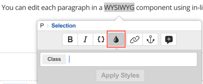 Figure 2. The class popover
 -
In the class field, enter the class name to use and select Apply styles.
To delete a class:
-
Make a content selection.
-
Click the Class button to display the class information in the class field.
-
Delete the previously set class and select Apply styles.
| You can use the Remove format button to clear the formatting from the selected content. |
The class is applied to the content as described in this example:
<h1 class="intro">Heading</h1>
Removing formatting
The remove format tool lets you remove any text formatting (bold, italic, etc.) within your content while maintaining the text itself. This action includes clearing any style attributes, classes, and justifications within your content.
To remove formatting, make a content selection, and select Remove format.
The following HTML tags are not allowed within WYSIWYG containers and are always removed when you try to edit a component through the editing interface:
-
<script> -
<form> -
<input> -
<textarea> -
<button> -
<select> -
<label>
|
Disallowed HTML tags can sometimes be added to this component type accidentally through an API update, or when a Code component is converted to a WYSIWYG component. An error appears describing the issue when this situation occurs: HTML contents of this container interfere with the edit interface. WYSIWYG editor has been disabled for this container. Below is the raw HTML content. Search for these tags in the content and remove them to reactivate WYSIWYG editing again. |
Applying a format
The formats tool lets you control your content formats, whether they be paragraphs, divisions, quotes, or preformatted content.
To specify the formats of your content, make a content selection, and select Formats to invoke the formats popover:
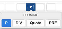
The current format type of content will be selected.
In this case, the P option indicates that this content is using paragraph tags.
In the Formats popover, select the format to which you want to switch:
<p>Content</p>
<div>Content</div>
<blockquote>Content</blockquote>
<pre>Content</pre>
Creating, editing and maintaining tables
The insert table tool lets you insert a table into your asset’s content.
Click on the Insert Table button to invoke the insert table popover:
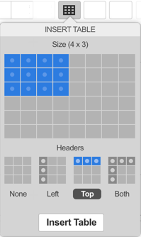
In the insert table popover, specify the table’s size and indicate the position of the table Headers.
Once you have done this, select Insert Table; the table will be inserted into the content
You can modify a table’s settings by selecting it within the component and clicking the Insert Table button. You will be able to change either the entire table or the selected row, column, or cell.
The settings in these tools allow you to:
-
Define the width of the table
-
Specify a table summarY
-
Insert a caption for the table
-
Insert and move rows and columns
-
Merge and split cells
-
Add CSS classes
-
Add headers
-
Delete rows, columns, cells, or the entire table.
Inserting an image
The insert image tool lets you insert an image into the content of your asset, either as an image asset within your site or through the URL of the image.
Click on the Toggle image options button to insert an image.
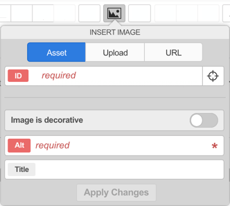
In the insert image popover, enter a URL to the image that you want to insert. Alternatively, you can insert an image asset from elsewhere in your site or upload an image from your computer.
To insert an image asset, select Pick asset. You can use the asset finder to navigate to and select the image to add.
If you want to upload a new image, select Upload and select the image you want to insert. You can use the additional Location field to specify where you want to upload your image. The Use current asset as upload location option is selected, by default.
You can select whether to display this new image asset within your site’s navigation menus using the Show in menu option. By default, this field will be disabled, meaning that the image will be uploaded as a hidden link asset and not displayed in the menus of your site.
| You can copy and paste images directly from a Word document or a folder on your local computer. You can also drag and drop multiple images at once. This functionality is available on all Mozilla Firefox, Google Chrome, and Safari browsers, and Internet Explorer 10 and 11. |
Once you have specified an image to insert, the insert image popover will display the chosen image.
The insert image popover also lets you indicate whether the image is decorative and provide a title and alternate text.
Once you have selected and configured the image, select Apply changes to insert the image into your content.
You can resize your image by selecting the component and using the handles to drag your image to the desired size.
To modify the settings of an image once inserted, select the image within the component and select Toggle image options; the insert image popover will be displayed, listing the current settings of the image. Once you have reconfigured these settings, select Apply changes to update the image.
Inserting a horizontal rule
The horizontal rule tool lets you create a horizontal line within your content, used to define a thematic break.
Select Horizontal rule to insert a <hr /> element into your page.
Adding and removing links
The insert link and remove link tools allow you to manage links to external sites or internal assets within your content.
To add a link:
-
Make a content selection and select Insert link to load the insert link popover:
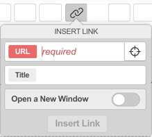 Figure 7. The insert link popover
 -
In the URL field, enter the URL address you want to link to, including the protocol, such as
https://www.example.com.Alternatively, you can select Pick asset to select an internal asset to link to using the asset finder.
-
In the Title field, enter a title for the URL. This value is assigned to the HTML title attribute on the
<a>tag. -
Select the Open a new window option if you want this link to open in a new browser tab.
-
Once you have configured the settings in the insert link popover, select Insert link.
To remove a link:
-
Select the link in the content.
-
Click the Remove link button.
If you are linking to a link or redirect page asset, there will be another option available called Use link destination, which is on by default. When enabled, the URL produced on the frontend is the URL those asset types are pointing to rather than the URL of the link or redirect page asset themselves.
Adding an anchor ID
The anchor ID tool lets you insert an anchor or destination point within the content of a page. These anchors can then be linked to, enabling quick navigation to the content within your site. For example, you could create links at the top of a page to each separate section of content within that page.
To insert an anchor ID, make a content selection and then select Anchor ID.
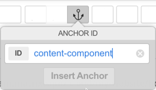
In the ID field, enter an ID or name for the anchor and select Insert anchor.
<h1 id="content-component">
A content component lets you add content to your website pages.
</h1>
To delete an anchor ID:
-
Highlight the relevant content, then select Anchor ID to display the anchor information.
-
Click the Clear this value button in the anchor field to delete the previously set ID
-
Select Update anchor.
| Enroll in Matrix 6: Editing content to learn more about this topic. |
Using special characters
The insert character tool lets you add special characters into the content of your page.
Click the Insert character button to open the insert character options.
The insert character popover groups available characters under Symbol, Latin, Mathematics, Currency, and Greek categories. Click on a character to insert it into the content of your page.
Searching and replacing content
The search and replace tool lets you search all content within the component and, optionally, replace it with another specified string. For example, you could search for all uses of the phrase "Writer" in your content, replacing those instances found with "Editor".
To search and replace content:
-
Click the Search and replace button.
-
In the search field, enter the text to search for.
-
Select Find next button do a basic content search for the text.
-
Choose from one of the following Replace options:
If you want to replace this string within your content, enter the replacement string in the Replace field.
-
Select Replace to locate and replace the found string with the replacement string in the Replace field.
-
Select Replace all to replace all instances of the found string with the replacement string in the Replace field.
Using the language tools
The language tools allow you to insert acronym, abbreviation, and language tags within your content.
Use these tools by highlighting content and then select Language tools.
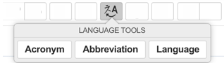
To add an acronym tag:
-
Select the acronym content you want to define in your text.
-
Click the Language tools button and select Acronym.
-
Define the acronym and then select Insert acronym.
-
Hover over the acronym and its definition displays as hover text.
To add an abbreviation tag:
-
Select the abbreviated content you want to define.
-
Click the Abbreviation button.
-
Define the abbreviation and then select Insert abbreviation
-
Hover over the abbreviation to see the explanation as hover text.
To add a language tag:
-
Select the content you want to identify as a different language.
-
Click the Language button.
-
Define the language information you want to include and select Insert language.
Using the accessibility auditor
The accessibility auditor tool evaluates and reports on the accessibility of your asset’s content, highlighting any known or potential issues for review and resolution.
-
Select Accessibility auditor to load the accessibility auditor report controls.
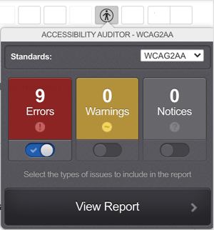 Figure 10. The accessibility auditor
 -
From the Standards list, select a standard to check your content against.
-
Select the issue types to review in the report.
-
Select View report to show the results of the audit.
For more information on this tool and its use, refer to the Accessibility Auditor.
Viewing the HTML source code
The source editor tool in the Editor lets you view the HTML source code of your content.
Clicking the Toggle source view button invokes the source editor popover, allowing you to view the content source code.
You can use the source editor to modify the HTML code of your content. Once you are satisfied with your work, select Apply changes to return to the WYSIWYG view.
Using Matrix keywords
The insert matrix keyword tool lets you add a keyword replacement within the content of your page.
To insert a keyword, select Insert Matrix keyword to display the keyword popover.
This popover will display a list of keyword replacements available for use on the asset.
Select the keyword that you want to use and select Insert to add the keyword to the page content.
Read Keyword replacements for more information on the keyword replacements available within the Squiz Content Management system.
Inserting a snippet
The insert matrix snippet tool lets you insert snippets of content within your page, in a similar manner to linking a division or nesting another asset.
To insert a snippet, select Insert Matrix snippet to display the insert matrix snippet popover.
This popover will provide a list of the bodycopy assets available to use as snippets.
Select the snippet you want to use an select Insert to add the snippet keyword to the page content.
By default, no snippets will be available for use on this tool.
To make snippets available, enable the Snippet Keyword Replace setting on the Global Preferences screen and configure a snippet location.
For more information, refer to the Global Preferences chapter in the System Configuration manual.