Page contents and components
|
Make the switch from legacy Standard Pages to Content Pages in Page Builder. Get A/B testing, Personalization, Layouts and Templates, ongoing feature improvements, and a great authoring experience compared with Standard Pages. Read the standard page and content page feature comparison page for more information. |
Learn about dependent assets and components and how you can add, edit, and conditionalize content displayed in these assets.
When you add certain assets in Squiz Content Management, such as a standard page, Squiz Content Management creates a few additional "dependent assets" by default.
A page contents asset and its parent asset (for example, a standard page) are dependent on each other. The page contents cannot exist without its parent asset, and it cannot be moved, cloned, or linked to another asset.
Each of these asset types serves a specific purpose:
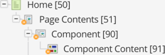
- Home (Standard page)
-
Holds the main attributes and details such as the page name, status, metadata, workflow, URLs, among other screens.
- Page contents
-
Controls the page structure/order of all the content components.
- Content component
-
Holds the configuration and attributes of a content block such as the HTML class, presentation type, content templates, among other configurations.
- Component content
-
Defines the type of content block, such as a WYSIWYG, nested content, or code, and holds the actual content for a component.
The structure of the asset gets defined under the page contents by adding content components. The content of the asset gets added to these components.
By default, a content component gets created along with the page contents asset; these components can be viewed and edited on the Edit contents screen of the asset.
Linking components between assets
Avoid linking components between multiple assets.
When you edit the parent asset, it automatically gets the locks on the page contents and its child components. Because you can link a component to multiple parent assets, you may not be able to edit a component if someone else is already editing it.
Additionally, a linked component’s status does not change if it is lower than its other parent asset. For example, say "component-1" gets linked under the "Home" and "About Us" pages, and both pages are live. If you change the "About Us" page to under construction, the status of "component-1" will not change, and it will remain live.
Add a component
You add content components to a page from the Content screen.
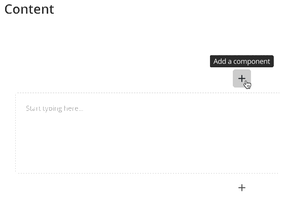
-
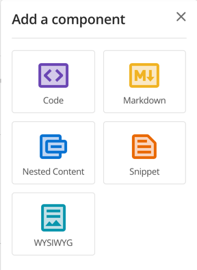
Select + to open the Add component panel.
-
Select a component type.
Once you have created the new component, it also appears in the asset tree.
Once you have two or more components under a Page contents asset, you can re-order them by dragging and dropping them in the asset tree to the desired order.
Edit the properties of a component
The gear button opens the basic and advanced properties of a component in the Properties panel.
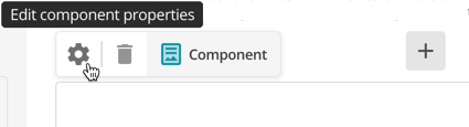
Once you have edited the properties, click Save.
The properties are saved independently of the changes you make to component content on the Content screen.
Basic properties
- Name
-
The asset name of the component.
- Description
-
A short description of the component displayed when you use the component as a snippet and when listed under the Insert snippet drop-down in the WYSIWYG toolbar.
- Component template
-
If your system has templates set up, you can select a template from the available options.
- Component type
-
Change the component to another component type. The available options are:
- WYSIWYG
-
A component with the WYSIWYG editor available.
- Markdown
-
A code editing component that lets you enter markdown code.
- Code
-
A code editing component that lets you enter raw HTML into the component. You can use this component to enter any code, such as HTML, XML, or scripting code, such as JavaScript.
- Snippet
-
This component allows you to select from a list of pre-defined content snippets available within the system.
- Nested content
-
This component allows you to nest content from another page into this component.
Read Content components for more information about the available content components.
Advanced settings
- Component ID
-
The HTML ID of the component. By default, this ID is automatically generated based on the asset name and the asset ID of the component to ensure the HTML ID attribute becomes unique on the frontend. Select Customize ID to change the component ID.
The component ID is not the same as the asset ID, but rather the ID that appears within the component’s HTML structure on the frontend.
For example:
<div id="content_component_1234">
...content...
</div>
The HTML ID attaches to the Presentation tag.
If the Presentation tag is set to Raw (ie, no formatting), changing a component’s HTML ID has no effect.
Many of Squiz’s default designs are built with the Presentation tag set to Raw.
- Disable keywords
-
Enable this to prevent Squiz Content Management keywords from being evaluated within this component. You can do this if you want to include text enclosed by percentage signs, which is interpreted as a keyword replacement. For example, you may wish to include the text
%New Products%in the component. - Presentation tag
-
Select the HTML tag to wrap around this component.
If Raw is selected, no wrapping HTML tag is used.
The Component ID attaches to the Presentation tag. As a consequence, if Raw is selected, changing the Component ID has no effect.
- Custom class
-
Enter any class names you want to add to this component.
Custom class names only appear on the frontend if the Presentation setting is not set to Raw. - Text direction
-
The default direction the text will run in your component. This setting will set the
dirHTML attribute on the component.The text direction attribute will only appear on the frontend if the Presentation setting is not set to Raw.
Configuring the component display conditions
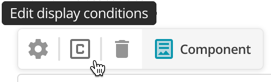
Select Edit display conditions to open the component Display Conditions pop-up.
The Display conditions settings panel lets you enable display conditions and configure the content display conditions within the selected content component.
The Settings section allows you to enable conditional content on the current content component and define the logic to use when matching conditions.
- Display Conditions
-
Select whether or not to enable to use of conditional content on the content component. If this option is enabled, the content will only be displayed if the conditions match, as configured.
- Logical Grouping
-
Select the logic to use when matching the configured groups defined on the content component. The options available are:
- All groups must match
-
Each configured group must match to display the content of the component.
- At least one group must match
-
One or more configured groups must match to display the content of the component.
Add a display condition group
Display condition groups define the conditions that must be met for the component’s content to be displayed.
This component toolbar item only displays when you have set display conditions up within the Conditions screen. Read Asset conditions screen for more information about setting up conditions for component condition groups.
No groups display when you first open the display conditions.
To add a group:
-
Select Add group to create a new group logic and condition set.
-
Configure the group logic and conditions based on the following options:
- Logical Grouping
-
Select the logic to use when matching the Condition Group’s configured conditions. The options available are:
- All conditions are true
-
Each Condition specified on the group must be met for the group to match.
- At least one condition is true
-
One or more Conditions specified on the group must be met for the group to match.
- All conditions are False
-
Each Condition specified on the group must NOT be met for the group to match.
- At least one condition is False
-
One or more Conditions specified on the Group must NOT be met for the group to match.
- Condition
-
Select a condition to use on the group. The available conditions in this field are those configured on the Conditions screen of the asset.
Read the Asset conditions screen documentation for more information about configuring conditions.
-
To add more conditions to a group, select Add condition and select from the configured conditions.
-
Select Apply changes.
Select Cancel to revert any changes you’ve made.
Delete a component
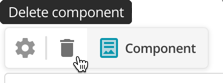
You might not see the Delete component button under these conditions:
-
The asset is Live on your website, and
-
Safe trash is enforced on your system.
This safety feature prevents content editors from accidentally removing a component without first making edits on a non-live version of the page. Change the status of the asset to a non-live status, and then delete the component if you encounter this scenario.
You can find out more about the different status types by reading Asset statuses and categories.
To delete a component without safe trash enforced on your system, click Delete component to send the component directly to the trash. Read Trashing and purging assets for more information about how deleted assets are managed in Squiz Content Management.