New features
The following new features are available in the latest version of Squiz Content Management.
New backend UI
The newly designed and improved backend UI aims to improve the usability and intuitiveness of the overall service.
New design
A new design theme is applied that follows the new Squiz Design System conventions used by all products in the Squiz Digital Experience Platform.
The new design theme improves the overall visuals of all UI elements such as fonts, colors, backgrounds, buttons, menus, and more.
The system default sign-in and password change screen also reflect the new design system.
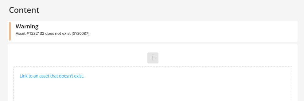
Finally, backend notices, warnings, and errors are visually improved to be easier to read and understand.
New toolbar
The application toolbar has a couple of new improvements to it. You can see your system name in the toolbar to quickly identify it if you have access to more than one system.

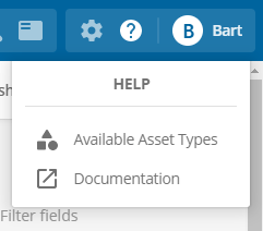
A new help menu option gives you quick access to the product documentation and a link to the asset type reference screen.
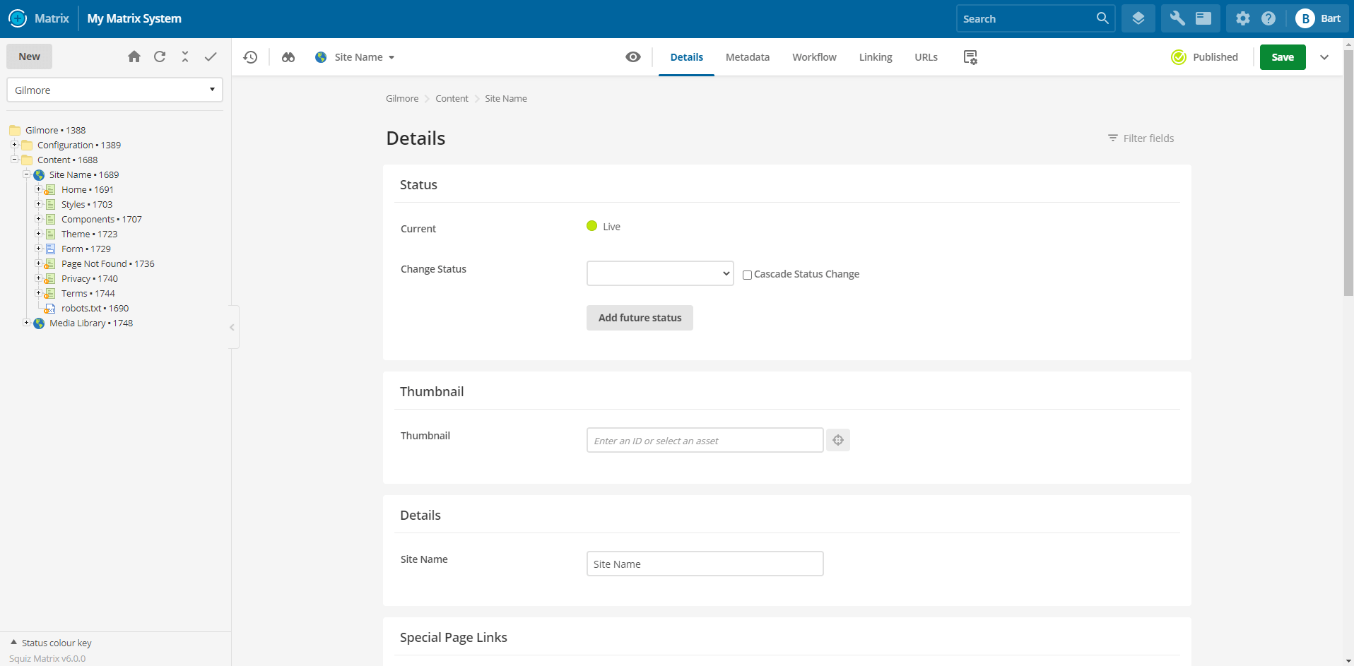
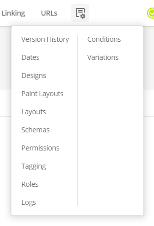
New screen header
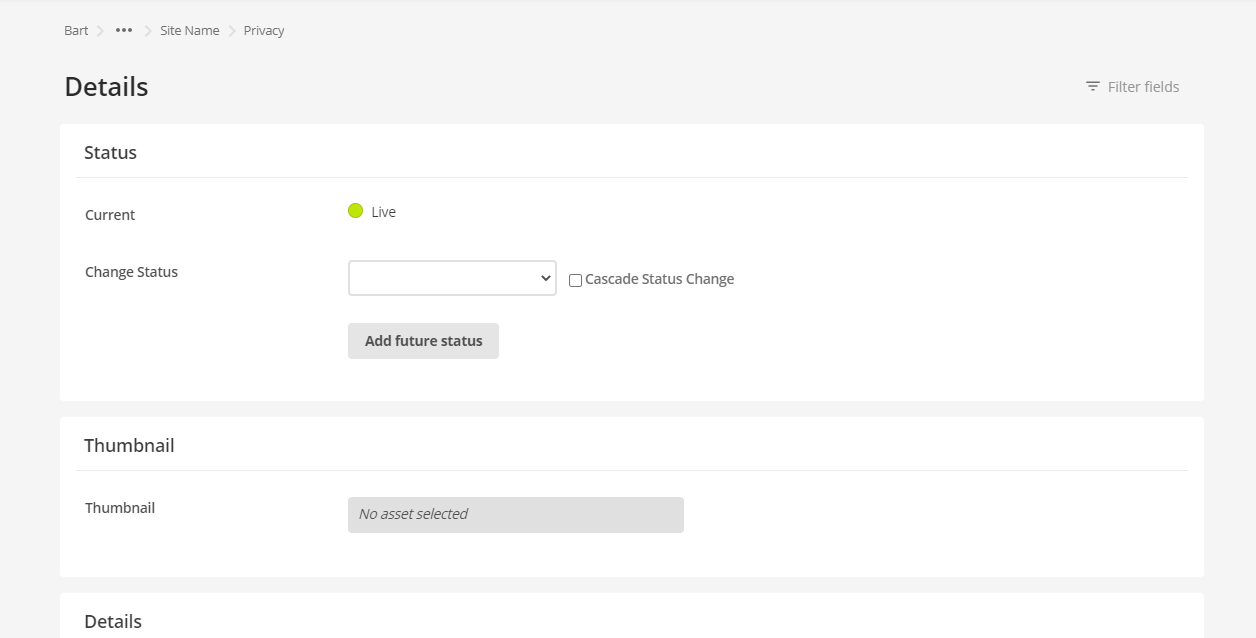
The new screen header aims to make it easier to do everyday actions such as navigating asset screens, seeing asset information, saving, acquiring editing locks, and changing status.

Navigating between screens is now much easier and faster because you can access common screens from the tabbed navigation. You can find additional screens within the Settings drop-down menu.
The new screen header also features a brand new status switcher. This feature lets you quickly change the asset status from any screen without always navigating to the details screen to do it.
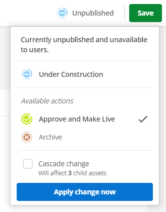
You can cascade the current status while also seeing how many child assets would be affected by the status change.
You can also add a workflow comment when requesting approval of an unpublished or draft asset.
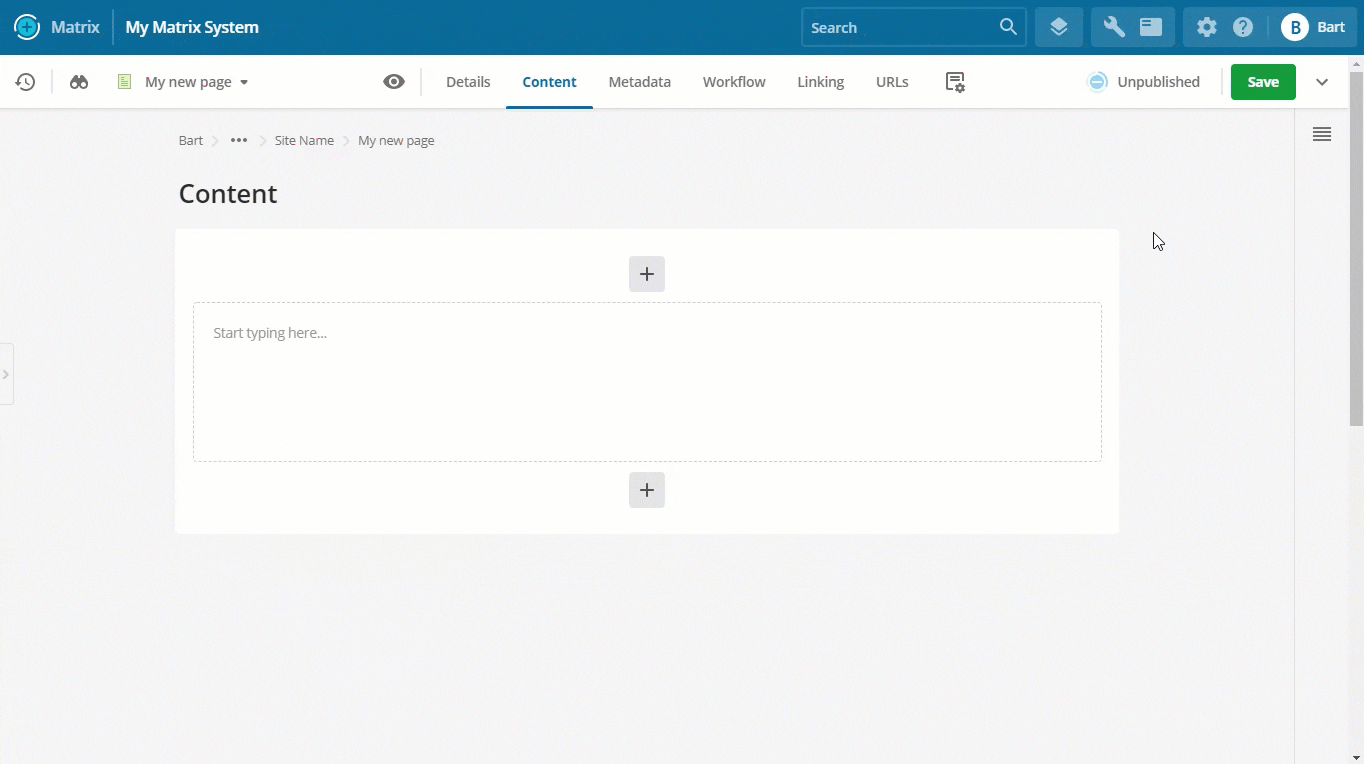
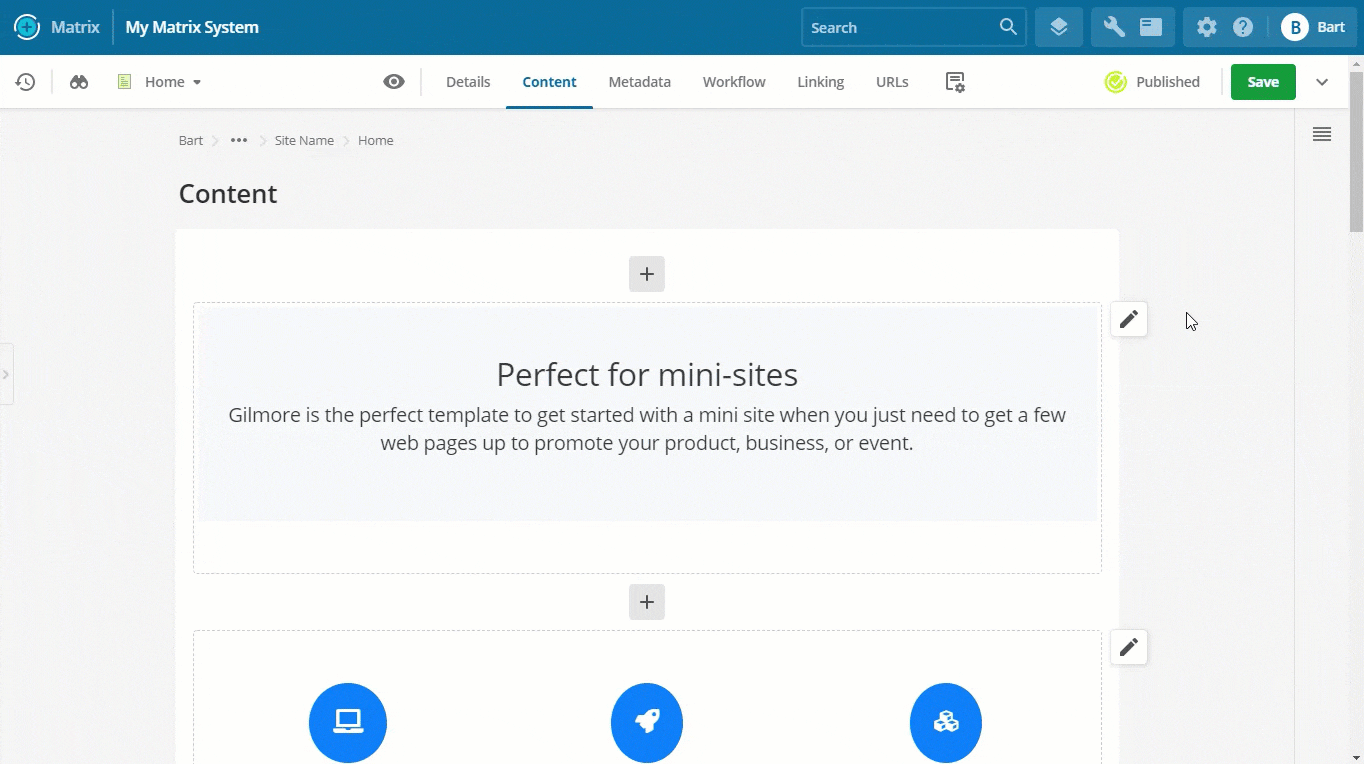
New main panel
The main panel area of the UI has been improved in layout and design to offer a more visually appealing and user-friendly experience.
Sections on screens now have a maximum width so that content within them is easier to read. Some screens, such as code editing screens, still have a fluid 100% width applied.
The main panel now also features an asset lineage that tells you the full hierarchical location of the current asset you are editing.
Furthermore, the current screen’s name is also now a heading on top of the main panel, together with the filter field tool being available to the right-hand side.
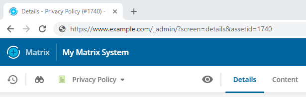
Dynamic and bookmarkable backend URLs
Your browser’s URL address bar updates automatically to represent the area or asset you are currently on and which screen you have active.
For example, navigating to the metadata screen of an asset with ID #1234 will result in the following URL: https://www.example.com/_admin?screen=metadata&asset_id=1234
Dynamic backend URLs are useful for when you want to share a backend location quickly with another user or if you want to bookmark that location to return to it later.
The <title> tag is also dynamically updated to quickly identify which asset and screen the bookmark refers to.
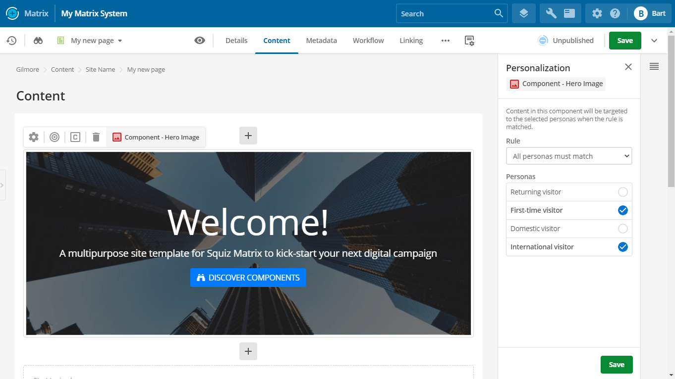
New page builder
A new page builder has been introduced to make it easier, faster, and more enjoyable to create, edit, and publish new page content.
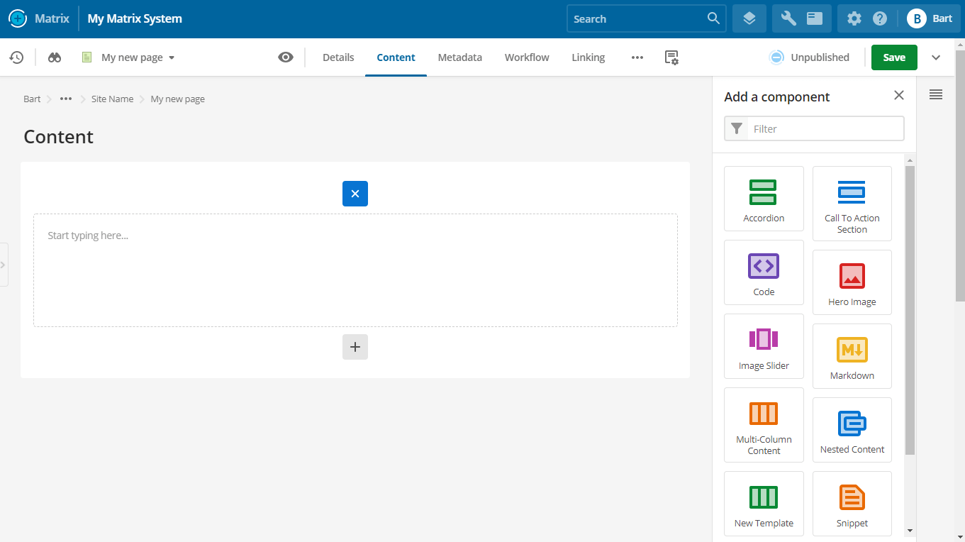
Access the new page builder by navigating to the “Content” screen of any asset that supports components. Content assets such as standard pages, custom forms, and layout assets like paint layouts and inline editing layouts support this screen.
Add new component
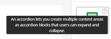
Adding a new component now opens a brand new panel that makes it easier to add new components by selecting from a unified list of core and custom components.
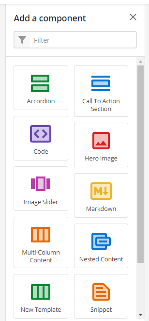
If the list of components is large enough, a filter tool will be available to find the component you want to add quickly.
Each component can have a colored icon and a description that tells the user more information about it.
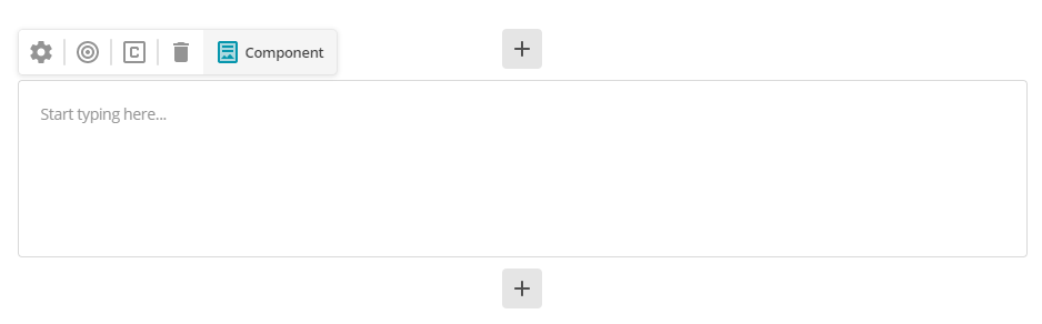
Component redesign
Components on the page are less cluttered when you view multiple components on a single page.
Hovering over a component displays the new component toolbar, which gives you access to all settings and tools of a component.
Edit component properties
The design of the component properties panel is improved.
Advanced settings are now hidden from view until you need them.
New inline editing experience
This release introduces the new inline editing experience.
Inline editing enables users to edit content quicker and more intuitively. You can directly see what your changes will look like on the frontend as you edit the content.
By default, inline edit mode is only available on standard page assets. Using the custom editing layout feature, you can create inline editing experiences for other asset types such as news, events, or even data records.
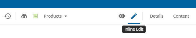
You can access inline edit mode on a standard page in three ways:
-
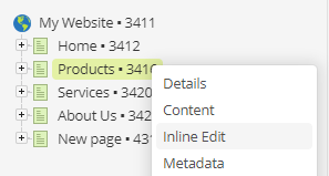
Right-click on the page in the tree and select “Inline edit”.
-
Click on the inline edit mode button (“pen icon”) in the screen navigation when viewing a standard page.
-
Append the inline edit mode suffix (
/_editby default) to the end of a page’s URL. For example, https://example.com/about-us/_edit.
Once you load this screen and acquire the locks, you will see the editable content highlighted within grey dashed outlines.
Click into these areas and start editing using the WYSIWYG editor.
Click Save once finished to save your changes, just like editing any other screen.
Within this mode, you can also click on-site navigation links within your design to navigate to other standard page assets to quickly edit them as well.
Read more about the new inline editing features in the Inline edit mode documentation.
Custom edit layouts
You can create custom edit layouts for the inline editing feature using the Custom edit layout (formerly known as “Simple Edit Layout”) asset.
The Custom edit layout asset lets you create inline editing experiences for assets that do not offer a native inline editing experience. This feature is useful for template implementations that use many metadata fields and customized paint layouts.
To add a custom edit layout to an asset, you first create a custom edit layout asset. You then configure it using a combination of the keyword replacement framework and your custom JavaScript and CSS.
Once created, you can apply it to an asset using its custom edit layouts screen.
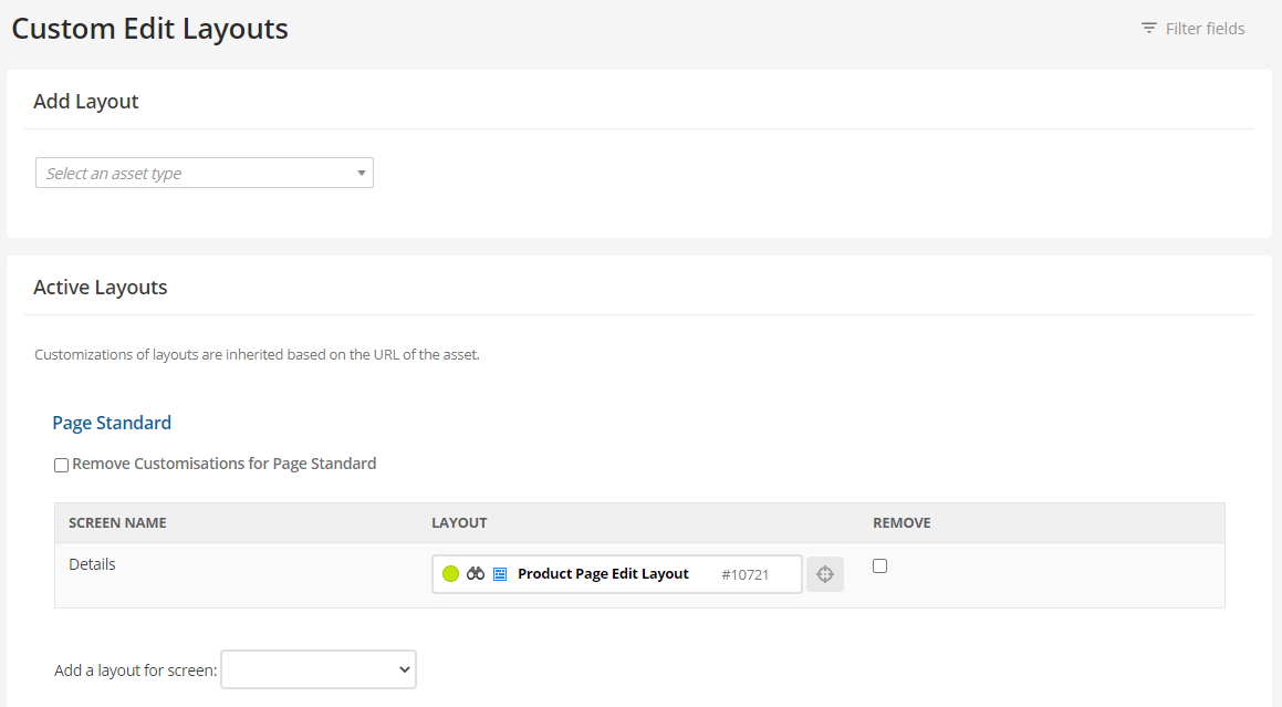
After that, users can access the “Inline Edit” screen on that asset and edit it using the customized layout.
Standalone inline edit mode
A new setting called Enable standalone inline edit mode has been added to the details screen of design assets. This setting lets you control the behavior of accessing inline edit mode on assets.

This setting is off by default.
When users add the inline edit mode suffix (/_edit by default) to an asset URL on the frontend, they get redirected to inline edit mode within the Admin UI.
With the setting turned on, the redirect from /_edit to the Admin UI will not happen, meaning that users can edit inline without loading the full Admin UI.
This mode does not give you all inline editing features. However, it may be a better choice if you heavily customize, limit, or control your users’ editing experience.
New asset creation experience
When creating a new asset, you’ll notice the creation screen loads inside a modal overlaid on the current screen you are editing instead of replacing it entirely.
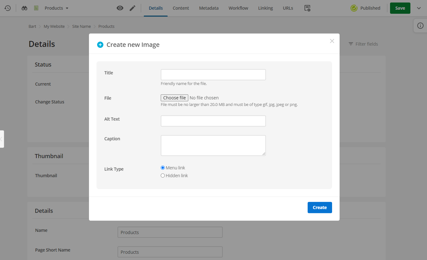
The modal makes it much quicker and easier to create the supporting assets you need while not leaving the current screen you are viewing.
For example, if you are on the Details screen of an asset and need to add a thumbnail image quickly, you can do so without leaving the details screen at all.
After creating the asset, you will see information about the newly created asset, including its asset ID, status, lineage, and URL.
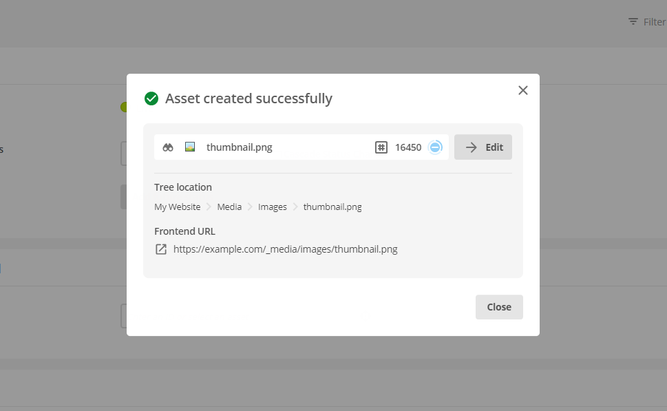
You can choose to navigate to that asset to edit it or close the creation modal to return to the screen you were on.
Furthermore, improvements to the creation interface of several asset types make the asset creation experience more consistent no matter what asset you are creating.
New asset reference report
A new reference report screen has been added to all user creatable asset types.
You can generate a report on this new screen that tells you all the places in the system that reference the asset.
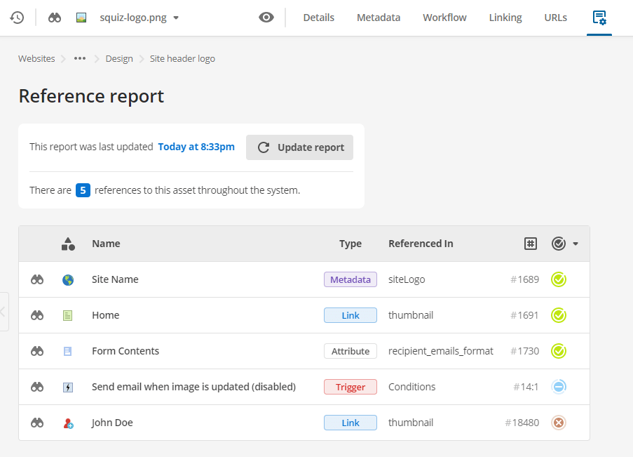
For each asset in the report, it will tell you where and how that reference is set.
This report is helpful when you want to unpublish or delete a specific asset, but you want to make sure that doing so will not impact any other assets.
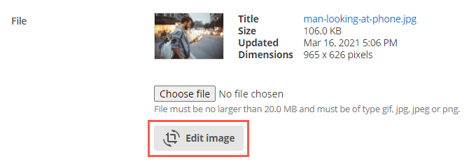
New image editor
You can make quick and simple edits to image files on image assets without relying on an external tool.
You can access this new editor on either the image’s Details or Varieties screen.
Once the image editor is open, you can use it to crop, rotate, or flip the image file easily.
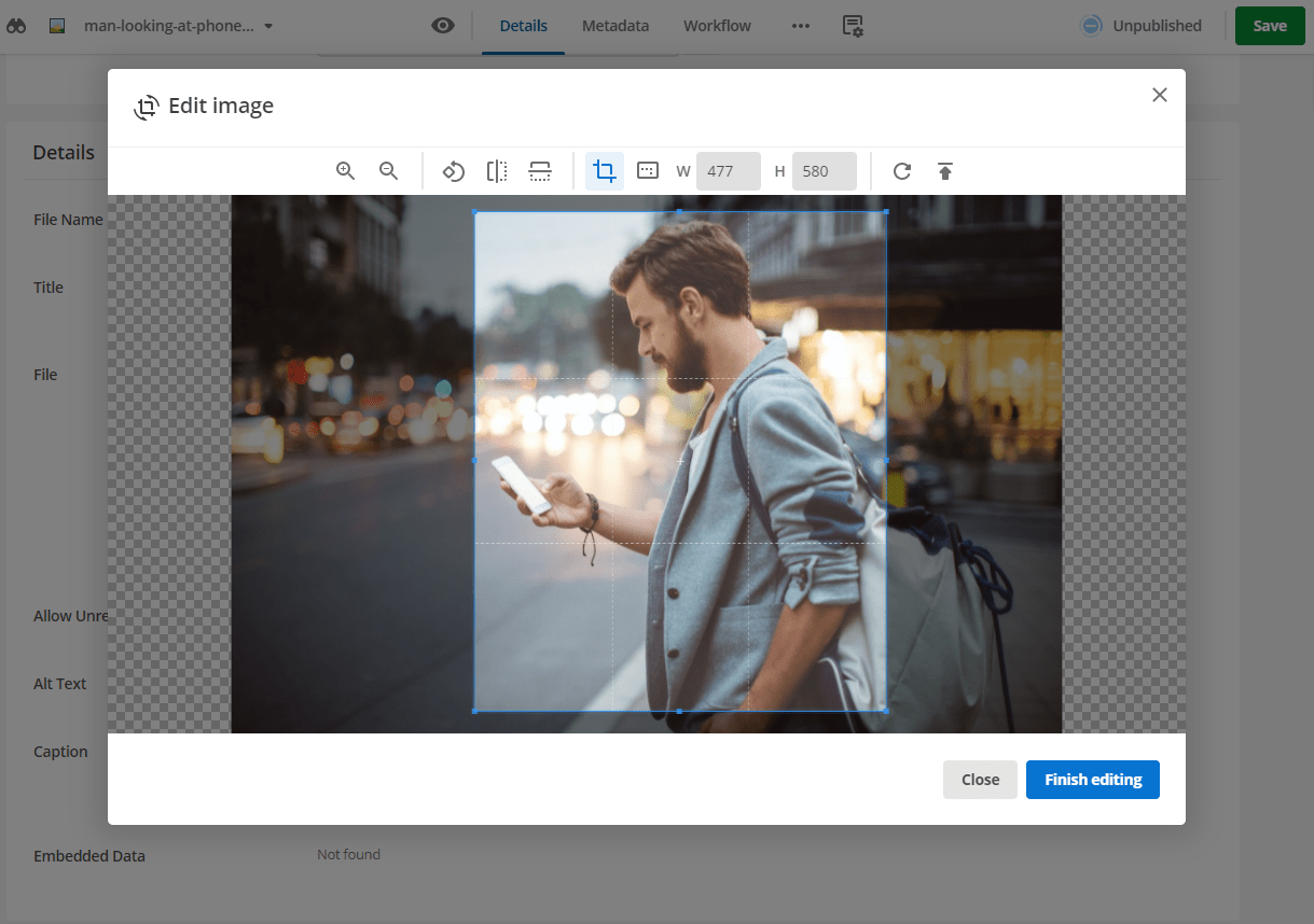
You can also use the editor to upload a different image file and edit that instead.