Step 7: Create component templates
In this part of the tutorial, you will introduce component templates to enable your content editors to create complex pages. The component will appear as an option on content pages.
For more information about component template features, see: Component templates documentation.
This tutorial will step you through creating a simplified version of the hero-image component available in the Squiz marketplace.
Create a component asset
Create a new component asset called Hero Image :
-
Right-click on the Configuration > Components folder.
-
Select .
-
Name the component Hero image component.
-
Select Create.
Configure the component asset
-
Edit the Details page of your component asset:
-
Right-click on the component asset.
-
Select Details.
-
Click Save.
-
-
Select a color and icon for your component:
-
Select a color in the Icon section of the Details screen.
-
Select an icon in the Icon section
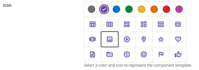
-
-
Switch on Enable custom edit layout interface in admin mode by clicking the toggle.
-
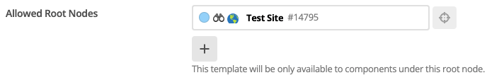
Set the Allowed Root Nodes field to the Site asset. Enter the asset ID of the Site asset or use the asset picker. This controls which content assets in your Content Management system will be allowed to use this component template.
-
Click Save.
The component will now be available on all of your pages when you select Add a component.
Create a metadata schema for the component
Create a metadata schema for the component to control the hero image contents and when it is displayed.
-
Right-click on the Hero image component.
-
Select .
-
Name the metadata schema Hero image schema.
-
Select Create.
Configure the metadata schema
Add fields to the metadata schema for the component.
-
Right-click on the metadata schema for the component.
-
Select Details.
-
Click Save.
-
Scroll down to Create New Section.
-
Name the section details.
-
Click Save.
-
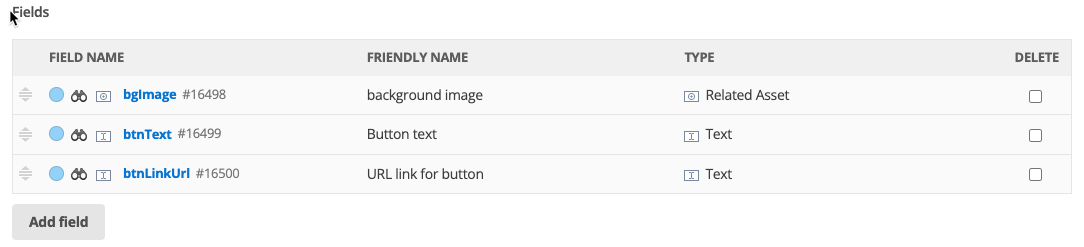
Add the following fields to the schema:
-
Select Add field.
-
Enter the details.
-
Repeat for each field.
-
-
Click Save.
Key Friendly name Field type bgImage
Background Image
related asset
btnText
Button text
text field
btnLinkUrl
URL link
text field
Apply the new metadata schema to the component
You must now tell the component about the metadata schema.
-
Right-click on the Hero image component asset.
-
Select Details.
-
Click Save.
-
In the Metadata Schemas field, enter the asset ID of the hero image schema or use the selector to assign it.
-
Click Save.
Load a hero image into Squiz Content Management
Load an image that you can use as your hero image.
-
Right-click on .
-
Select .
-
Enter the Title of your image.
-
Select Choose file.
-
Navigate to the image file you want to import.
-
Select the file.
-
Select Open.
-
Enter a brief description of the image in Alt Text.
-
Select Create.
Configure the hero image using the metadata
Use the metadata schema you have just created to configure the hero image.
-
Right-click on the Home page.
-
Select Content.
-
Click Save.
-
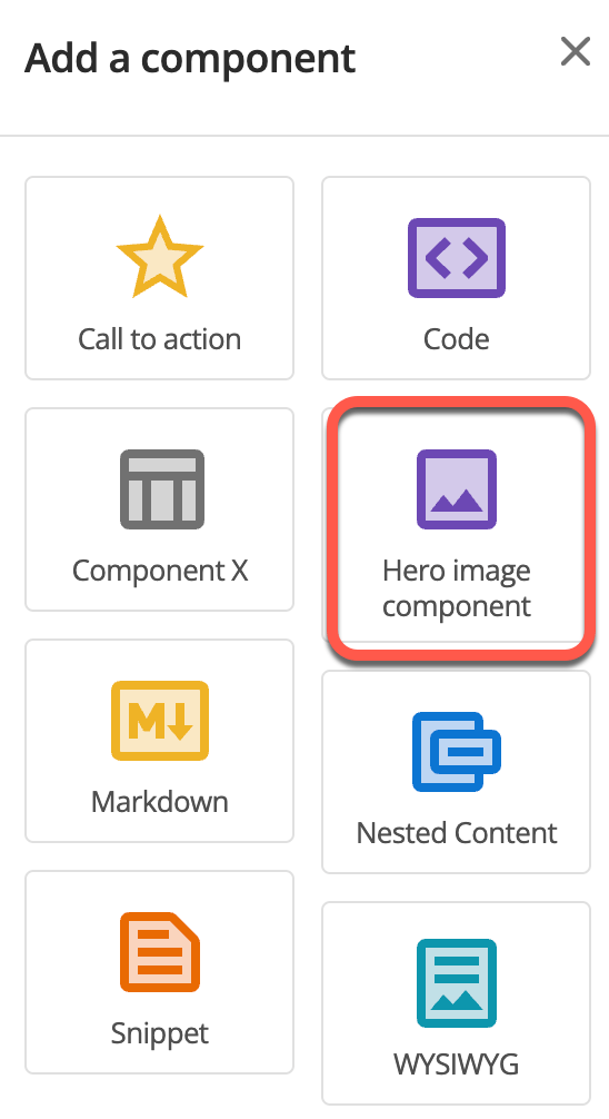
Add the Hero image component:
-
Select the + sign.
-
Select the Hero image component.
-
-
Click Save.
-
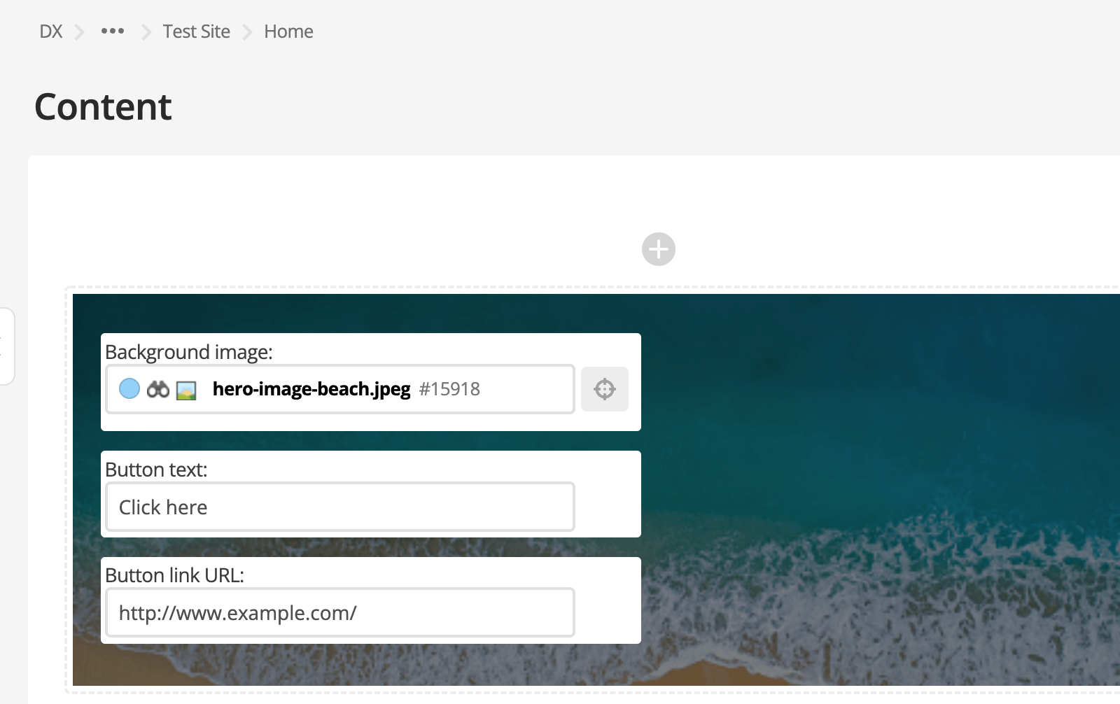
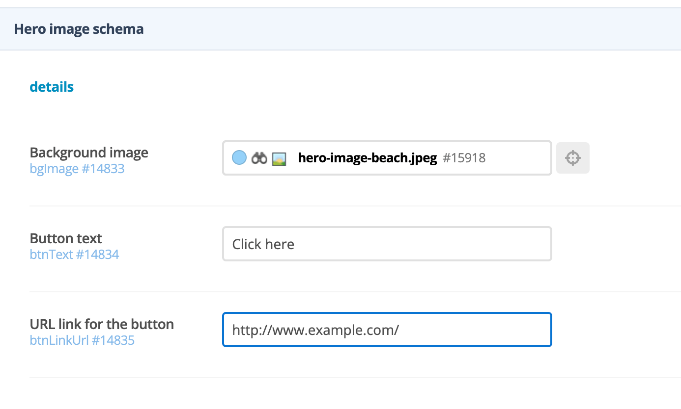
Configure the hero image.
-
Enter the asset ID of the image you loaded earlier into the Background image field or use the asset picker function.
-
Add Select here to the Button text field.
-
Enter http://www.example.com/ to the URL link for the button field.
-
Click Save
-
Create a paint layout
Create a paint layout for the Component template.
-
Right-click on the component.
-
Select .
-
Enter the name Hero image layout.
-
Select Create.
-
Edit the type format asset and add some code.
-
Expand the Hero image layout asset.
-
Right-click on Default Format.
-
Select Content.
-
Click Save.
-
Replace the existing text with the following code:
<div class="hero-image full-width-section p-5 m-5%"
style="background-image: linear-gradient(#00000080, #00000080), url(%asset_metadata_bgImage^as_asset:asset_url%);"> (1)
<div class="container">
<div class="text-center p-0 p-md-5">
<div class="text-light">
%asset_contents% (2)
</div>
<a class="btn btn-md btn-outline-light" href="%asset_metadata_btnLink^as_asset:asset_url^empty:{asset_metadata_btnLinkUrl}%">
<span class="ml-1" >%asset_metadata_btnText%</span> (3)
</a>
</div>
</div>
</div>
1 Inline styles in the hero-image div, which include a keyword that prints the URL of the background image as the CSS background image of the div. 2 The %asset_contents%keyword which prints the content of the component.3 Links that have two keywords that print the URL and the text of the call-to-action link. -
-
Click Save.
Apply the paint layout to your Component template
-
Right-click on the Hero image component asset.
-
Select Details.
-
Enter the asset ID of the Hero image layout asset in the Paint Layout field, or use the asset picker function.
-
Click Save.

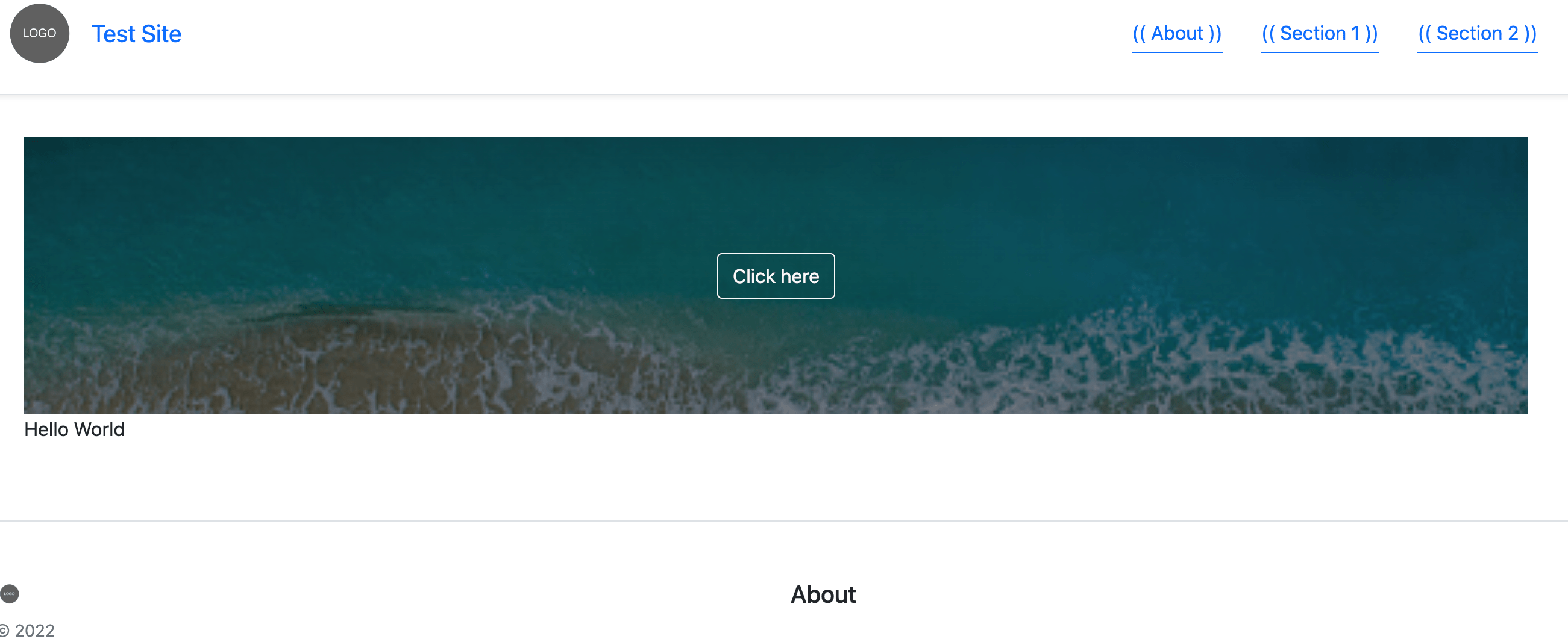
Test your changes
Test your changes so far.
You can test your site in a browser in two ways:
-
Copy the URL from the site asset and paste it into a browser.
OR
-
Right-click on the site asset and select .
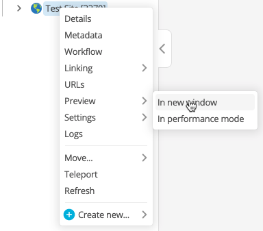
You will see your site in the new tab.
Create a custom edit layout
| This step is optional. |
Metadata is used to configure your site. Editors can use the raw metadata forms, or you can improve their experience by creating a formatted page to enter what they need. You create the formatted page using a custom edit layout.
To create a basic custom edit layout:
-
Right-click on the Hero image component asset.
-
Select Create New… > Design & Layout > Custom Edit Layout
-
Enter the name Hero image edit layout.
-
Select Create.
-
Right-click on the Hero image edit layout asset.
-
Select Content.
-
Click Save
-
Replace the existing code with the following code:
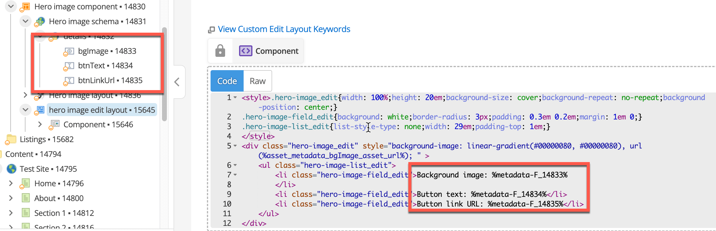
This code is a basic implementation of a custom edit layout and is not optimized for production. <style> (1) .hero-image_edit{ width: 100%; height: 20em; background-size: cover; background-repeat: no-repeat; background-position: center; } .hero-image-field_edit{ background: white; border-radius: 3px; padding: 0.3em 0.2em; margin: 1em 0; } .hero-image-list_edit{ list-style-type: none; width: 29em; padding-top: 1em; } </style> <div class="hero-image_edit" style="background-image: linear-gradient(#00000080, #00000080), url(%asset_metadata_bgImage_asset_url%); " > <ul class="hero-image-list_edit"> (2) <li class="hero-image-field_edit">Background image: %metadata-F_XXXX%</li> (3) <li class="hero-image-field_edit">Button text: %metadata-F_YYYY%</li> (4) <li class="hero-image-field_edit">Button link URL: %metadata-F_ZZZZ%</li> </ul> </div>1 It uses a style tag to style your custom edit layout, which would preferably use a separate stylesheet so it can be re-used across many custom edit layouts. 2 The code prints the HTML that will be rendered in the custom edit layout. You can add your own help text and descriptions here alongside the fields. 3 Prints the background image metadata field as the background for the component in editing mode, so that editors can preview what the background image will look like after saving. 4 Uses keywords in the form of %metadata-F_XXXX% to render the metadata form fields from the component, where XXXX is the asset ID of the metadata field. For a full list of keywords you can use in custom edit layouts, select view custom edit layout keywords link when editing the custom edit layout. 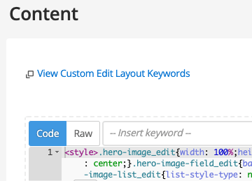
-
Update the code to replace XXXX, YYYY, and ZZZZ with the asset IDs of the appropriate metadata field IDs.
-
Click Save
-
On the screen:
-
Click Save.
-
Add the asset ID of your custom edit layout to the Custom Edit Layout field.
-
Click Save.
-
-
Edit your Home page again:
-
Go to
-
Click Save.
-
You should now see a more friendly editing interface.