View classes
A view class specifies how to render an input field of any integration component on the UI.
The view class (viewClass) is a required parameter in the developer:actions-triggers-comp.adoc#field-object of every component descriptor file.
Here are the general view classes used to render the input fields in the Integrations:
| View Class | Description |
|---|---|
Renders a single-line text field. |
|
Renders a multi-line text area. |
|
Renders a checkbox. |
|
Renders a drop-down menu to select from available values. |
|
Renders a drop-down menu to select multiple values from the available ones. |
|
Renders a standard password entry text field where the input values are replaced by symbols such as the asterisk (*) or a dot (•). |
|
Renders button for initiating the OAuth process. |
TextFieldView
TextFieldView has many purposes. Use it to draw a one-line text field form to input the information. For example, you can use it in the case of [Basic authorization] to input the API key. The possibilities are many, but the implementation is similar.
| Property name | Type | Required | Description |
|---|---|---|---|
label |
string |
Yes |
Renders a label with the given text above the input field |
required |
boolean |
Yes |
Specifies whether the input value is required for the component to operate correctly. A red asterisk (*) appears along with an input field or the label when true is set. If the value is false, it is optional to fill the field. |
placeholder |
string |
No |
Used to give a short and descriptive text rendered in the input field. |
note |
string |
No |
Used to provide more information about the input field. When present, a question mark (?) appears, and the text is shown in a tool-tip when hovered. It accepts a simple text, URL and HTML <em>. The text in the tool-tip is folded for longer texts. |
Here is an example implementation of TextFieldView view class:
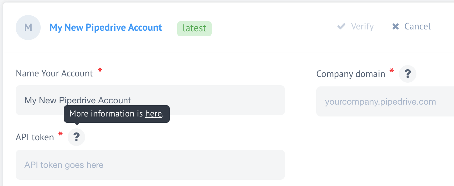
"credentials": {
"fields": {
"company_domain": {
"viewClass": "TextFieldView",
"label": "Company domain",
"required": true,
"placeholder":"yourcompany.pipedrive.com",
"note":"Enter <em>only</em> the domain name here"
},
"token": {
"viewClass": "TextFieldView",
"label": "API token",
"required": true,
"placeholder": "API token goes here",
"note":"More information is <a href='https://some/article/url'>here</a>."
}
}
}The above example is shown below, rendered in the UI:
TextAreaView
TextAreaView can be used to render multi-line text areas for different purposes.
| Property name | Type | Required | Description |
|---|---|---|---|
label |
string |
Yes |
Renders a label with the given text above the input field |
required |
boolean |
Yes |
Specifies whether the input value is required for the component to operate correctly. A red asterisk (*) appears along with an input field or the label when true is set. If the value is false, it is optional to fill the field. |
placeholder |
string |
No |
Used to give a short and descriptive text rendered in the input field. |
note |
string |
No |
Used to provide more information about the input field. When present, a question mark (?) appears, and the text is shown in a tool-tip when hovered. It accepts a simple text, URL and HTML <em>. The text in the tool-tip is folded for longer texts. |
Here is an example implementation of TextAreaView view class:
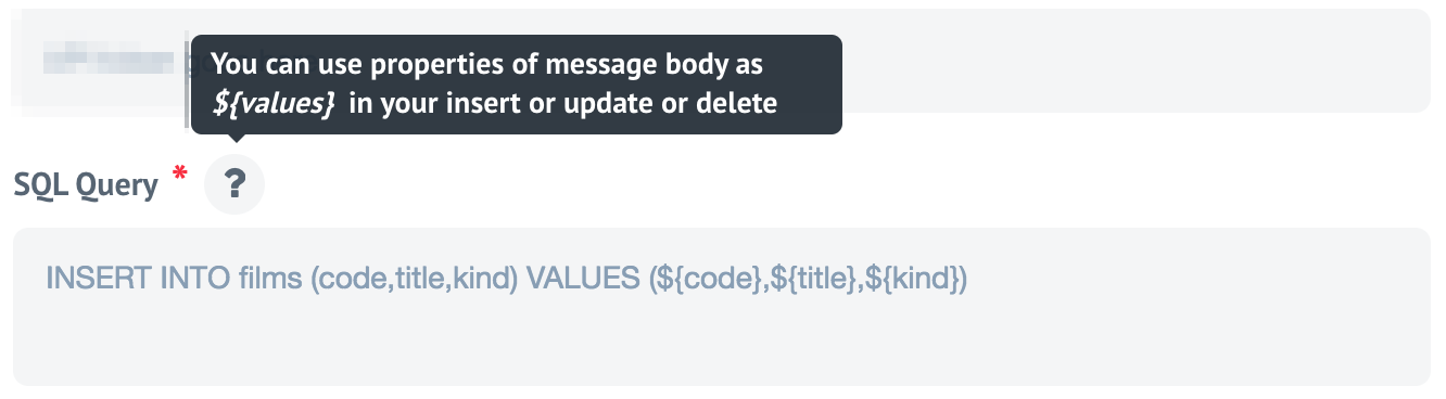
"query": {
"label": "SQL Query",
"viewClass": "TextAreaView",
"required": true,
"placeholder": "INSERT INTO films (code,title,kind) VALUES (${code},${title},${kind})",
"note": "You can use properties of message body as <em>${values}</em> in your insert or update or delete"
}Which would render in the following way:
CheckBoxView
The CheckBoxView view class can render a checkbox for enabling an option during the integration flow design. This view class had only one option:
| Property name | Type | Required | Description |
|---|---|---|---|
label |
string |
Yes |
Renders a label with the given text above the input field |
Here is an example implementation of CheckBoxView view class:
"fields" : {
  "SomeOption" : {
    ......
  },
  "CheckSomething": {
    "label": "CheckBoxView Label",
     "viewClass": "CheckBoxView"
  }
}
When the checkbox is selected, it transmits to the next stage, "CheckSomething" (following the example above). Alternatively, if the checkbox is not selected, it transmits nothing.
If multiple checkboxes are necessary, they must be implemented individually in the component descriptor.
SelectView
| Property name | Type | Required | Description |
|---|---|---|---|
label |
string |
Yes |
Renders a label with the given text above the input field |
required |
boolean |
Yes |
Specifies whether the selection is required for the component to operate correctly or not. When true is set, a red asterisk (*) appears along with the label. If the value is false, then it is optional to select. |
model |
object or string |
Yes |
Contains the name (string) of a function exposed by a component that returns the JSON object or the JSON object containing the values. |
prompt |
string |
No |
Used to give a short and descriptive text rendered in the select field. |
Here is an example of SelectView view class where the model property is an object containing the values:
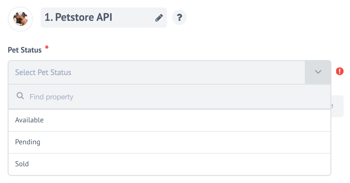
"fields": {
  "status": {
    "label": "Pet Status",
    "required": true,
    "viewClass": "SelectView",
    "model": {
      "available": "Available",
      "pending": "Pending",
      "sold": "Sold"
    },
    "prompt": "Select Pet Status"
  }
}
This is rendered in the following way:
The benefit of this view class is the ability to pass a string containing the name of a function exposed by a component that returns a JSON object.
This is commonly implemented with the dynamic select models. For example, the component descriptor of the MailChimp component has the following structure:
"fields": {
  "listId": {
    "viewClass": "SelectView",
    "prompt": "Select your MailChimp List",
    "label": "List",
    "required": true,
    "model": "getLists"
  }
}
Here the model has a getLists, which is exposed in the lib/commons.js as a function getLists:
/**
 * Function that returns values for the list selection box
 *
 * @param conf
 * @param cb
 */
function getLists(conf, cb) {
  co(function*() {
    console.log('Fetching lists');

    mailchimp.setApiKey(conf.apiKey);
    const lists = yield mailchimp
      .get('lists');
    let result = {};
    lists.lists.map((list) => {
      result[list.id] = list.name
    });
    console.log('Result ', result);
    cb(null, result);
  }).catch(err => {
    console.log('Error occurred', err.stack || err);
    cb(err);
  });
}
This function uses the mailchimp-v3 libraries to query the MailChimp API for the names of the lists in your connected account, which is not predetermined anywhere in the component descriptor.
MultiSelectView
MultiSelectView shares the properties of SelectView:
|Property name |Type |Required |Description
|label |string |Yes |Renders a label with the given text above the input field
|required |boolean |Yes |Specifies whether the selection is required for the component to operate correctly or not. When true is set, a red asterisk (*) appears along with the label. If the value is false, then it is optional to select.
|model |object or string |Yes |Contains the name (string) of a function exposed by a component that returns the JSON object or the JSON object containing the values.
|prompt |string | |No |Used to give a short and descriptive text rendered in the select field.
Below is an example:
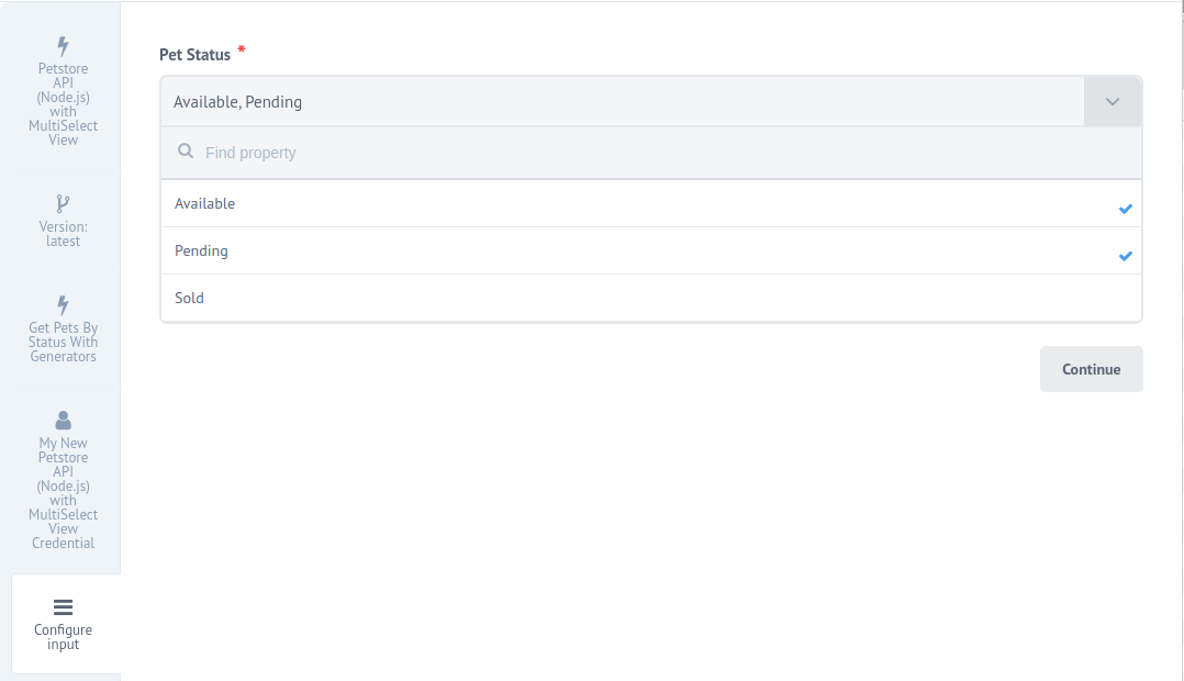
"triggers": {
  "getPetsByStatusWithGenerators": {
    "main": "./lib/triggers/getPetsByStatusWithGenerators.js",
    "type": "polling",
    "title": "Get Pets By Status With Generators",
    "fields": {
      "status": {
        "label": "Pet Status",
        "required": true,
        "viewClass": "MultiSelectView",
        "model": {
          "available": "Available",
          "pending": "Pending",
          "sold": "Sold"
        },
        "prompt": "Select Pet Status"
      }
    }
  }
}
Here is what it looks like in the UI:
PasswordFieldView
The PasswordFieldView view class provides a secure input field for passwords in the credentials of the integration components. It has the following properties:
| Property name | Type | Required | Description |
|---|---|---|---|
label |
string |
Yes |
Renders a label with the given text above the input field |
required |
boolean |
Yes |
Specifies whether the input data is required for the component to operate correctly or not. When true is set, a red asterisk (*) appears along with the label. If the value is false, then completion is optional. |
placeholder |
string |
No |
Used to give a short and descriptive text rendered in the input field. |
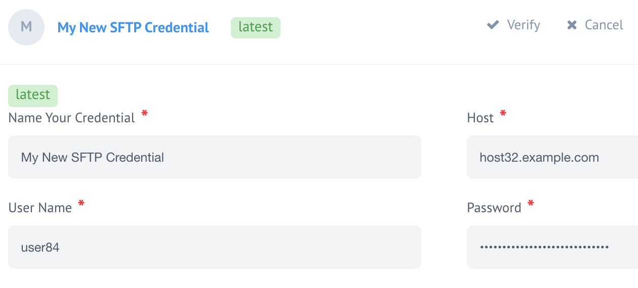
Here is an example of PasswordFieldView view class usage in the credentials:
"credentials" : {
  "fields": {
    "host":{
      "viewClass":"TextFieldView",
      "label":"Host",
      "required":true,
      "placeholder":"Name of the host"
    },
    "username": {
      "viewClass": "TextFieldView",
      "label": "User Name",
      "required": true,
      "placeholder": "Paste your SFTP user name"
    },
    "password": {
      "viewClass": "PasswordFieldView",
      "label": "Password",
      "required": true,
      "placeholder": "Paste your SFTP password"
    }
  }
}
This is rendered in the following way:
OAuthFieldView
The OAuthFieldView view class is used to render a button in the credentials of the component with authenticate or re-authenticate. When the button has been pressed, the process of OAuth1/Oauth2 authentication is started or repeated. This view class has only one parameter:
| Property name | Type | Required | Description |
|---|---|---|---|
required |
boolean |
Yes |
Specifies whether it is required to authenticate or not. When true is set, a red asterisk (*) appears along with the label. If the value is false, then it is optional to authenticate. |
Since the primary purpose of the OAuthFieldView view class is to facilitate the OAuth1/Oauth2 authentication then, it is worth presenting how to use it in conjunctions with the OAuth object:
"credentials" : {
  "fields":{
    "oauth":{
      "viewClass":"OAuthFieldView",
      "required":true
    }
  },
  "oauth2":{
    "client_id":"",
    "client_secret":"",
    "auth_uri":"https://accounts.google.com/o/oauth2/v2/auth",
    "token_uri":"https://www.googleapis.com/oauth2/v4/token",
    "scopes": [ "https://spreadsheets.google.com/feeds" ],
    "access_type": "offline",
    "prompt": "consent"
  }
}
This renders in the following way:
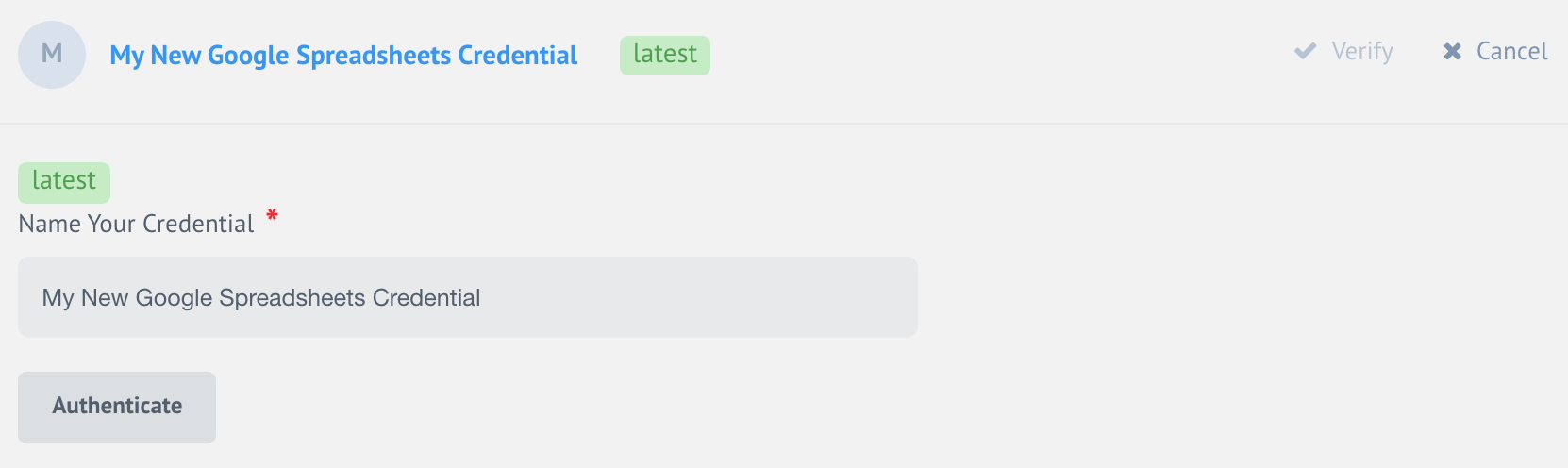
The OAuth2 authentication is initiated in the above method when the button Authenticate is pressed.