Quick options
Quick options, the ability to change a component setting from the component capsule or the page outline column, is enabled by adding the quickOption property to manifest.json and setting it to true.
Adding the optional ui:metadata property to the component input properties on a manifest and specifying values controls how you interact with this component in the Page Builder interface, including whether Quick options are available.
This property is a non-breaking change that does not affect the component being used on standard pages.
Add the following to a property to enable quick options:
"ui:metadata": {
  "quickOption": true
}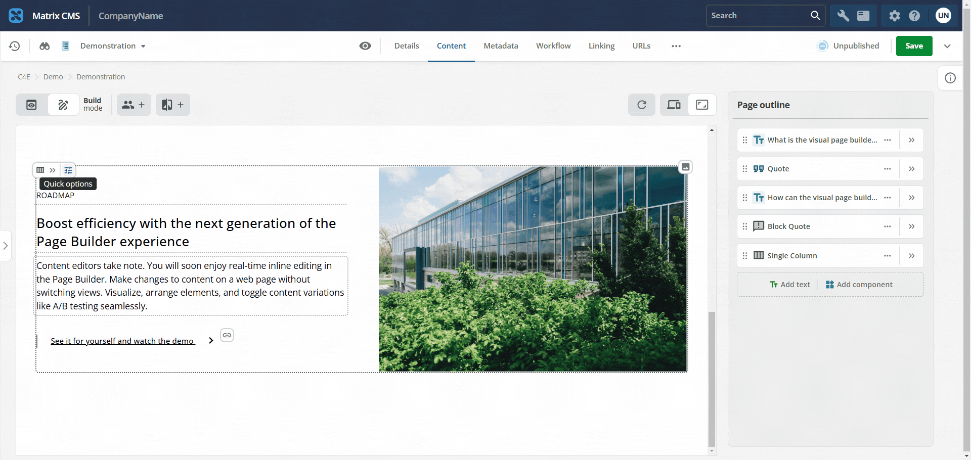
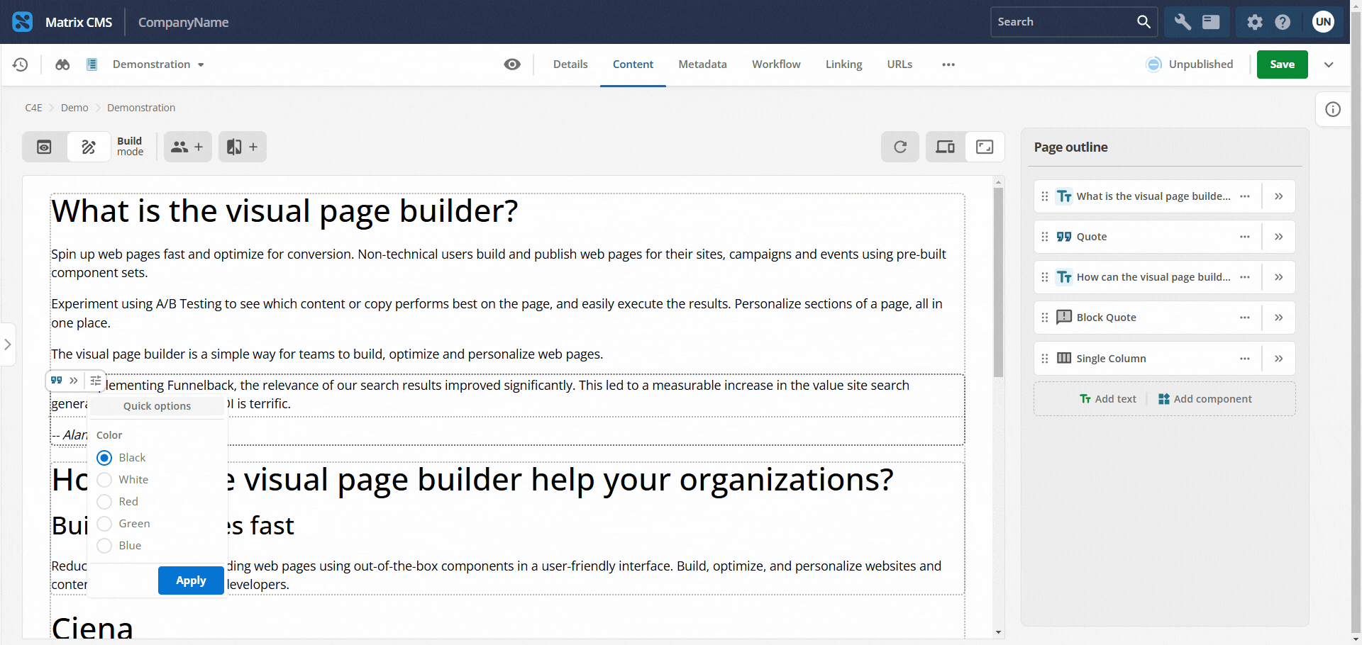
The quick control appears in the preview column for properties that expose a choice, such as a True or False toggle.
If the quickOption property is not set on a component property, editors can only change that property in the page outline column.
Boolean and string properties (with enumerated values) can be configured to be available as quick options.
A complete example of a single string (with enumerated values) property is shown below:
"foregroundColor": {
  "type": "string",
  "title": "Foreground Color",
  "enum": [
    "Black",
    "White",
    "Red",
    "Green",
    "Blue"
  ],
  "default": "Black",
  "ui:metadata": {
    "quickOption": true
  }
}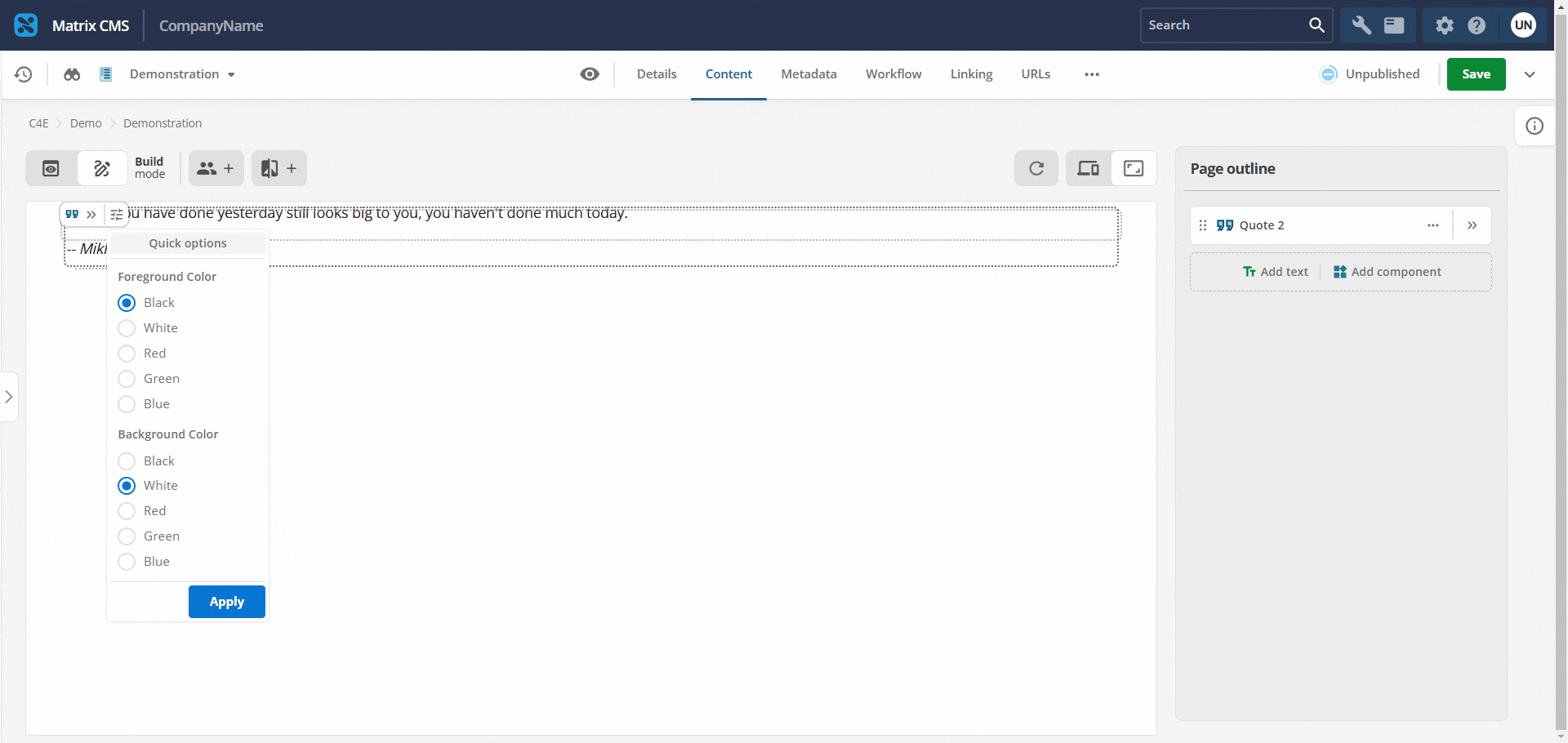
Omit quickOption: true when only a subset of boolean or string enum properties must appear as quick controls.
For example, a component can define several boolean or string enum properties, but only some of them need quick controls in the preview column.
Too many quick options add many entries to the capsule menu.