Introduction to page layouts
Page layouts are reusable containers that define how components and formatted text are arranged on a page.
Layouts are uploaded to the Component Service and can be configured into component sets to control access.
Page structure
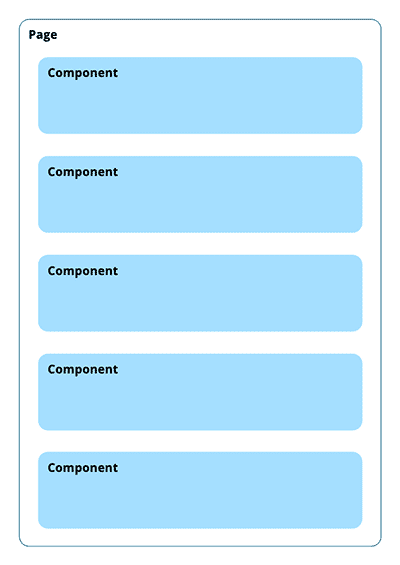
The structure of a content page is a linear collection of objects, which can be text blocks or component blocks.
In a basic page structure, each object takes up the entire width of the page.
Content in columns
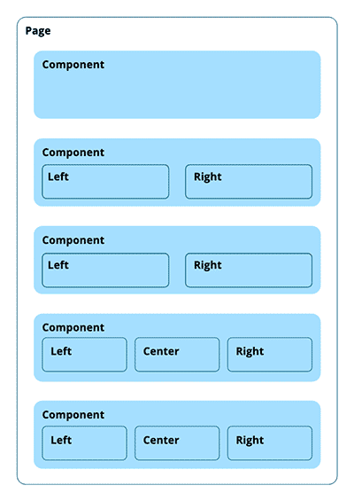
To configure part of a page in two columns or three columns, the required components must be written to support this configuration.
In the example figure, the second and third component blocks are configured to show their content in two columns.
An example of this may be to show an image in one column and text content in the other column.
The fourth and fifth component blocks are configured to show their content in three columns.
|
Components must be written to specifically support multiple columns, and to also support dynamic configuration of the number of columns. |
Using layouts
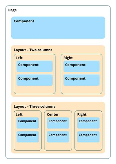
A layout simplifies structural elements on the page.
Layouts are configured structural containers with content zones.
In the example figure, there are two layouts: one configured for two columns and one for three columns.
When a layout is added to a page, the editor inserts content blocks into the configured content zones inside the layouts.
Complex layout example
The earlier example shows a column setup with two or three content zones displayed side by side.
A layout can also define multiple, more complex content zones.
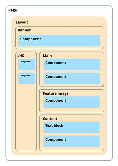
This layout defines:
-
A content zone across the top, labeled Banner.
-
A content zone down the left-hand side, labeled LHS.
-
Three content zones down the right-hand side, labeled Main, Feature Image, and Content.
When a layout is added to a page, the layout can contain other layouts.
For example, in the Content zone in the more complex example, an editor can insert a three-column layout and add text or component blocks to each column.