Best practices for inline editing components
For the smoothest Page Builder experience, make components inline editable.
There are also some specific best practices when designing components with inline editing elements.
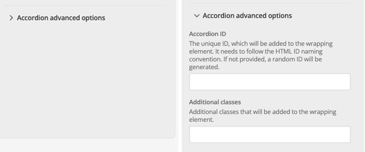
Collapse non-essential fields by default
If a field is unlikely to be edited frequently, consider hiding it by default in the sidebar to keep the editing interface clean and focused for Content Editors.
For example, internal settings like id, className, or technical toggles.

"ui:metadata": {
    "collapsedByDefault": true
}
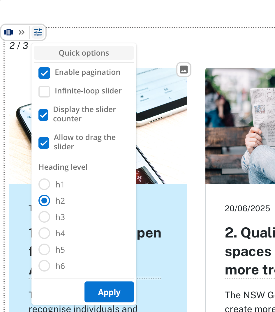
Prioritize essential fields for Quick Edit
Page Builder content page assets display all Quick Edit options within a single panel. The panel can become crowded and harder to navigate if there are too many.
Include only those fields that are relevant for content editors. Fields that are unlikely to be updated frequently — or that control layout or technical behavior — can either be excluded or collapsed by default.

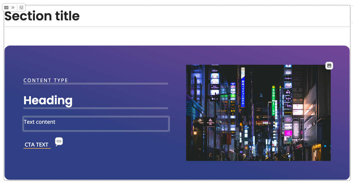
Provide meaningful default values
Giving a default text value for fields like heading, label, or buttonText makes the initial experience smoother for editors.
They will see real content they can select and edit instantly.
The heading appears immediately in the component preview. It makes inline editing available immediately and removes the need to open the sidebar to fill it in.

"heading": {
  "type": "string",
  "title": "Heading",
  "description": "The main heading text.",
  "default": "Heading",
  "ui:metadata": {
    "inlineEditable": true
  }
}
Be explicit about the display mode your component uses
Components can access the ctx.editor boolean attribute within a context object.
This attribute indicates whether a component is being rendered in Page Builder’s display mode or whether it is in editing mode.
Setting the attribute lets a Component Developer conditionally return extra detail specific for the edit interface.
Read more about this mode in the context utility documentation.