Semantic Versioning and Component Services
Component versioning follows the Semantic Versioning (SemVer) principles, as they pertain to Component Services.
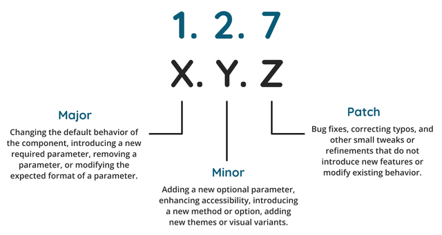
In Semantic Versioning each level of the x.y.z version number hierarchy communicates something specific about the software and it’s relationship with other software.
| # | Name | Core communicated meaning |
|---|---|---|
x |
Major |
Backwards-incompatible changes. |
y |
Minor |
Backwards-compatible changes. |
z |
Patch |
Backwards-compatible bug fixes. |
Why Increment Component Versions?
Versioning is a Component Services requirement.
Once a component is changed, redeploying it under the same version is not possible.
Consequently, all component code modifications — whether it’s an added feature or a fixed bug — require a version increment.
As well, versioning offers security, allowing users in DXP environments to revert to earlier versions if necessary.
Versioning also means the version currently in use is always known.
Finally, versioning enables version comparison, providing insight into the specific changes made between compared versions.
Semantic Versioning in the Component Service
Semantic versioning aims to communicate the nature and extent of changes in a new version.
In the context of Component Service, we tailor SemVer to the scale and context of individual components.
Versioning reflects the evolution of these components, from minor tweaks and bug fixes to significant feature additions and breaking changes.
To illustrate, consider a version number, 1.5.3.
This notation signifies:
-
this is the first major version of the component;
-
which has undergone five minor updates;
-
and three patches.
This numbering tracks the component’s progress and, it is hoped, also signals its maturity and stability to users.
Incrementing a version number
The part of a version number incremented depends on the scale of the change introduced.

| Incremented # | Reasons for incrementing this number |
|---|---|
Major |
|
Minor |
|
Patch |
|
Resetting minor and patch values
In terms of the presented version number, a major update does two things.
It, obviously enough, increments the major value.
It also resets the minor and patch values back to zero.
For example, if a component is at version 3.2.5 and the next release is a major update, the new version number must be 4.0.0.
A minor update changes the presented version number in equivalent fashion, but only with regards the patch value.
For example, if a component is at version 5.12.423 and the next release is a minor update, the new version number must be 5.13.0.
Patch updates only increment the patch value in a version number.
Not incrementing a version number
Versioning is primarily about communicating with end users.
Consequently, not all work done on a component service should change any part of the version number.
For example, none of the the following work should change the component service’s version:
-
adding inline comments to code;
-
correcting typographical mistakes or errors in documentation;
-
incorporating tests in JEST or Cypress.
-
adding presentational CSS.
None of these actions impact the component’s operation. Nor do they affect the component’s functionality. They are not, therefore, reasons to increment any part of the component’s version number.
Version number changes are directly linked to code modification.
structural CSS vs presentational CSS
The section immediately above, Not incrementing a version number, notes that adding presentational CSS to a component is not, of itself, a reason to increment a version number.
Defining presentational here is important. Consider the following:
<h2>${text}</h2>

.h2 {
	font-weight: 900;
	color: red;
}
If the following changes are made —
<h2 class="hello-world">${text}</h2>

.h2 {
	font-weight: 900;
	color: black;
}

.hello-world {
	color: red;
}
— the addition of the hello-world CSS class requires a version number increment.
The addition of a presentational property specific to the new CSS class does not.
Where component version number changes are made
A component’s version is set and updated in the manifest.json file.
In the example below the component’s version is the value of the version field.
{
  "$schema": "http://localhost:3000/schemas/v1.json",
  "name": "testcomp",
  "namespace": "namespace",
  "description": "Component description",
  "displayName": "Test Component",
  "version": "0.1.0",
  "type": "edge",
  "mainFunction": "main",
  ...
}|
Redeploying without incrementing the version number is not possible
As noted in Why Increment Component Versions? above, deploying the same version twice is not possible. Attempting to redeploy a component with the same version number results in an error. |
Beginning Development
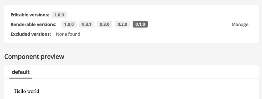
At the earliest development stages it is appropriate to start with version 0.1.0.
For example, consider a proposed component that, when released, will present Hello World inside a <div></div> .
An initial project is created that includes:
-
the files needed for any component to function; and
-
the planned output — the Hello World — included in the appropriate file.
A version of 0.1.0 signals that this component is in the initial stages of development and not ready for production use.
It also, however, represents more than just a concept. This is a first iteration that can be tested and further developed.
Reaching Milestone 1.0.0
Incrementing a component to version 1.0.0 signals to users and other developers that the component is stable and reliable for use in production applications.
Therefore, a component is only ready to be incremented to version 1.0.0 when said component is complete in implementation and ready for production.
Guidelines for determining when a component is complete in implementation and ready for production include the following:
- Stability
-
When the component operates without known bugs affecting its core functionality.
- Feature completeness
-
The component includes all planned features outlined in whatever planning and design documentation was prepared for the component.
- (OPTIONAL) Documentation
-
the README file is complete and edited and all fields in the manifest are accurately described.
- Testing
-
The component has been tested across various use cases and environments.
- Feedback
-
Upgrading to version 1.0.0 should include reviewing feedback from code reviews and stability testing in various environments to ensure it meets expectations.
Deployment
The development mode user interface allows for previewing component inputs and outputs in a fashion similar to those in Matrix proper.
Testing a component in a real environment, using production assets, is, however, encouraged.
As is deploying an in-progress component at virtually any development stage (assuming some working functionality).
In particular, publishing component versions that are not fully functional is entirely possible.
Deploying something like "Hello World" version 0.1.0 demonstrates progress and verifies that all the component’s files are correctly linked and built.

Examples
Versioning component examples at different stages of development are included below.
Example 1: an Accordion component
Consider an Accordion component, beginning with the initial creation of all required files through to a fully operational and ready-for-production component.
- 0.1.0
-
HTML structure added, but the component is not functional yet.
- 0.2.0
-
Scripts that add some functionality added. The component is not, however, production-ready.
- 0.3.0
-
Component styling and adjusting the component HTML structure. The look and presentation are complete, but the component is still not ready for deployment.
- 1.0.0
-
A functioning and stable version, ready for production use. All key features work correctly.
- 1.1.0
-
Addition of a new feature: the ability to configure expansion animations.
- 1.1.1
-
A minor bug found in the operational version is fixed.
Example 2: a long-operational News Listing component
A News Listing component has been operational in production at version 2.10.3 for some time.
An error is found in a manifest field description and is corrected.
The code-related error is a patch-level change.
The version number should be incremented to 2.10.4
Example 3: Adding a new and optional parameter
A UserProfile component, at version 1.4.5, and already used on the production environment across multiple pages.
This component includes the following parameters: username and email.
The 1.4.5 component structure is as follows:
export default {
  async main({ username, email }) {
    return `
      <section class="profile-section profile-section--light">
        <h2>${username}</h2>
        ${email ? `<a href="mailto:${email}">${email}</a>` : ''}
      </section>
    `;
  },
};
A planned update introduces a feature that allows for end-user selecting between dark and light themes.
This will be implemented by adding an optional colorTheme parameter. This parameter accepts two values: light or dark, with a default of light.
After this feature is added, the component’s structure is as follows:
export default {
  async main({ username, email, colorTheme = 'light' }) {
    return `
      <section class="profile-section profile-section--${colorTheme === 'light' ? 'light' : 'dark'}">
        <h2>${username}</h2>
        ${email ? `<a href="mailto:${email}">${email}</a>` : ''}
      </section>
    `;
  },
};
The colorTheme parameter is new but optional. This is a backwards-compatible with the previous version.
The version number should be incremented to 1.5.0.
Example 4: Removing a parameter and replacing it with a new parameter
Still working with the example UserProfile component, updated to version 1.5.0 in Example 3: Adding a new and optional parameter above.
As a consequence of evolving privacy requirements, the email parameter must be removed from the component and replaced with a new parameter, userId.
After implementing this change, the component’s structure will look as follows:
export default {
  async main({ username, userId, colorTheme = 'light' }) {
    return `
      <section class="profile-section profile-section--${colorTheme === 'light' ? 'light' : 'dark'}">
        <h2>${username}</h2>
        <p>${userId}</p>
      </section>
    `;
  },
};
This change replaces the email parameter with a userId parameter, which is a backwards-incompatible change.
The version number should be incremented to 2.0.0.