The FormattedText input type
The Squiz Component Service introduces the FormattedText type for JSON schema, which provides for the entry of rich text that can be styled and formatted using HTML tags and attributes and formatting classes.
Although similar to a WYSIWYG, a FormattedText field more closely aligns with a What You See Is What You Mean (WYSIWYM) input. This means that the type will not be strongly opinionated on how you present and control your formatting and will inject as little inline styling as possible so that it can be controlled using CSS or other design system elements.
Schema definition
To define a property as a FormattedText in JSON Schema, you use the "type" keyword with the value "FormattedText".
"input": {
    "type": "object",
    "properties": {
        "richTextField": {
          "type": "FormattedText",
          "description": "The text to be formatted"
        }
      },
    "required": []
},
This example also demonstrates how to provide a description and title to the FormattedText field for use within the editing interface.
Editing interface
Rich text editor field
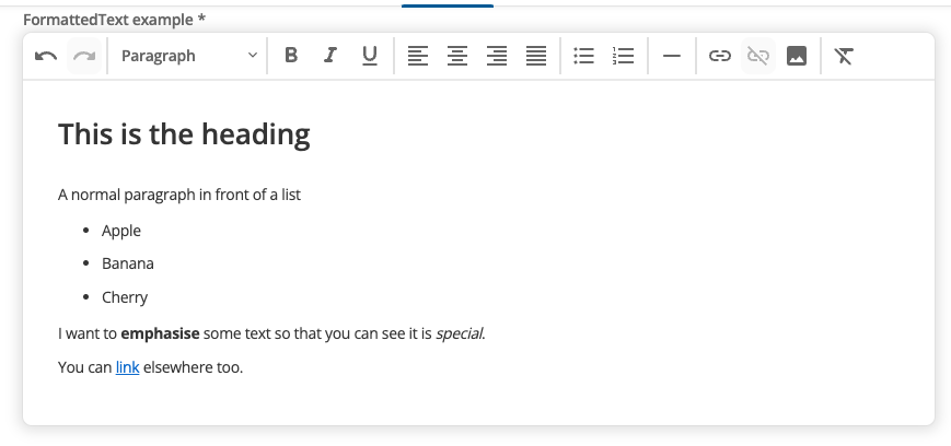
The FormattedText editing interface provides a rich text editor with formatting controls.
Users can apply styling like headings, bold text, and lists without needing to write HTML code directly. The editor outputs clean HTML that integrates with your design system.
Use FormattedText inputs when you need users to create content with formatting like headings, bold text, lists, and links - similar to a word processor but optimized for web content.
Input object structure
The FormattedText input type is available to consume in the main function through the input object. The FormattedText field will output as HTML.
const input = {
  formattedTextField: '<h1>A heading.</h1><p>A paragraph</p><ul><li>List item 1</li><li>List item 2</li></ul>'
};

export default {
  async main(input) {
    return `
      <div class="myFormattedTextWrapper">
        ${input.formattedTextField}
      </div>`;
  },
};|
Use
<div> wrappers for FormattedTextAlways wrap Because |
Default value
|
Best Practice
If you decide to add a default value in your formatted text field, this means that the field can never be left empty when a user saves their changes. Therefore, default values are only recommended for required fields. |
The default values presented in the editor are different from both the typical "string" value, the "preview" text, and preview placeholder hint text in Page Builder.
If you read the Full manifest definition, you will notice that the "preview" text uses HTML. However, the default field values presented in the editor use the Abstract Syntax Tree (AST) format.
"default": [
  {
    "type": "tag",
    "tag": "p",
    "children": [
        {
          "type": "text",
          "value": "Add the"
        },
        {
          "type": "tag",
          "tag": "br"
        }
    ]
  }
]
Default values require data to be structured as an array, rather than as HTML elements used in the component preview data. This requirement is necessary to present information in a way that the WYSIWYM editor can interpret and then render the default value.
Preview placeholder
Use the previewPlaceholder property to show hint text in the Page Builder preview when a FormattedText field is empty.
The property accepts a string or the boolean value true.
-
Set a string to use that text as the placeholder in the preview.
-
Set
trueto use the field’stitleas the placeholder text.
Preview placeholder copy is not saved as field content.
It does not appear on the live site.
It is separate from the default AST value and from HTML used in component previews.
"body": {
    "type": "FormattedText",
    "title": "Body copy",
    "previewPlaceholder": "Add body copy here",
    "ui:metadata": {
        "inlineEditable": true
    }
}"intro": {
"type": "FormattedText",
"title": "Introduction",
"previewPlaceholder": true
}If you set both default and previewPlaceholder on the same field, the preview shows the default when the component is first added.
If the editor deletes that content, the field is empty and the preview shows the preview placeholder instead.
See Placeholder content for editor behaviour, use with defaults, and the JavaScript alternative for complex previews.
Full manifest definition
Expand to see the manifest.json file with a formatted text input field
{
  "$schema": "http://localhost:3000/schemas/v1.json",
  "name": "myFormattedText",
  "version": "1.0.0",
  "type": "edge",
  "mainFunction": "main",
  "displayName": "FormattedText example",
  "namespace": "formatted-text-component",
  "icon": {
  "id": "list_alt",
  "color": {
    "type": "hex",
    "value": "#2D2D2D"
    }
  },
  "description": "This component is set up as a demonstration component for documentation purposes.",
  "functions": [
    {
      "name": "main",
      "entry": "main.mjs",
      "input": {
        "type": "object",
        "properties": {
          "formattedTextExample": {
            "type": "FormattedText",
            "title": "Rich text editor",
            "description": "Allow free entry of formatted text"
          }
        },
        "required": []
      },
      "output": { "responseType": "html" }
    }
  ],
  "previews":
    {
      "firstpreview": {
        "functionData": {
          "main": {
            "inputData": {
              "type": "inline",
              "value": {
                "formattedTextExample": "<h1>A heading.</h1><p>Example paragraph text</p><ul><li>List item 1</li><li>List item 2</li></ul>"
              }
            },
            "wrapper": {
              "path": "preview-wrapper.html"
            }
          }
        }
      }
    }
   }