File structure
| Want an interactive way to learn about components? Check out the DXP Component Library for best practice examples. |
A component is made up of a set of files organized into a directory, with at least a manifest.json file and a JavaScript file.
Generally, a set of components is stored as a set of multiple directories and deployed into a single Git repository, making it easy to collaborate on a collection of components that form an implementation of a design system.
All the files and all the resources must be in the same directory as the manifest.json file, or in a child directory of that directory.
Using matrixAssetTypes to restrict file types
You can specify which file types are valid for fulfilling a particular field in your component by defining a matrix-asset-uri input type in the manifest.json file.
The code below limits the valid file types for the relatedFile field to PDF, audio files and general files:
"input": {
"type": "object",
"properties": {
"relatedFile": {
"type": "string",
"title": "Related File",
"format": "matrix-asset-uri",
"matrixAssetTypes": ["pdfFile", "audioFile", "file"]
}
},
"required": [
"relatedFile"
]
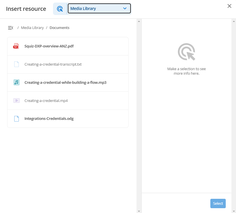
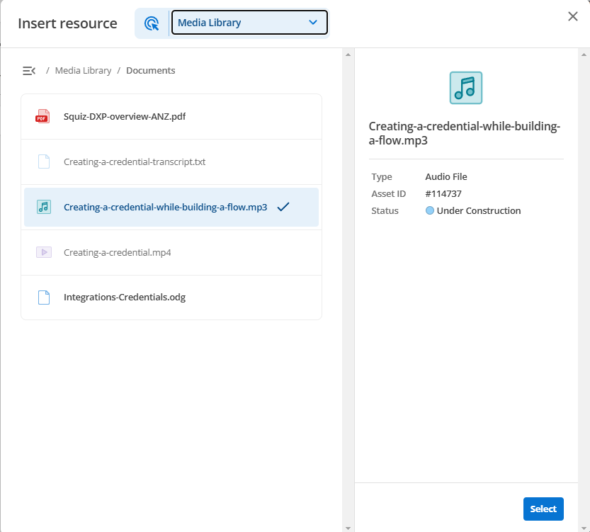
}Files present in the resource location that are not valid will still be visible in the UI but will not be selectable:
The nominated matrixAssetTypes can be any one or more of the following:
-
audioFile
-
bodycopyContainer
-
bodycopyDiv
-
calendarEventsSearchPage
-
contentContainerTemplate
-
contentTypeMarkdown
-
contentTypeNestContent
-
contentTypeRawHtml
-
contentTypeSnippet
-
contentTypeWysiwyg
-
cssFileFolder
-
cssFile
-
customForm
-
dataRecord
-
designAreaAssetLineage
-
designAreaBody
-
designAreaMenuNormal
-
designAreaNestContent
-
designCssCustomisation
-
designCss
-
designCustomisation
-
designScss
-
design
-
docx
-
excelDoc
-
file
-
folder
-
gitBridge
-
googleAnalyticsConnector
-
googleAnalyticsView
-
image
-
jsFileFolder
-
jsFile
-
jsonWebToken
-
layoutManager
-
layout
-
link
-
metadataFieldDate
-
metadataFieldRelatedAsset
-
metadataFieldSelect
-
metadataFieldText
-
metadataFieldWysiwyg
-
metadataSchema
-
metadataSection
-
newsItem
-
oauthAccountManager
-
pageAccountManager
-
pageAssetListing
-
pageCalendarEventsSearch
-
pageCalendar
-
pagePasswordReset
-
pageRemoteContent
-
pageRestResourceJs
-
pageRestResourceOauthSession
-
pageRestResourceOauthTwoLegged
-
pageRestResource
-
pageSiteMap
-
pageStandard
-
paintLayoutBodycopy
-
paintLayoutPage
-
pdfFile
-
pdf
-
persona
-
powerpointDoc
-
pptx
-
redirectPage
-
regex
-
regularExpression
-
rtfFile
-
samlAccountManager
-
saml2Acs
-
saml2Sls
-
searchPage
-
site
-
textFile
-
TriggerTypes?
-
userGroup
-
wordDoc
-
workflowSchema
-
workflowStepCondition
-
workflowStep
-
workflowStream
-
xlsx
-
xmlFile
ES Modules
Component Service uses ES Modules (ESM) and adopts either the .mjs or .js file extension for the entry file.
Read the Components at Edge tutorial for more information.
JavaScript files
JavaScript files are used to render your component. Usually, you will have one main entry file (for example main.mjs).
It is also important to ensure that any libraries you use are intended to be used outside the browser, such as in a Node.js environment.
For example, JavaScript executed server side will not have access to a window object.
The following example shows a simple component entry file that outputs one of the values of your component:
export default {
  async main({ entryfield }) {
    return `
    <div>
      <h2>${entryfield}</h2>
    </div>`;
  },
};
This JavaScript file would output the text value of entryfield as defined in the manifest file above.
The first argument to the function contains the input values defined in your manifest, which are used to generate the editing form.
For Edge components, a second info parameter provides environment variables and helper functions; see the Change to component context documentation.
Preview files
Preview files can be used to mock inputs to your component for local testing previews and deployed previews for demonstrating components in the DXP console. Preview data is in a JSON format, while the preview wrapper is an HTML file used for providing additional context to display your component in.
Read Preview components for more information about the preview files.
Inline editing and added complex behaviors
When you build components with inline editing and add complex actions, like event handlers to FormattedText fields, they will not work in the Visual Page Builder preview column unless you put a wrapper element around the field.
Attach the event handler to the wrapper instead.
Attaching an event handler to the <div> around the FormattedText field for a quote will not work.
<div data-sq-field="quote"> (1)
  ${quote}
</div>| 1 | Event handlers attached here will not work. |
We need to add a <div> wrapper element around the code and attach the event handler to it instead.
<div class="wrapper">  (1)
  <div data-sq-field="quote">
    ${quote}
  </div>
</div>| 1 | Attach event handlers to this div instead. |