Basic features
There are three main features of the Component Service:
-
The Component library that allows web or digital administrators manage components and design systems.
-
Component editing in Content Management that allows content editors to work effectively and build landing pages.
-
Local development of components which allows developers to develop and test components locally
Component types
Components can be divided into three categories:
-
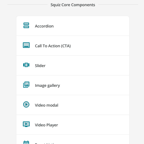
Core components
-
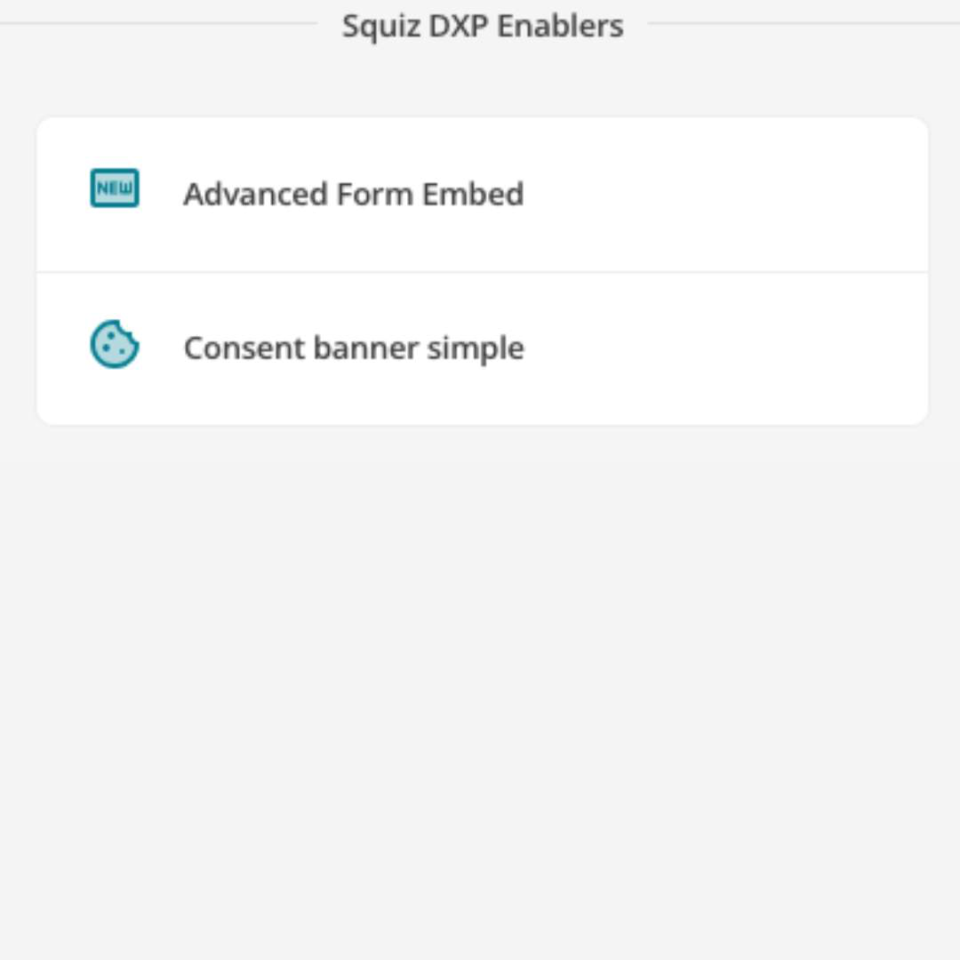
DXP enabler components
-
Custom-built components
| Core components | DXP enablers | Custom-built components |
|---|---|---|
|
|
|
Available as part of DXP subscriptions. Built and maintained by Squiz. Used on standard and content pages by Content Editors to build out most web pages. |
Available as part of DXP subscriptions. Built and maintained by Squiz. These components connect with other DXP capabilities or services to provide cross-service functionality. |
Custom-built components are built to serve more specific needs. Built and maintained by in-house developers or Squiz Professional Services developers using the Component Service. |
Example usage: Use the image gallery core component to display visual content on a page. |
Example usage: The form embed component enables the embedding of a Squiz Advanced Forms form on a page. |
Example usage: Your organization might build a component for use on an internal page that displays quick links to other cloud applications, for staff access. |
Component examples
| Design system components | Complex components | Data-driven components | Search components |
|---|---|---|---|
|
|
|
|