Placeholder content
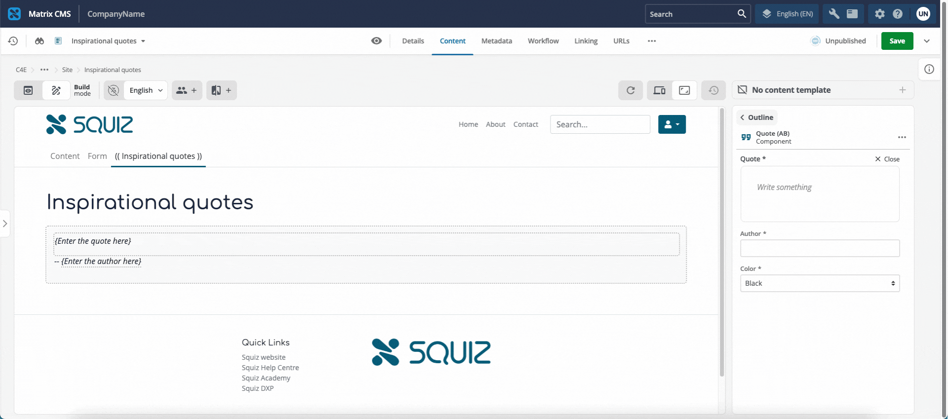
When you add a component from the page outline column, the new component displays in the preview column. If a field has not yet been given a value, the preview can omit it (for example, a heading).
Placeholder text signals to editors that they must replace placeholder copy with real content. This placeholder content can also include short instructions about what to enter.
Placeholder text is not the same as the field’s default value. A default is stored with the component and can appear on the live site. Preview placeholder copy appears only in the Page Builder interface while the field is empty.
Use previewPlaceholder in the manifest
Add the previewPlaceholder property to string and FormattedText fields in manifest.json.
The property accepts either a string or the boolean value true.
-
When you set a string, that value is the placeholder text shown in the preview.
-
When you set
true, the placeholder uses the field’stitlevalue.
"heading": {
  "type": "string",
  "title": "Heading",
  "previewPlaceholder": "Enter a heading",
  "ui:metadata": {
    "inlineEditable": true
  }
}"body": {
"type": "FormattedText",
"title": "Body copy",
"previewPlaceholder": true,
"ui:metadata": {
"inlineEditable": true
}
}For full property details, see string preview placeholder and FormattedText preview placeholder.
Editor behaviour
When a field is empty, the preview shows the placeholder text so editors can start inline editing immediately.
When an editor selects the field to type, the placeholder disappears.
If the editor clears the field again, the placeholder returns.
If the editor types text that matches the placeholder string, that text is saved as real content. It is not treated as placeholder copy on a later edit.
Using default and preview placeholder together
You can set both default and previewPlaceholder on the same field.
When the component is first added, the preview shows the default value.
If the editor deletes that content, the field is empty and the preview shows the preview placeholder instead.
Placeholder text in component JavaScript
For most situations, previewPlaceholder is enough to enable inline editing.
It is the recommended approach.
If your use case is more complex or includes dynamic or interactive elements, you may choose to substitute display text in main while Page Builder renders the preview.
For example, you might need a hover control to appear in edit mode even when the underlying field is empty.
Use the editor property on info.ctx to detect a Page Builder render.
Substitute placeholder copy only when editor is true so site visitors do not see that copy on the live site.
export default {
  async main({ name }, info) { (1)
    const componentContext = info?.ctx || null; (2)
    const squizEdit = componentContext?.editor || false; (3)

    if (squizEdit) { (4)
      name = name || 'Default name';
    }

    return `<div>
      <p>${name}</p>
    </div>`;
  }
}-
Make sure you have access to the additional argument
infofor themainfunction. Figure 2.
mainfunction with theinfoargument. -
Access the
ctxobject from theinfoargument. Figure 3. Reading
ctxfrominfo.The
ctxobject contains information about the context in which the component is being rendered, including whether the component is being edited in Page Builder. See Set editing mode (ctx.editor) for other legitimate uses of this flag. -
Determine whether the component is being rendered inside Page Builder using the boolean
editorproperty. Figure 4.
editordistinguishes Page Builder from live-site renders. -
Provide placeholder text only when
squizEditis true.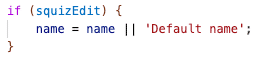 Figure 5. Placeholder copy only when
squizEditis true in Page Builder. -
When
squizEdit === true, substitute placeholder text (for example,Default name) if the editor has not entered a value.