Collapsed by default
Some components can have a large number of settings that an editor can modify to control how the component displays. A long list of properties in the page outline column can make it more difficult for an editor to find a specific field.
The component manifest can group related properties together so that they can be collapsed and expanded. Collapsed groups reduce scrolling when an editor searches for a field.
This option creates two interface management options:
-
Configure
collapsedByDefaulton all groups so that all settings groups are collapsed when an editor opens them in the page outline column. This method lets editors quickly find the group that contains the setting they need to edit.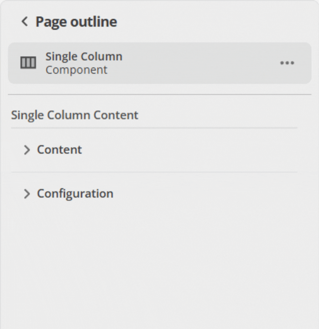 Figure 1. Object groups with
collapsedByDefaultstart collapsed in the page outline. -
Alternatively, keep the properties that are most often changed together in a single default-expanded group, and set
collapsedByDefaulton the other groups. This method keeps commonly used settings within reach and keeps lesser-used settings out of sight until needed.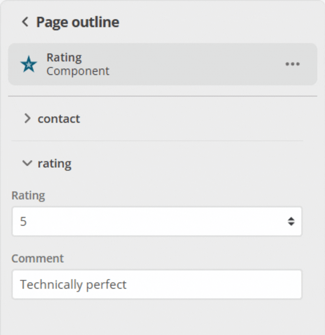 Figure 2. Expanded object group in the page outline.
If the component has a group of inputs (where the parent object has "type": "object"), you can specify whether this group of inputs appears collapsed by default in the page outline column.
The change needed to enable collapsed by default is an addition to the ui:metadata section of the manifest.json file.
"ui:metadata": {
  "collapsedByDefault": true
}
A complete example of a single object property (contact) group is shown below:
"type": "object",
"properties": {
  "contact": {
    "type": "object",
    "required": [
      "name",
      "email"
    ],
    "properties": {
      "name": {
        "type": "string",
        "title": "Name"
      },
      "email": {
        "type": "string",
        "title": "Email",
        "format": "email"
      }
    },
    "required": [],
    "ui:metadata": {
      "collapsedByDefault": true
    }
  }
}
When this component is added to a content page and expanded in the page outline column, the group of objects it contains is collapsed by default. Each time this component is selected or expanded in the page outline column, it collapses again. The page outline column does not remember the last expanded or collapsed state for that selection.