About the editing experience
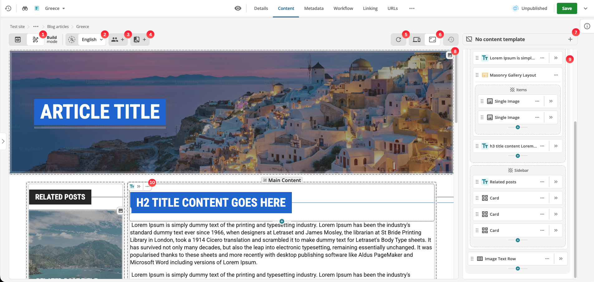
The Page Builder interface provides a range of editing tools and features to customize your page content and structure on a content page. Content can be managed in two ways:
-
inline via the Preview column column
-
via the Page outline column column
| The Template Builder provided by the content template asset uses the same interface as the Page Builder, with some differences described in Template Builder vs Page Builder. |
|
View or edit content
As the adjoining label suggests, the Preview and Build buttons toggle a content page between a Preview of the page material and the Page Building or Editing mode.
The annotated screenshot above shows the Build view, complete with Page outline column column, block element markers, and an Capsule control editing control in the top left-hand corner of a block element.
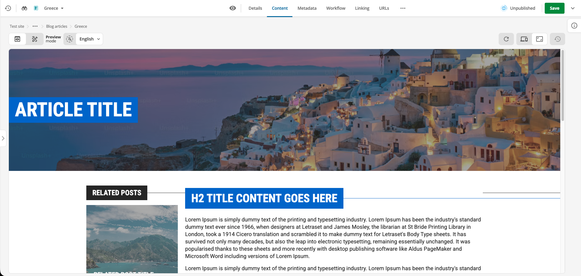
The unadorned screenshot below shows the Preview mode, with the Page outline column column hidden, and the content presented without block markers or the Capsule editing control.
Translations
Click the Translations button to reveal the Translations menu. The menu presents the available languages for the current content page.
Read more about translations in the Translations documentation.
Personalization
Click the Personalization button to reveal the Personalization menu.
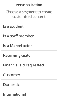
Personalization is used to create variants that show different content depending on what segment a website user opts into.
What options appear in this menu depend on what personalization segments are set up using the Personalization tools.
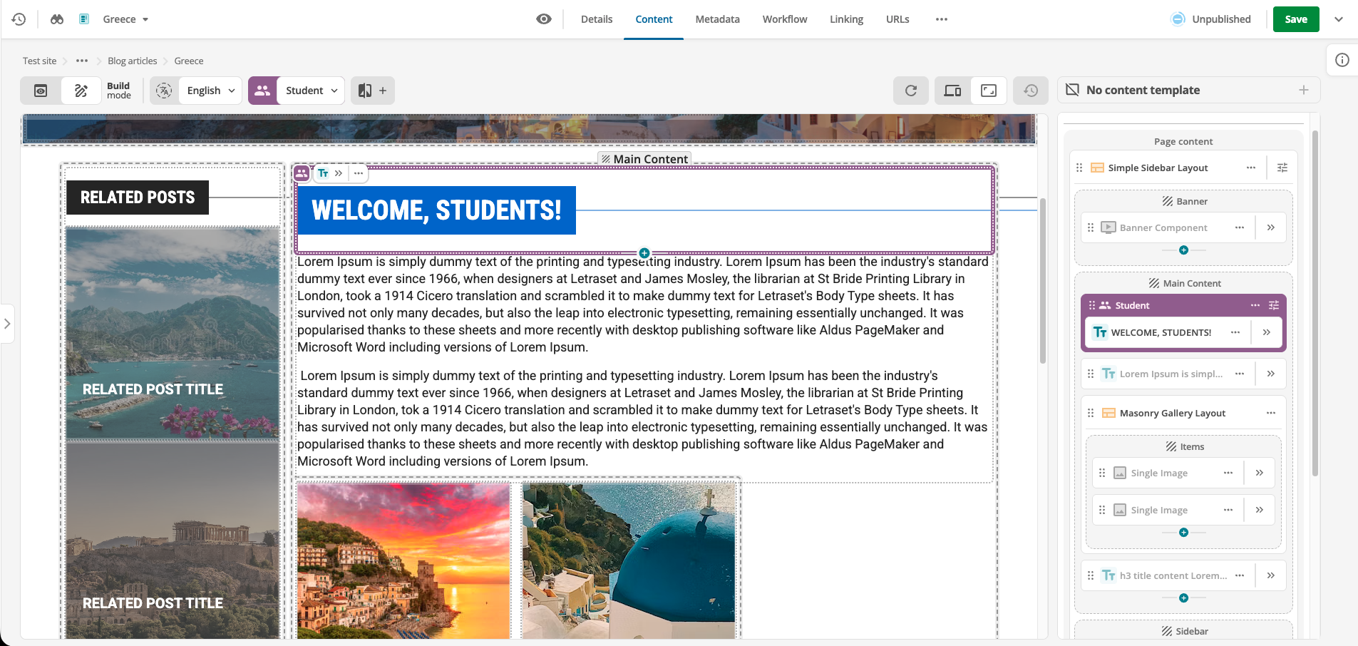
When a given personalization is selected, both the View and Edit content toggles preserve the selection and consequent presentation.
So, for example, if a page has a default presentation and a specific presentation for anyone who matches the is a student criteria, when is a student is selected from the Personalization menu, the is a student page variant is presented in the View and Edit modes.
See Understanding personalization segments for details regarding how content variation order affects what segment is shown to website users.
|
Personalization effects editing options
When Personalization is in use, content page editing options and UX are affected. The Personalization menu selection restricts the blocks available for editing to those associated with the menu selection. If, for example, the current Personalization menu choice is Is a student, only blocks set as for Is a student can be edited. |
A/B testing
The Add A/B test button provides access to controls for adding, removing, and changing A/B tests (also known as split or bucket testing) on the current page.
Add an A/B test
Click the Add A/B test button to load the Add A/B test to page dialog.
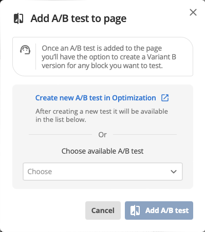
See A/B testing for details on setting up A/B tests.
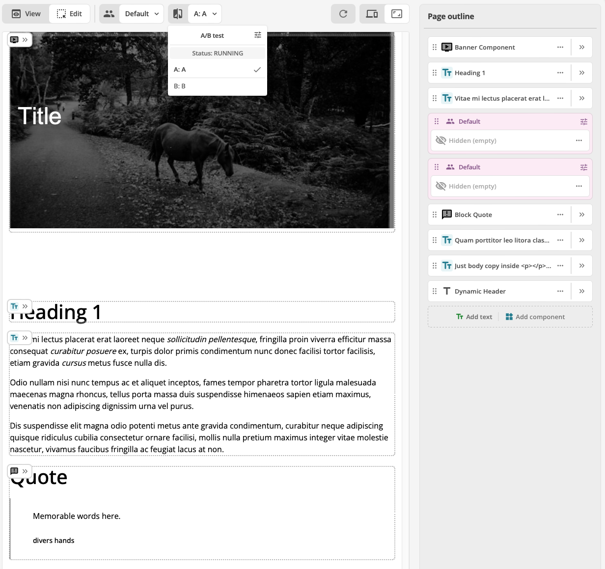
If a content page has an A/B test connected, the A/B testing menu is always active and the first option (the A in A/B) is selected by default.
|
Test names
By default, an A/B test has two options, named Variant A and Variant B by default. These names can be customized, however. If the names are customized, the customized names will appear in the button:[A/B test] menu. |
Remove an A/B test
To remove an A/B test
-
Open the A/B test menu
-
Click the Settings button.
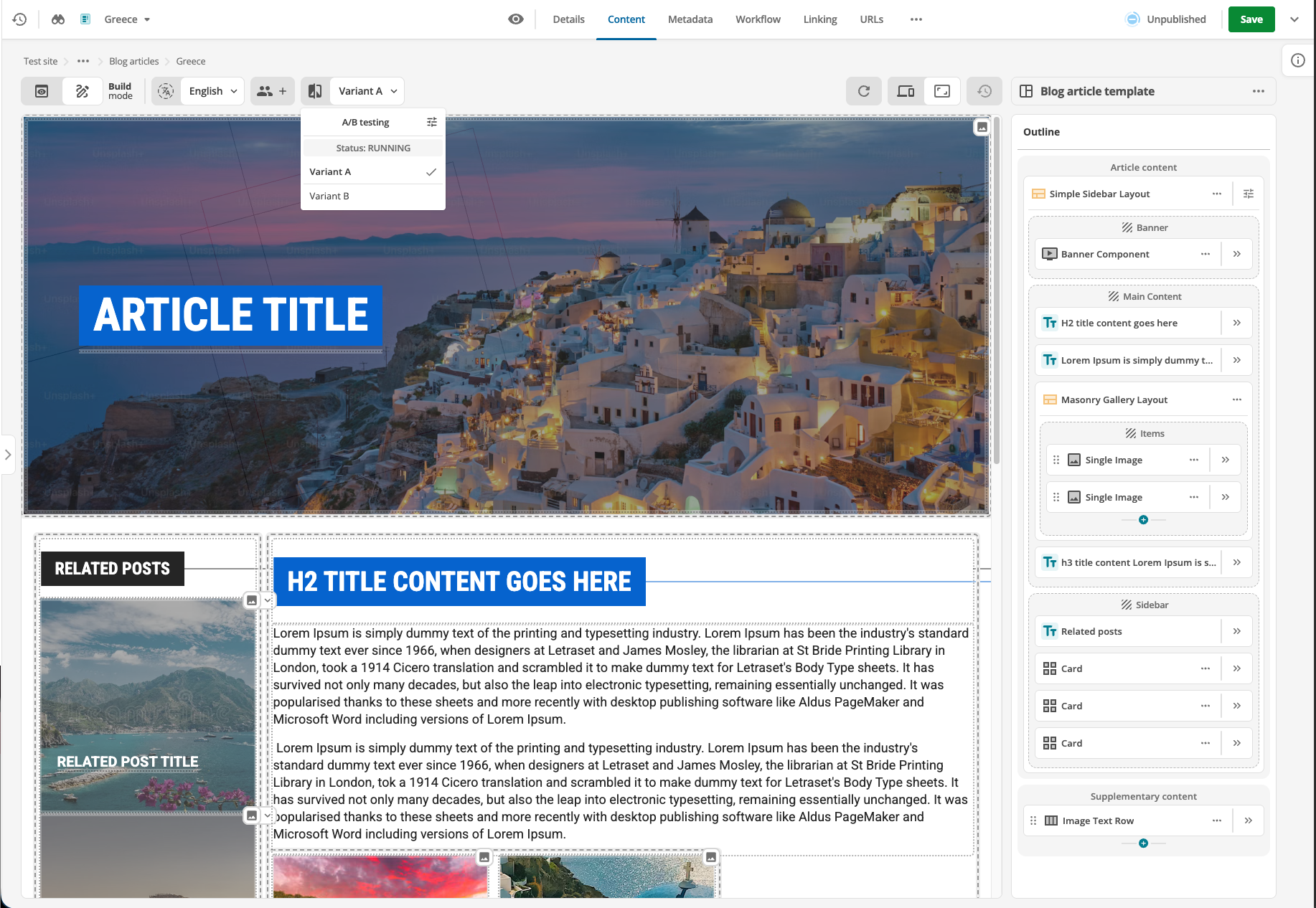 Figure 7. A/B test menu with an A/B test running and the settings icon highlighted.
The Page settings for A/B test dialog presents.
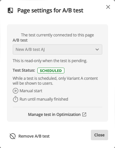 Figure 8. Page setting for A/B test dialog
 -
Click the Remove A/B test button.
The Remove A/B test from page alert presents.
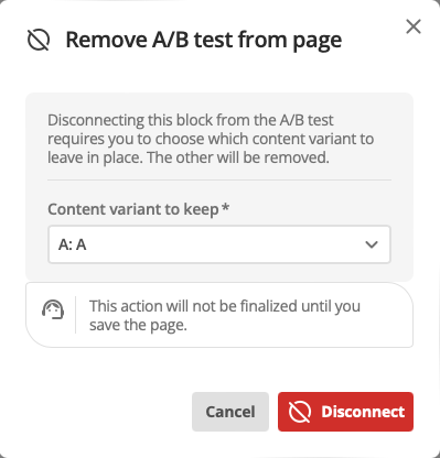 Figure 9. Remove A/B test from page dialog
 -
Click the Disconnect button.
Change an A/B test
To change from one A/B test to another
-
Use the add A/B test procedure to setup a new A/B test.
Update preview
The Update preview button, as its name suggests, reloads the Preview column and updates any and all changed content blocks.
Size toggle
The Size buttons toggle the Preview column between two views: Full size and a user-defined Custom size.
When the Custom size button is selected, a text-entry field presents.
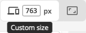
Enter the desired column width, in px, and press Return to set the Custom size.
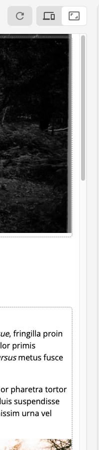
Alternatively, use the re-size handle that presents when the Custom size button is active to re-size the Preview column.

|
The five controls noted above constitute the Actions toolbar. It is always present above the Build/Preview column. |
Template selector
The template selector allows page editors to add, change or remove a template.
It displays the currently applied template name, or "No content template" if no template is applied.
Read more about templates in the Templates documentation.
Preview column
The Preview column is a view of how the page will look when saved and made available as part of a site.
In Edit view, each component, text block and layout zone is delimited with a dotted outline. As well, a Capsule button presents in the top left-hand corner of each outlined component or text block when the pointer hovers over the component or text block.
|
The Capsule control
The Capsule control presents differently, depending on the current editing context. See Capsule control for details. |
In Preview view, the Content column expands and presents the page almost identically to how it will appear when made available as part of a site.
Clicking a particular Open edit panel button opens the edit panel for that particular component or text block in place of the Page outline column column. (Clicking this button is equivalent to clicking the Edit control for a component or text block in the Page outline column.)
Inline editing
Text blocks — blocks added to a page with the Add text button — can also be edited inline.
To edit a text block inline click anywhere in the block to make the block active.
The editing toolbar presents at the top of the Preview column view.
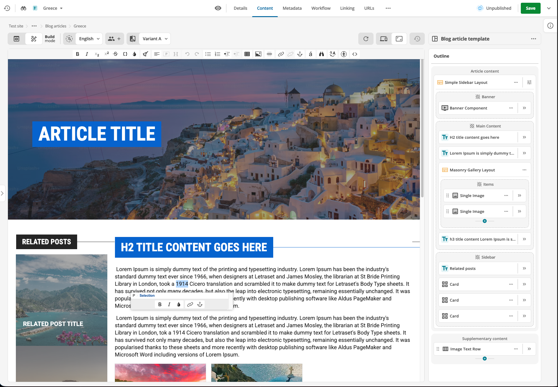
As well, if the selection in the text block is non-empty (that is, if text in the text block is selected) a contextual formatting menu presents immediately below the selection.
|
Contextual formatting menu not appearing
If the selection in a text block is too close to the bottom edge of the browser viewport, the contextual formatting menu does not present. |
Preview column block colors
When Personalization is applied to a component or text block, and when a component or text block is subject to A/B testing, the outline markers associated with the component or text block change color to visually signify the block’s customization.
Page outline column
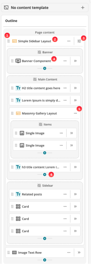
The Page Outline column presents the page’s components and content blocks, in rendering order.
Each presented component or block in the outline presents a label and three user controls and an information label.
-
Drag handle
Click and hold on this control and then drag the component or block to change its place in the page outline.
-
Layout name
The name of the layout. To customize the name, see Rename a content item.
-
Layout settings
Click the Settings button to reveal the layout settings dialog. Layout properties can be configured here.
-
Component name
The name of the component. To customize the name, see Rename a content item.
Text blocks, including headings and sub-headings, by default are not explicitly named in the outline.
Instead, the first line of copy in the text block is presented here.
Empty text blocks are, however, named as Text block.
For labelling purposes, a text block is treated as empty if it only contains non-printing characters, such as Return and space characters.
To customize the name for a text block, see Rename a content item.
-
Options
When this control is clicked, a menu of component, layout, or text-block–specific options presents.
If a component is selected, clicking this option presents a menu with four available commands: Rename, Move, Component info and Delete.
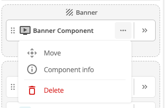 Figure 15. Options menu for components.
-
Selecting the Rename command presents the Rename dialog.
-
Selecting the Components info command presents the View component information dialog
-
Selecting the Delete command deletes the selected object.
If a layout is selected, clicking this option presents a menu with four available commands: Rename, Move, Layout info and Delete.
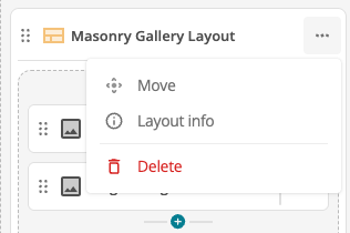 Figure 16. Options menu for layouts.
-
Selecting the Rename command presents the Rename dialog.
-
Selecting the Layout info command presents the Layout information dialog
-
Selecting the Delete command deletes the selected layout, and any content stored within its zones.
If a text block is selected, clicking this option presents a menu with three available commands: Rename, Move and Delete.
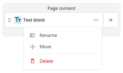 Figure 17. Options menu for text blocks.
-
Selecting the Rename command presents the Rename dialog.
-
Selecting the Delete command deletes the selected object.
There is no confirmation or warning dialog when the Delete command is selected.
Selecting the command deletes the object immediately.
-
-
Edit
When this control is clicked, the Page outline column is replaced by an edit UI for that component.
To exit the editing UI and return to the Page outline view, click the ❮ Outline button — as highlighted in the screenshot below.
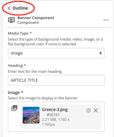 Figure 18. Editing UI view with the return to Page outline view control highlighted.
 -
Add a text block or component
Click the Add text button to add a text block to the end of the existing Page outline.
See Add formatted text to a content page for more.
Click the Add component to open the Add component dialog.
See Add a component block for more.
|
Keyboard navigation and control of objects in the Page outline column
When a component or text block is selected in the Page outline column, the user controls can be navigated and activated using Keyboard shortcuts. |
Capsule control
The Capsule control presents at the top of a content or component block when the pointer is hovering over that block.
See Capsule control for details on the multiple ways the Capsule presents and the utility available in these presentations.