Tabs
Use the tabs component when you wish to format a set of options in tabs on a page.
| The tabs component does not allow you to nest other components within the tab content. |
Add the component to your page
When you are editing your page using page-builder:
-
Add a component to your page by clicking the Add component button or by adding a content block (by clicking the button) then clicking the add component button.
-
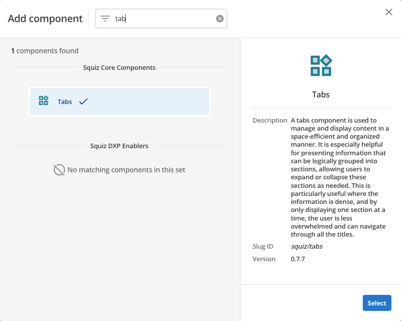
Locate the tabs Squiz core component within the component browser and then click the Select button.
-
This will add the tabs component to your page.
Configure the tabs component
-
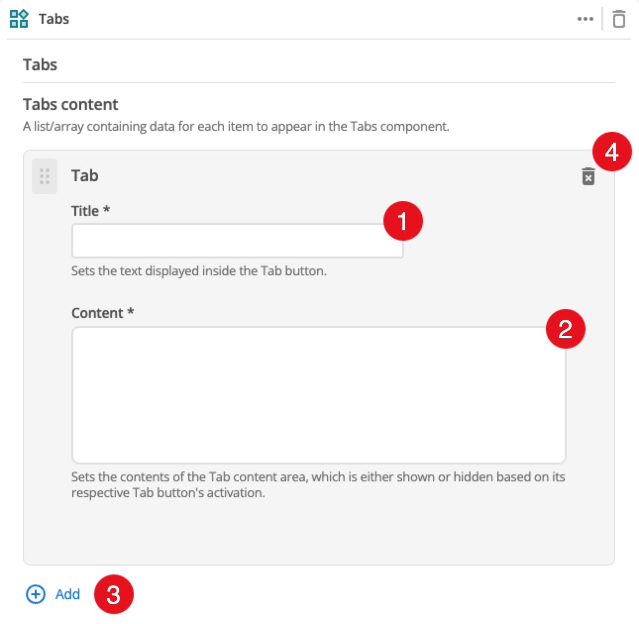
Click the add button to add additional tabs. Each tab is configured using a dedicated card as shown above. This is covered in the Tab configuration section.
-
When enabled, this option displays a button if there are too many tabs to display in the available space.
-
Controls the tab placement above the tab content panel.
-
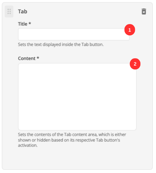
This can be used to select the default tab to make active when the page loads.
-
(Optional) This allows you to add a unique ID into the HTML markup to the instance of the component so that you can add custom styling and functionality using CSS and javascript respectively.
-
(Optional) This allows you to add a class into the HTML markup to the instance of the component so that you can add custom styling and functionality using CSS and javascript respectively.