Collapsed by default
Components can have many settings that an editor can modify to change how the component is displayed.
This can make locating the required property in the page outline column complicated and time-consuming.
If a component’s properties are placed into an input group (that is, the parent object is "type": "object",) you can specify whether or not that input group appears collapsed by default in the page outline column.
For example, a component manifest can group related properties. These related properties can then be presented as collapsed or expanded.
A component’s settings can, for example, be set to present all input groups as collapsed. This allows the editor to expand only the group they need.
Alternatively, a component manifest can place the properties most likely to be modified into a single group and set this group to be expanded by default, with other property groups set as collapsed by default.
Component changes
To put component settings into input groups, add the "collapsedByDefault": true key-value property to ui-metadata in the manifest.json file.
ui-metadata is an optional property that can be added to the component input properties on a manifest by a developer.
The values specified for this property informs the interaction behavior of the component in the Page Builder interface for a content editor.
This property is a non-breaking change that will not affect the component being used on standard pages.
The default value for collapsedByDefault is false. If this property is not explicitly set (or is explicitly set to true), the component’s settings are presented as expanded.
manifest.json file changes
A simple example:
"ui:metadata": {
    "collapsedByDefault": true
}
A more complete example of a single object property (contact):
{
"type": "object",
"properties": {
"contact": {
"type": "object",
"required": [
"name",
"email"
],
"properties": {
"name": {
"type": "string",
"title": "Name"
},
"email": {
"type": "string",
"title": "Email",
"format": "email"
}
},
"required": [],
"ui:metadata": {
"collapsedByDefault": true
}
}
}
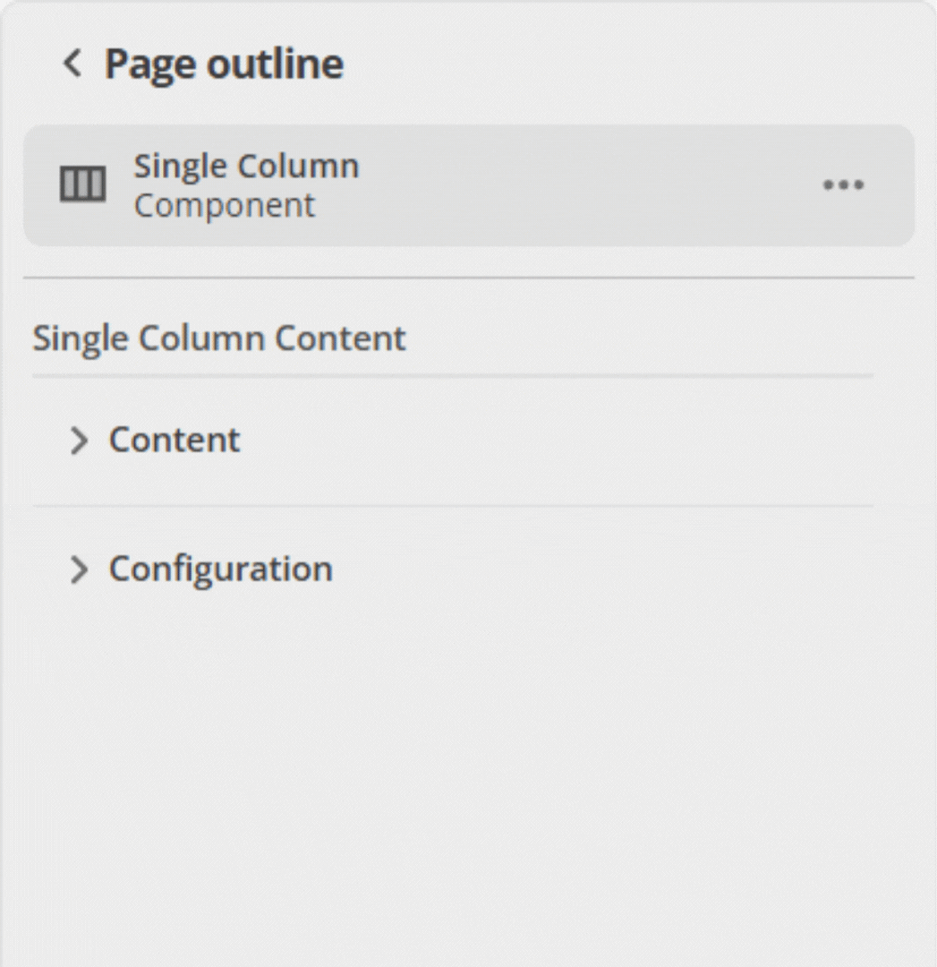
}When this component is added to a content page and expanded in the page outline column, this group of objects is collapsed by default.
Each time this component is expanded in the page outline column, it will also be collapsed.
That is, it does not maintain your last expanded/collapsed state.