Step indicators
A step indicator visually indicates where users are in the form-filling process.
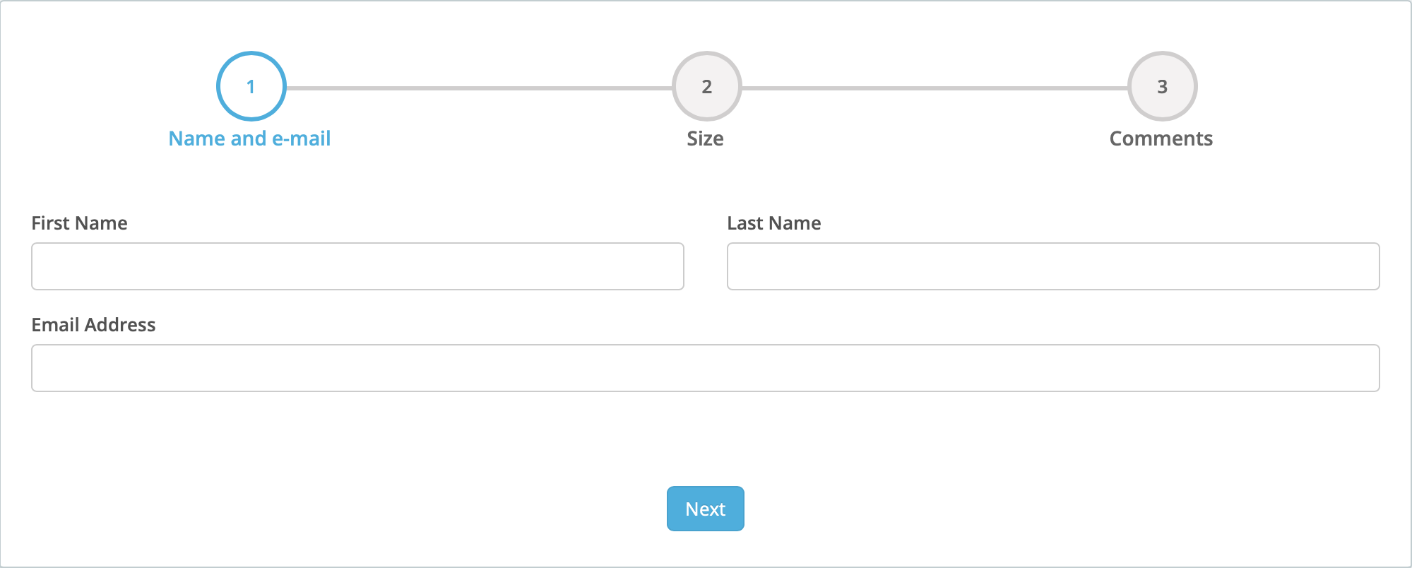
Consider a three-step form as follows.
-
The form consists of three steps:
-
Name and e-mail;
-
Size; and
-
Comments.
-
-
The Size field must have a value.
Using the default presentation options, the first step of the form presents as follows:
After these fields are filled out and the Next button is clicked, the second step of the form presents as follows:
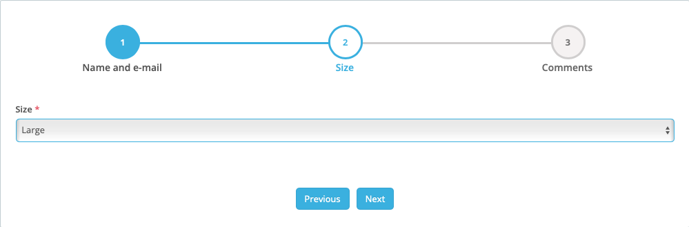
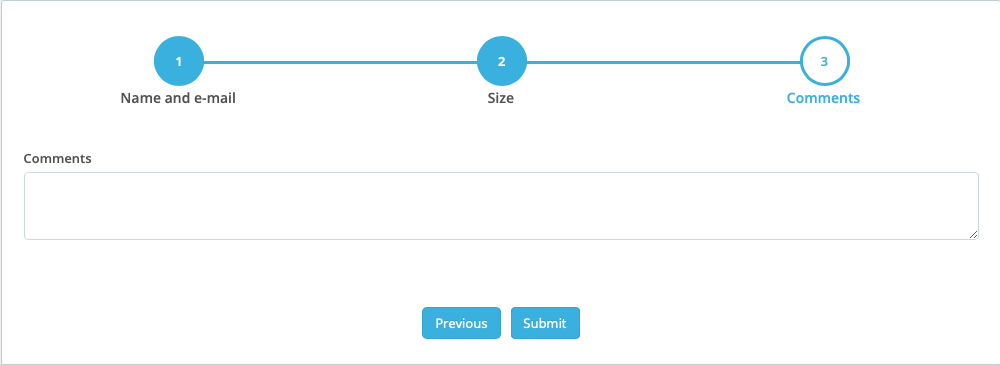
Next, setting a value for the Size field and clicking the Next button presents the form’s third step as follows:
|
Step indicators and progress bars
Step indicator is the UI/UX term of art for the user-interface element that indicates what steps of a multi-step procedure are done and what steps are still to do. Progress bar is the UI/UX term of art for the user-interface element that visualizes, in real-time, the state of an in-progress operation. In this documentation, this element is referred to by its normative name: Step indicator. In the application UI, however, the element is idiosyncratically referred to as a Progress bar. When the application UI is documented, the idiosyncratic usage is quoted. |
Add a step indicator
To add a step indicator to an existing form, on the Advanced Forms Dashboard page, click Edit in the Actions column of the form to be edited.
Then
Add page breaks
-
Drag the Page Break element from the Design elements section of the Form Fields tab to the position in the form marking the end of one step and the beginning the next.
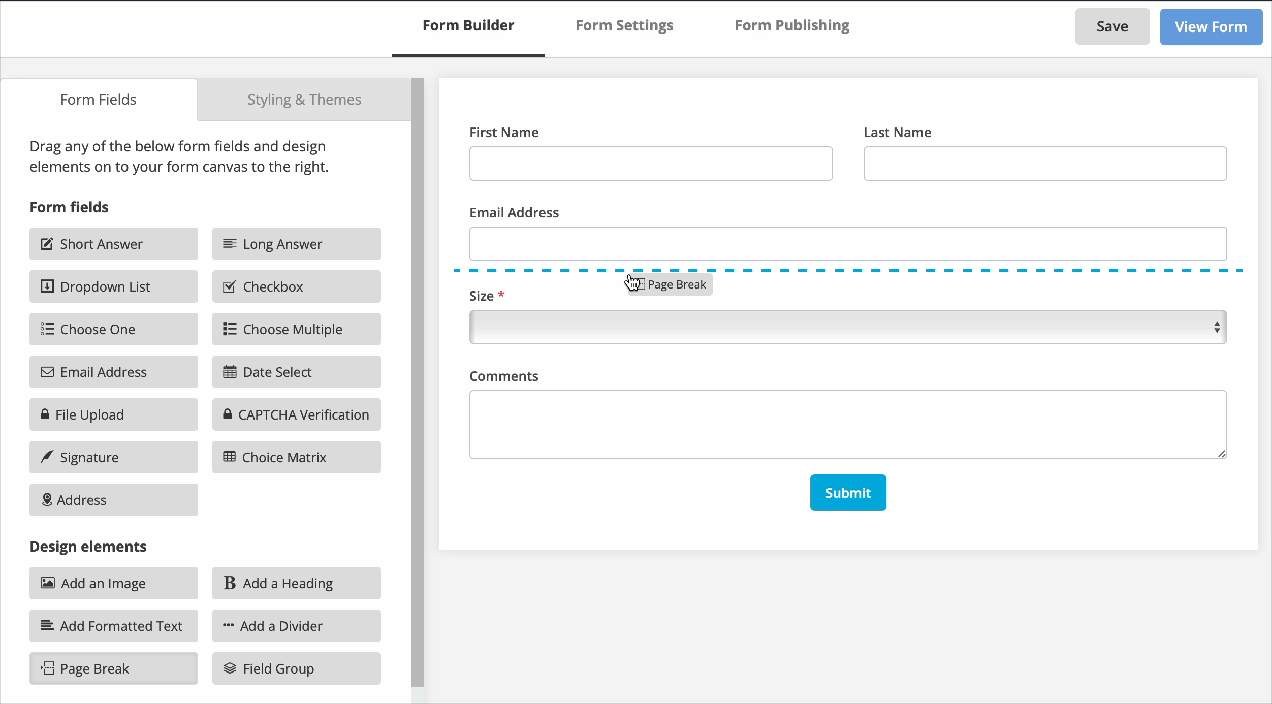 Figure 4. Dragging a Page Break component on to a form.
 -
(Optional) Click the Show Advanced Options button and set the options presented there as wanted.
-
In particular, set the automatically save an incomplete form response when the user passes this page option to automatically save user input as they move from one page to the next.
See Viewing incomplete form responses for more.
-
-
Click the Save & Close button.
-
Repeat steps 1 through 3 for each required step indicator.
-
Click the Save button.
-
(Optional) Click the View Form button to view the form and test the multi-page process.
Add step indicators
-
Click the Form Settings tab.
-
Click Usability.
-
In the General section, select the Enable progress bar for multi-page forms checkbox.
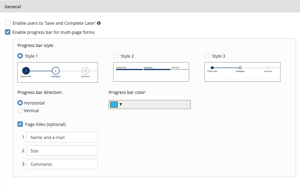 Figure 5. The Progress bar style section in the General section
 -
In the Progress bar style section, select a Style
-
Style 1 — a set of numbered and named steps — is selected by default.
-
-
Set the Progress bar direction
-
This is set to Horizontal by default.
-
-
Select a Progress bar color.
-
Optionally, check the Page titles checkbox.
When this checkbox is checked, text-entry fields appear immediately below the checkbox. The number of presented text-entry fields is the number of page breaks (that is, the number of steps) in the form being edited.
The screenshot shows optional page titles added to a three-step form.
-
Click the Save button.
Add conditional logic to multi-page forms
Conditional logic hides fields and other design elements in a form until other field conditions are met.
Show a field only if another field meets a preset condition
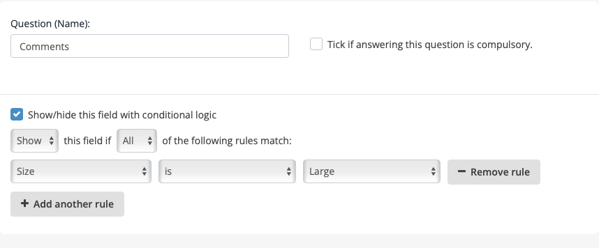
In the 3-step form set out earlier, the following logic hides the Comments field unless the Size field has a particular value.
|
In this example, because the Comments field is the only field on the form’s third step (or page), hiding the Comments field also hides the form’s third page. |
Prevent form users from proceeding until certain field conditions are met
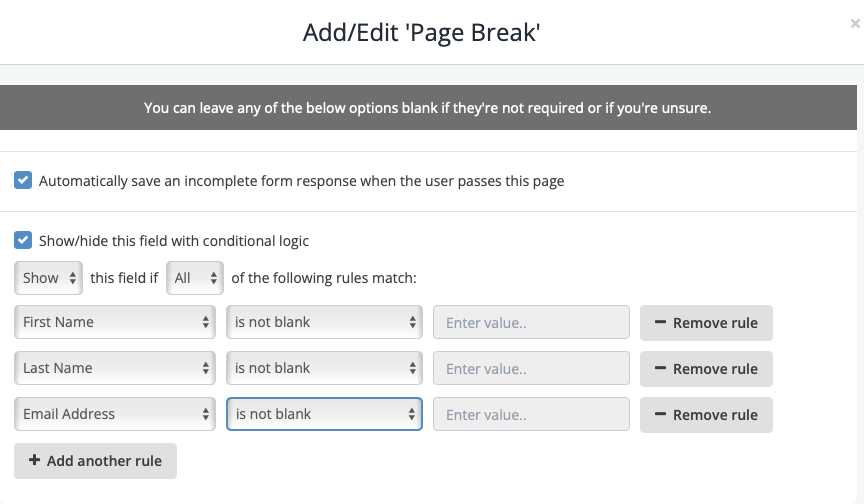
In the 3-step form set out earlier, applying the following logic to the page break between step 1 and 2 disables the Next unless all three fields in step 1 contain data.
|
This logic is functionally equivalent to checking the Tick if answering this question is compulsory. checkbox for the three fields, First Name, Last Name, and Email Address. The UX is different, however. Checking the Tick if answering this question is compulsory checkbox for the three fields means each field displays a red asterisk after the field label, indicating the field must be filled-in. It does not disable the Next button. Instead, an error — This answer is required — presents below each not filled-in field when the Next button is clicked. Conversely, setting the Page break with the conditional logic statement above does not cause the fields to appear with a red asterisk. Instead, the Next button does not become active until all three fields are filled-in. Checking the Tick if answering this question is compulsory checkbox and setting the Page break with the conditional logic statement is functionally redundant but provides a more straightforward UX. |