Event listing
Use the event listing component to provide an event listing on your web page.
Add the component to your page
When you are editing your page using page-builder:
-
Add a component to your page by clicking the Add component button or by adding a content block (by clicking the button) then clicking the add component button.
-
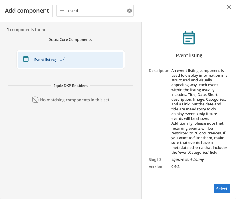
Locate the event listing component within the component browser and then click the Select button.
-
This will add the event listing component to your page.
Configure the event listing component
-
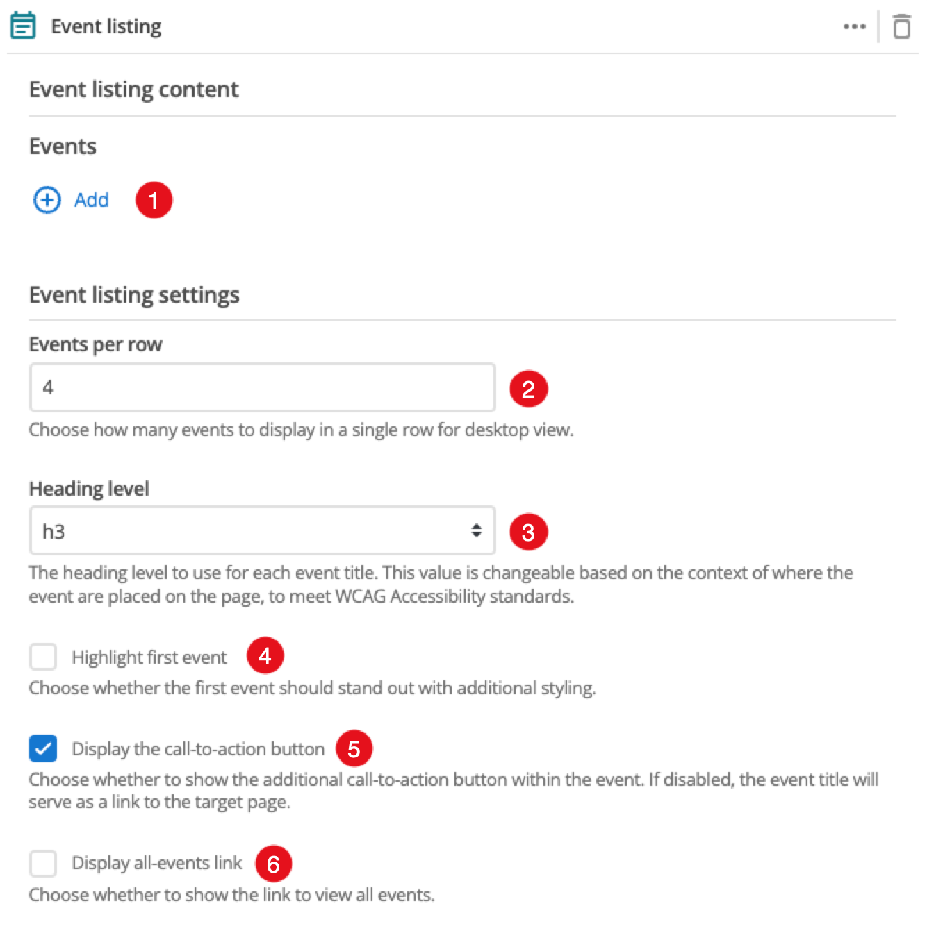
The Add button allows you to add additional events. When the component loads you will have an unpopulated event card that you can fill in . This is covered in the Event configurations section.
-
This setting defines the maximum number of events that will display in a row when viewing your page in a desktop browser.
-
This allows you to choose the heading level for the event title.
-
This applies a highlighting style to the first event.
-
(Optional) This allows you to add a unique ID into the HTML markup to the instance of the component so that you can add custom styling and functionality using CSS and javascript respectively.
-
(Optional) This allows you to add a class into the HTML markup to the instance of the component so that you can add custom styling and functionality using CSS and javascript respectively.
Event configurations
The following options can be used to configure each event:
-
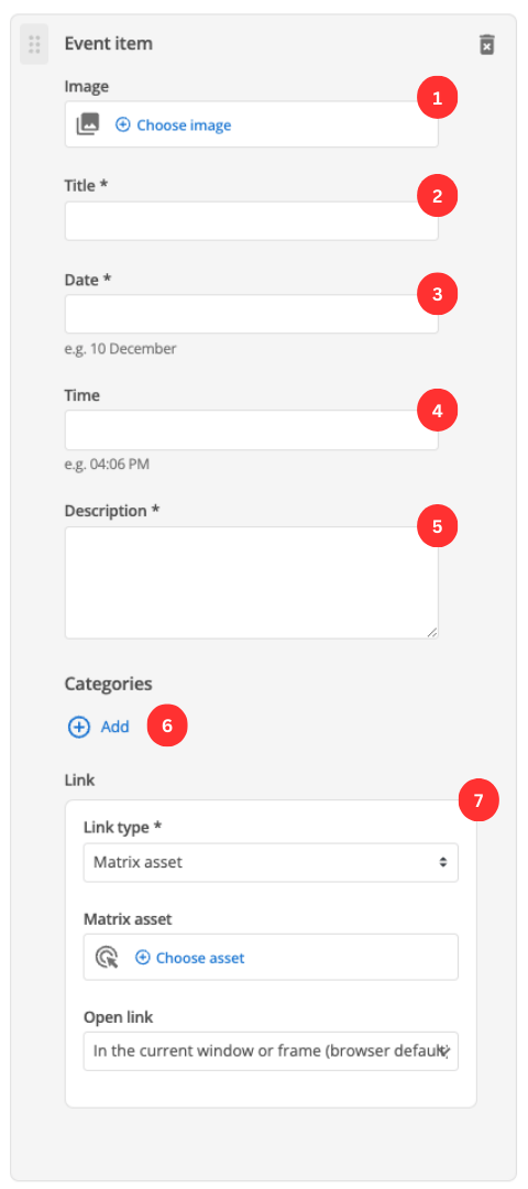
(Optional) Choose an image that you have already uploaded to the CMS to display as the event thumbnail.
-
Enter the event’s title.
-
Enter the event’s date.
-
(Optional) Enter the event’s time.
-
This field allows you to provide descriptive text for your event.
-
(Optional) Allows you to add categories for your event by clicking the button. A field presents, into which you can enter a category label. You can also add additional categories and reorder the category list.
-
This specifies if you are linking to another page in the CMS or an external, user-specified link. Depending on what link type you select you will see a combination of the following fields.
- Matrix asset
-
This is displayed for Matrix asset picker links and allows you to choose the CMS page to which your card links.
- Text
-
This is displayed for user-specified links and defines the link text.
- URL
-
This is displayed for user-specified links and defines the link URL.
- Open link
-
This controls how the link is opened when you click it. For example, open on a new page.