Video modal (secondary color pattern)
Use the video modal component to display a YouTube or Vimeo video within a pop-up modal dialog on your web page.
The component provides a teaser image, accompanying text, and call-to-action links. When the teaser is clicked the video opens in a modal.
Add the component to your page
When you are editing your page using page-builder:
-
Add a component to your page by clicking the Add component button or by adding a content block (by clicking the button) then clicking the add component button.
-
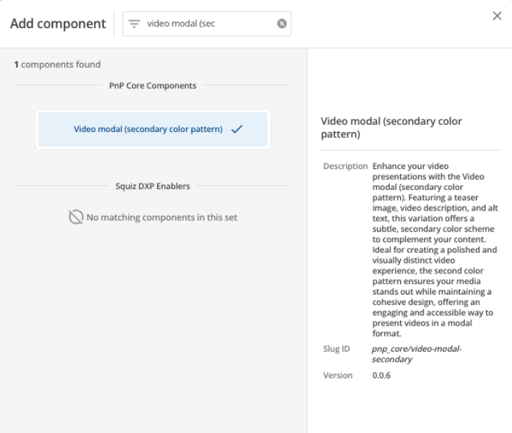
Locate the video modal (secondary color pattern) Squiz core component within the component browser and then click the Select button.
-
This will add the video modal (secondary color pattern) component to your page.
Configure the video modal component
-
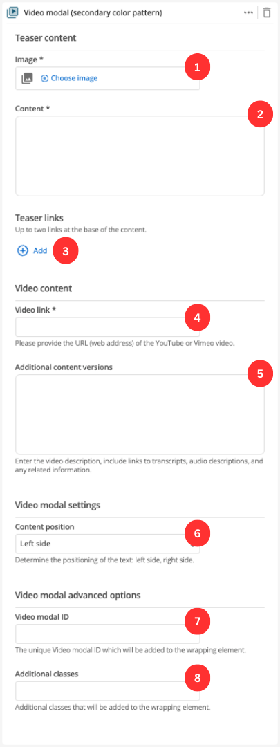
(Optional) Choose an image that you have already uploaded to the CMS to display as a thumbnail or teaser image for the video.
-
Supporting content for the teaser, displayed alongside the video.
-
The Add button allows you to add up to two buttons. See Teaser links settings for information on configuring the button fields.
-
This is the URL to the video.
The link must be a YouTube or Vimeo link to the video page. -
(Optional) Supplementary information about the video such as a short description, transcripts and any related information.
-
Specify the positioning of the text: left side, right side.
-
(Optional) This allows you to add a unique ID into the HTML markup to the instance of the component so that you can add custom styling and functionality using CSS and javascript respectively.
-
(Optional) This allows you to add a class into the HTML markup to the instance of the component so that you can add custom styling and functionality using CSS and javascript respectively.
Teaser links settings
Add up to two teaser links that are displayed below the formatted content.
-
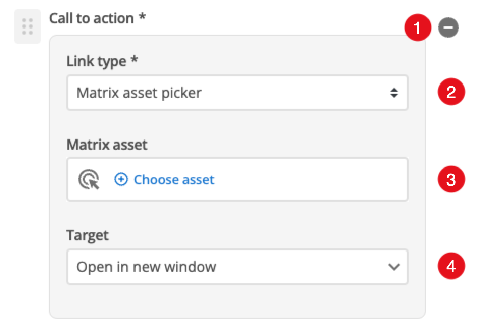
Click this to remove the selected button from your teaser.
-
Choose between linking to a Matrix asset, or a user-defined link.
-
Depending on what link type you select you will see one or two fields to specify your link.
- Call-to-action button - Matrix asset
-
This is displayed for Matrix asset picker links and allows you to choose the CMS page to which your card links.
- Call-to-action button - Text
-
This is displayed for user-specified links and defines the link text.
- Call-to-action button - URL
-
This is displayed for user-specified links and defines the link URL.
-
This controls how the link is opened when you click it. For example, open in a new page. allows you to provide some descriptive text/links/images for your video, such as a transcript.