Banner with background image (primary color pattern)
Use the banner component to empower your marketing campaigns.
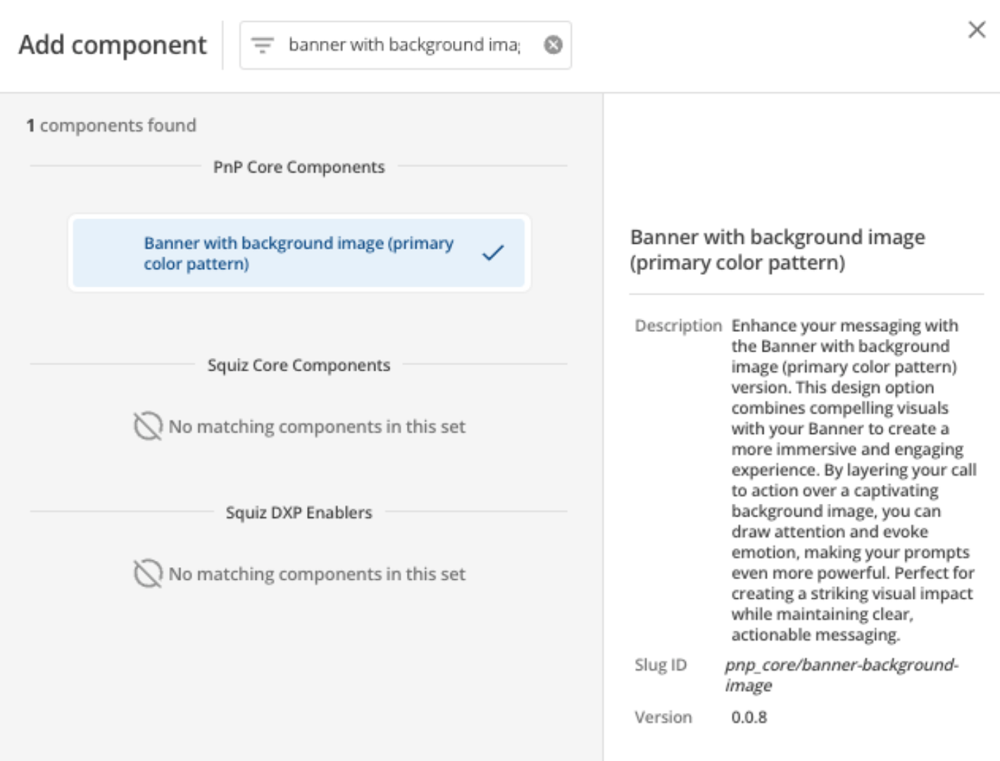
Add the component to your page
When you are editing your page using page-builder:
-
Add a component to your page by clicking the Add component button or by adding a content block (by clicking the button) then clicking the add component button.
-
Locate the banner with background image (primary color pattern) component within the component browser and then click the Select button.
-
This will add the banner with background image (primary color pattern) component to your page.
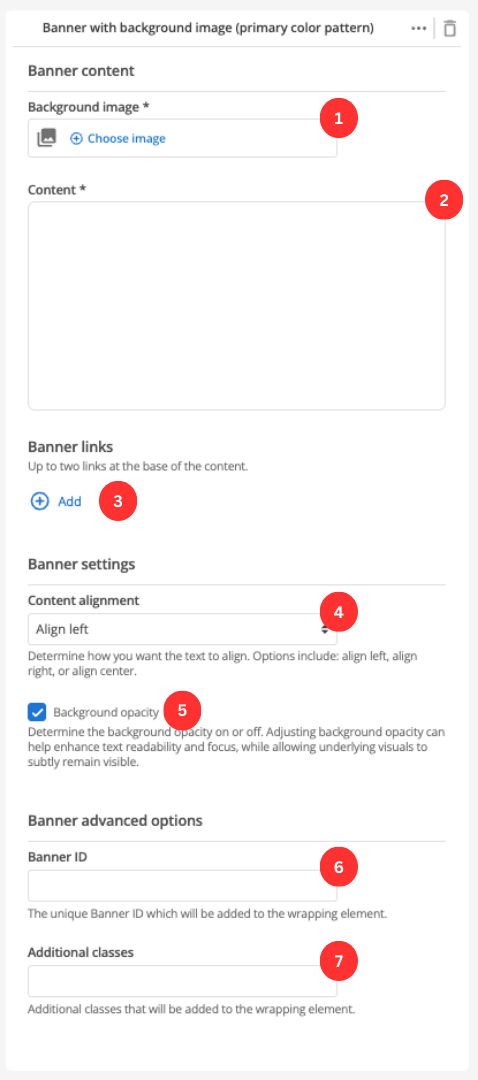
Configure the banner component
-
Choose an image that you have already uploaded to the CMS to display as the background of the banner.
-
This field allows you to provide some descriptive text/links/images for your banner.
-
The Add button allows you to add up to two buttons. Information on configuring the button fields is in the Banner link configurations section.
-
Choose the positioning of the text within the banner component.
-
Choose when the background should be slightly opaque. This should be used to increase the readability of text which is displayed on top of the background image.
-
(Optional) This allows you to add a unique ID into the HTML markup to the instance of the component so that you can add custom styling and functionality using CSS and javascript respectively.
-
(Optional) This allows you to add a class into the HTML markup to the instance of the component so that you can add custom styling and functionality using CSS and javascript respectively.
Banner link configurations
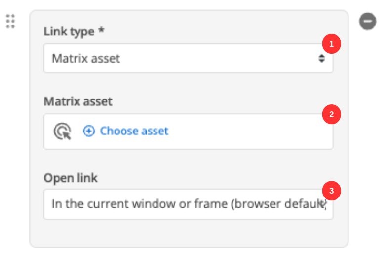
Add up to two banner links that are displayed below the formatted content.
-
Choose between linking to a Matrix asset, or a user-defined link.
-
Depending on what link type you select you will see one or two fields to specify your link.
- Matrix asset
-
This is displayed for Matrix asset picker links and allows you to choose the CMS page to which your card links.
- Text
-
This is displayed for user-specified links and defines the link text.
- URL
-
This is displayed for user-specified links and defines the link URL.
-
This controls how the link is opened when you click it. For example, open on a new page.