Details
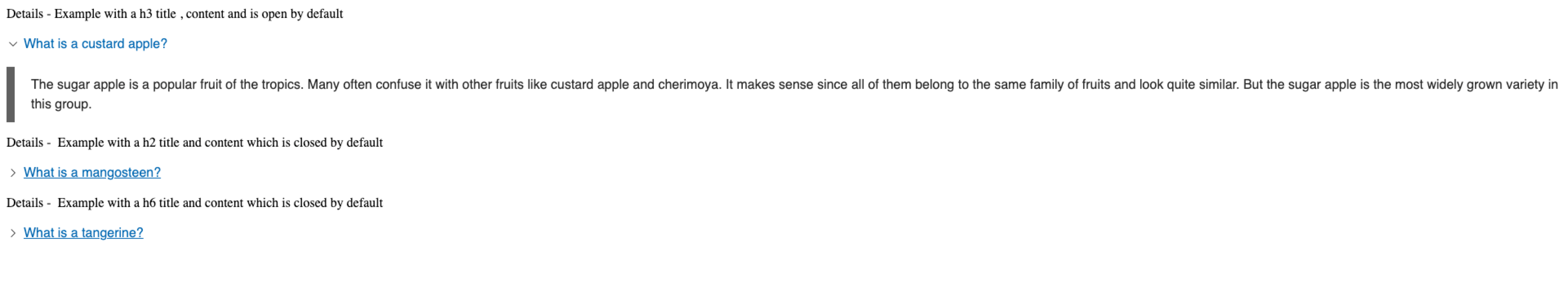
Use the details component to display a small panel with a title and collapsible details section.
Add the component to your page
When you are editing your page using page-builder:
-
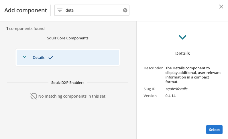
Add a component to your page by clicking the Add component button or by adding a content block (by clicking the button) then clicking the add component button.
-
Locate the details Squiz core component within the component browser and then click the Select button.
-
This will add the details component to your page.
Configure the details component
-
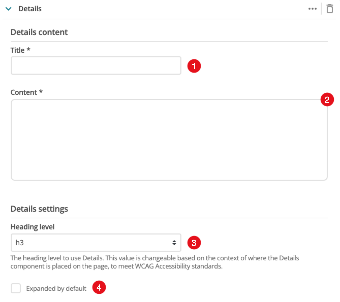
A heading which is displayed for the collapsible section.
-
Content to display when the panel is expanded.
-
The heading level applied to the title.
-
Controls if the panel should load in an expanded (open) or collapsed state.
-
(Optional) This allows you to add a unique ID into the HTML markup to the instance of the component so that you can add custom styling and functionality using CSS and javascript respectively.
-
(Optional) This allows you to add a class into the HTML markup to the instance of the component so that you can add custom styling and functionality using CSS and javascript respectively.