Capsule control
The Capsule control presents at the top-right of a content or component block when the pointer is hovering over that block.
Core Capsule elements
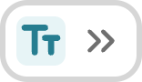
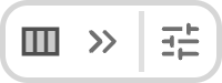
The core elements of the Capsule control are the icon, representing the block or component type, and the chevron-style arrows pointing to the Page outline column to the right of the Preview column.

Clicking either the icon or the arrows opens the edit panel for that component or text block.
Other icons appear as part of the Capsule control depending on the current editing context.
Quick options icon
Component developers can, for some components, setup end-user configuration options in addition to content options. See Add a component block for more on these options.
A component with end-user configuration options also makes these options available to end-users via the menu:[quick options] menu, which is added to the Capsule control when such configuration options exist.
When the menu is opened, the configuration option or options both present, and can be changed from within the open menu.
- image
No editing locks acquired icon
If editing locks have not been acquired for a particular page the Capsule control also displays a lock icon for each block and component

Personalization-specific icons
If Personalization has been applied to components on a page, two presentation changes occur.
-
An additional icon presents to the immediate left of each Capsule control, denoting which variant applies to the block or component.
 Figure 5. A Capsule control for an editable Text component when Personalization is active.
 -
On blocks and components that cannot currently be edited, the OpenCapsule control presents a Read-Only icon.
 Figure 6. A Capsule control for a read-only Dynamic Header component when Personalization is active.