Dialog
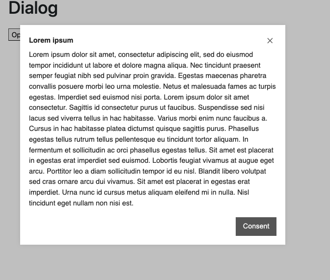
Using the Dialog component allows the display of additional information in a dialog box/lightbox.
Add the component to your page
When you are editing your page using page-builder:
-
Add a component to your page by clicking the Add component button or by adding a content block (by clicking the button) then clicking the add component button.
-
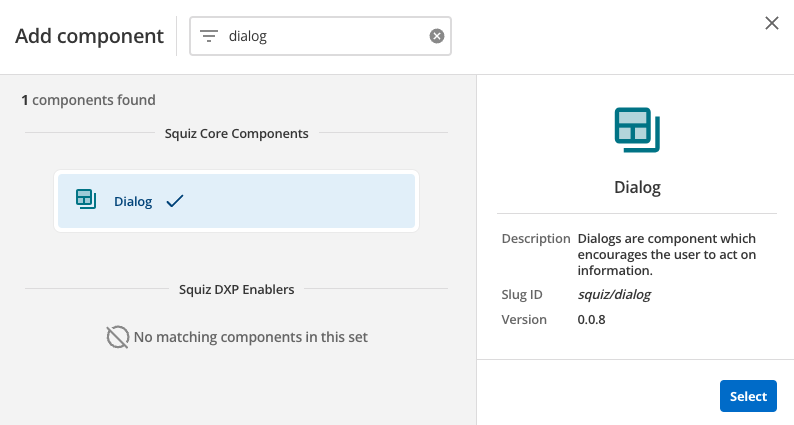
Locate the dialog component within the component browser and then click the select button.
-
This will add the dialog component to your page.
Configure the dialog component
-
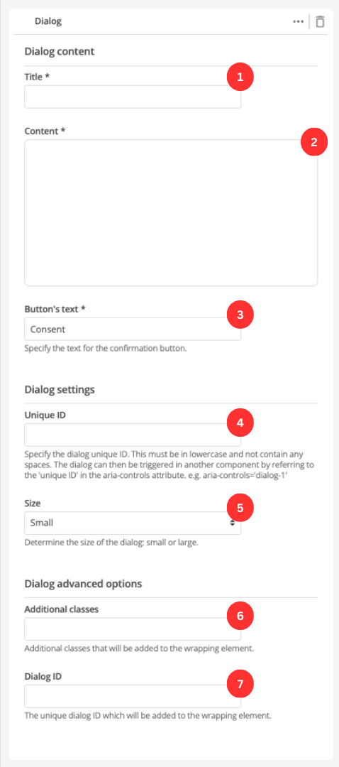
Enter the dialog’s title.
-
Enter the dialog’s content.
-
Enter the text that will appear on the dialog close button.
-
Enter a unique ID for the dialog. The ID will be used to trigger the dialog in another component. e.g.
<a href="#" id="unique-id-of-dialog-to-open"> -
Specify the size of the dialog.
-
(Optional) This allows you to add a unique ID into the HTML markup to the instance of the component so that you can add custom styling and functionality using CSS and javascript respectively.
-
(Optional) This allows you to add a class into the HTML markup to the instance of the component so that you can add custom styling and functionality using CSS and javascript respectively.