Add a component block
Components offer a consistent way of structuring non-text or design content elements within a page.
You can view and add different components designed to solve specific content challenges.
If you only need to add formatted text to your page, consider choosing the Add text block option.
Before you start
Read About the editing experience to learn the Page Builder interface basics.
Adding a block to the page
-
At the bottom of the Page outline column are two buttons: Add text and Add component
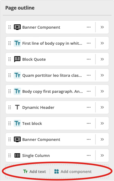 Figure 1. Page outline column with Add text and Add component buttons highlighted.
 -
To add a component, click the Add component button.
The Add component dialog presents.
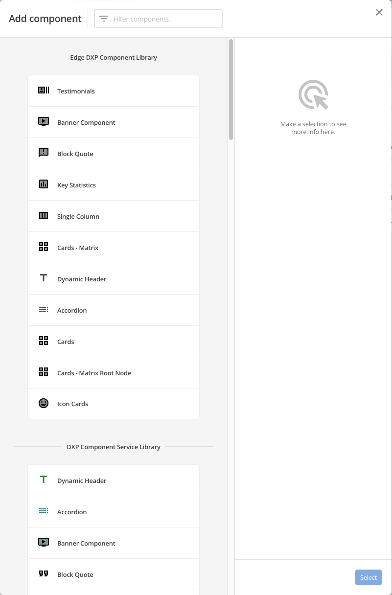 Figure 2. Add component dialog
 -
Select a Component and click the Select button.
-
The Add component dialog closes, and the selected component is added to the end of the existing Page outline.
Customising an added component block
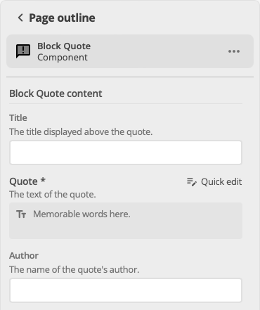
To customise a component block, click the Edit control for that component in the Page outline column.
The specific options available to customise depend on the component, but most component blocks present these options in one of two ways:
Content options
A component with only content options presents those options when the Edit control for that component is clicked.
For example, a Block Quote component allows for
-
setting the quote Title;
-
setting the quote itself; and
-
selecting the Author of the quote.
And, it presents these when its Edit control is clicked.
Content options and configuration options
Developers can also provide configuration options for a component.
Such components present both content and configuration choices when the Edit control for that component is clicked.
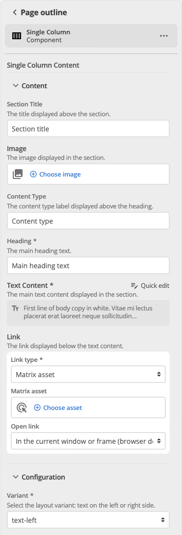
For example, a Single Column component allows for the following content options:
-
a Section title;
-
an image;
-
a Content type label;
-
a Heading;
-
Main heading text;
-
text content; and
-
an internal or external link.
In addition, a Single Column component offers a single configuration option:
-
Layout variant, for text on the left or the right.
And, when the Edit control for a Single Column component is clicked, the content and configuration options are presented as separate sections.
|
The screenshot above shows the Content and Configuration sections as open. Whether these sections are open or closed on presentation is a developer-specific option. However the developer sets the sections, they will always present as such when the component’s Edit control is clicked. If, for example, the Content and Configuration sections are both set to open by the developer, they will present as open each time the component’s Edit control is opened. End-users can change a section’s open or closed state while the Edit control is open. And the section will honour this changed state so long as the control remains open. When the component’s Edit control is closed, however, the end-user’s state change is lost. When the component’s Edit control is re-opened the developer-set state will present. |
The configuration option section can also be made available to end-users as a quick options menu in the component’s Capsule control.