View component information
The Component info dialog presents basic information about Page builder components added to a content page.
To open the dialog, choose menu:[Component info] from the component Options menu in the Page outline column.
| Component info only appears for content components blocks and not the Text block. |
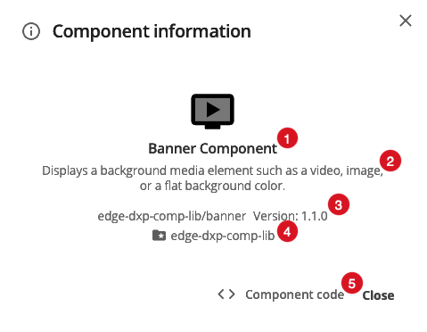
-
The component name.
A component’s name is set by the component developer.
-
Description
A component’s description is also set by the component developer.
-
Component ID and version
A Component’s ID consists of two parts: the ID of the component set and the ID of the component itself.
A solidus (aka a forward slash) — / — delimits the set ID from the component ID.
When this same information is presented in Page Builder’s Add component dialog, the IDs are labelled Slug ID.
-
Component set
The set ID for the component, presented on its own line.
-
Component code
Click this to open a dialog showing a read-only view of the code underlying the selected component.
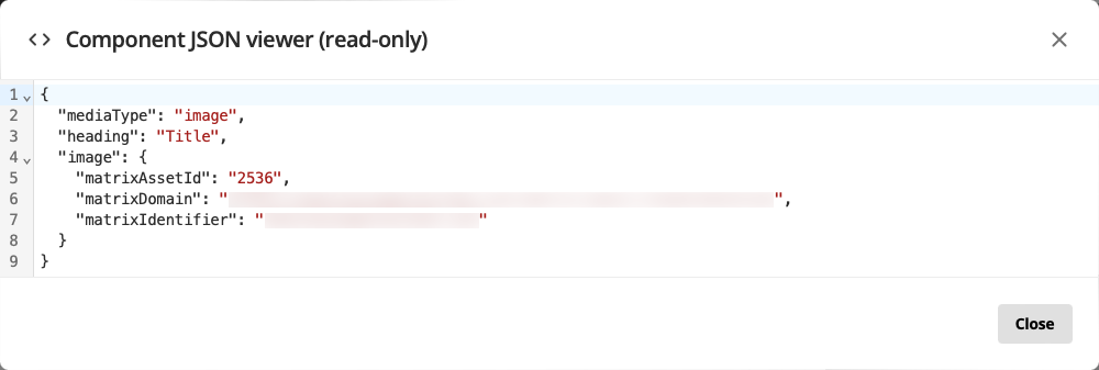 Figure 2. A Component code dialog for a Banner Component.