Drawer
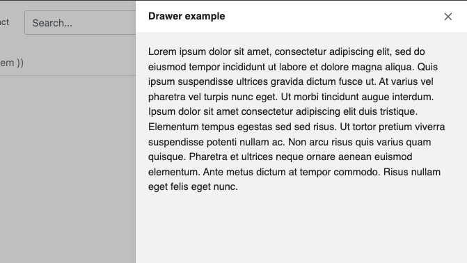
Use the drawer component to provide easy access to information that does not need to be visible at all times.
Add the component to your page
When you are editing your page using page-builder:
-
Add a component to your page by clicking the Add component button or by adding a content block (by clicking the button) then clicking the add component button.
-
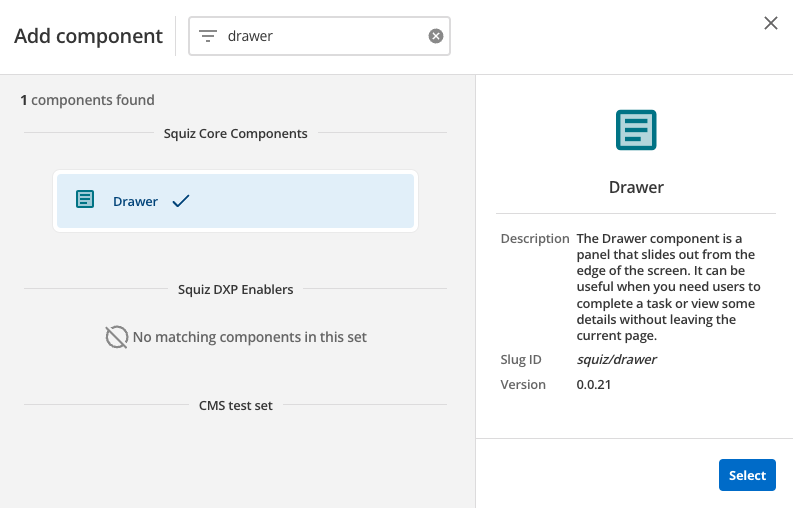
Locate the drawer component within the component browser and then click the Select button.
-
This will add the drawer component to your page.
Configure the drawer component
-
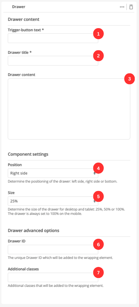
Enter the label of the title which will trigger the drawer.
-
Enter the drawer’s title.
-
Enter the drawer’s content.
-
Specify the position of the drawer when it is open.
-
Specify the size of the drawer as a percentage of the screen.
The drawer will always take up 100% of the screen on mobile.
-
(Optional) This allows you to add a unique ID into the HTML markup to the instance of the component so that you can add custom styling and functionality using CSS and javascript respectively.
-
(Optional) This allows you to add a class into the HTML markup to the instance of the component so that you can add custom styling and functionality using CSS and javascript respectively.