Features with images
Use the features with images component to highlight the most important features of your product or service.
Add the component to your page
When you are editing your page using page-builder:
-
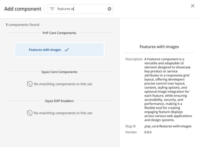
Add a component to your page by clicking the Add component button or by adding a content block (by clicking the button) then clicking the add component button.
-
Locate the features with images Squiz core component within the component browser and then click the Select button.
-
This will add the features with images component to your page.
Configure the features component
-
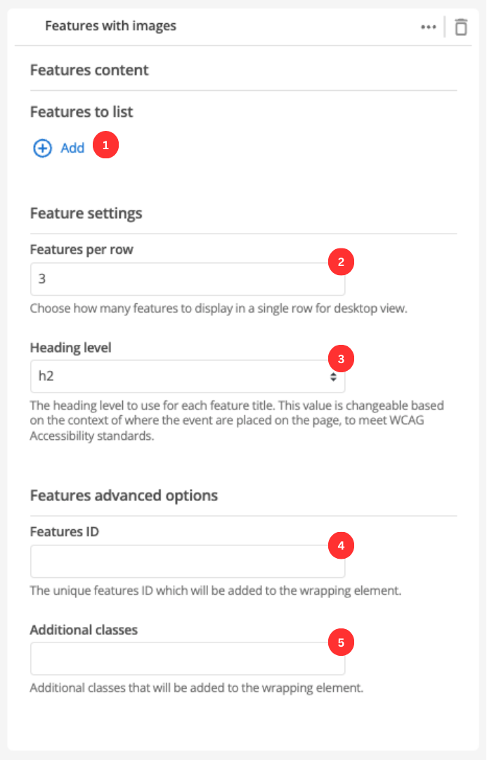
The Add button allows you to add additional items to your list of features. When the component loads you will have an unpopulated item that you can fill in (see Feature configuration).
-
This setting defines the maximum number of features that will be displayed in a row when viewing your page in a desktop browser.
-
This allows you to choose the heading level for the feature items.
-
(Optional) This allows you to add a unique ID into the HTML markup to the instance of the component so that you can add custom styling and functionality using CSS and javascript respectively.
-
(Optional) This allows you to add a class into the HTML markup to the instance of the component so that you can add custom styling and functionality using CSS and javascript respectively.
Feature configuration
The following options can be used to configure each feature:
-
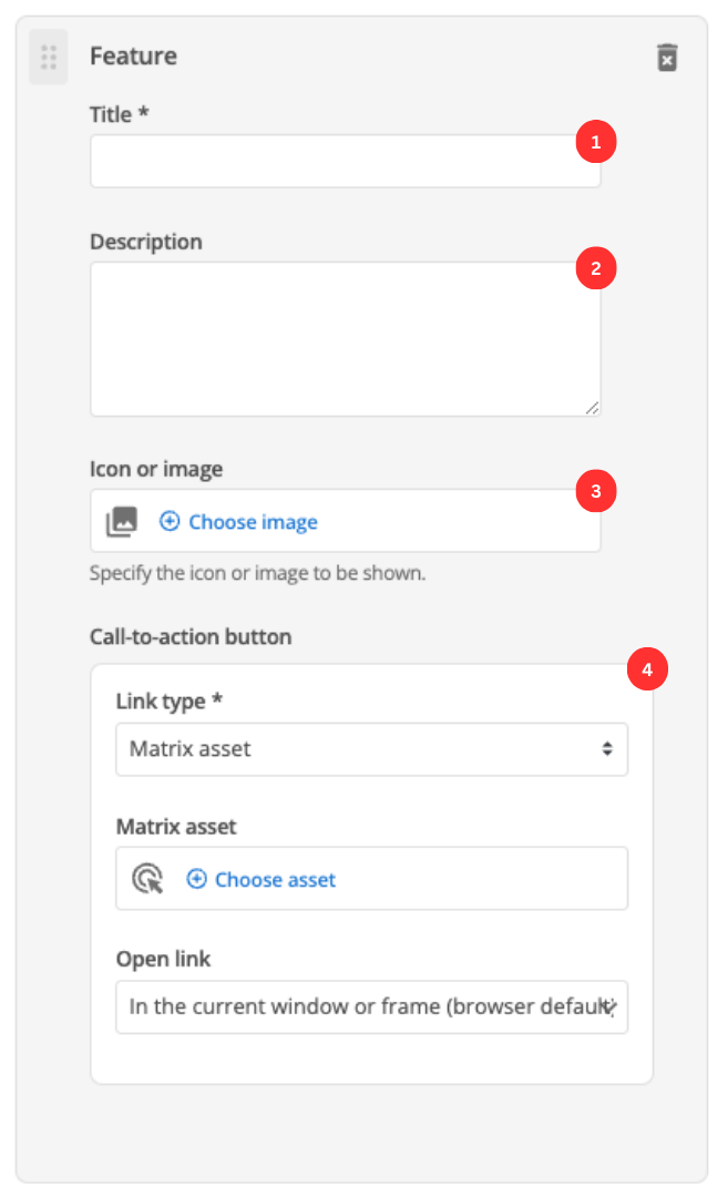
Enter the feature’s title.
-
(Optional) Enter the description that will be displayed for this feature item.
-
(Optional) Choose an image that you have already uploaded to the CMS to display.
-
This specifies if you are linking to another page in the CMS or an external, user-specified link. Depending on what link type you select you will see a combination of the following fields.
- Link type
-
Depending on the link type selected, you will see two or three fields to specify your link.
- Matrix asset
-
Displayed for Matrix asset picker links. It allows you to choose the CMS page that your feature links to.
- Text
-
This is displayed for user-specified links. It defines the link text.
- URL
-
This is displayed for user-specified links. It defines the link URL.
- Open link
-
Controls how the link is opened when you click on the link.