Accordion
Use the accordion component to display a set of items within an accordion on your web page.
Add the component to your page
When you are editing your page using page-builder:
-
Add a component to your page by clicking the Add component button or by adding a content block (by clicking the button) then clicking the add component button.
-
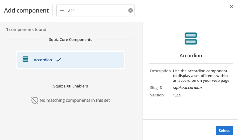
Locate the accordion core component within the component browser and then click the Select button.
-
This will add the accordion component to your page.
Configure the accordion component
-
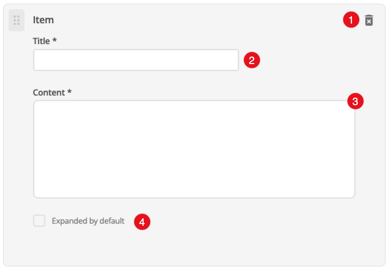
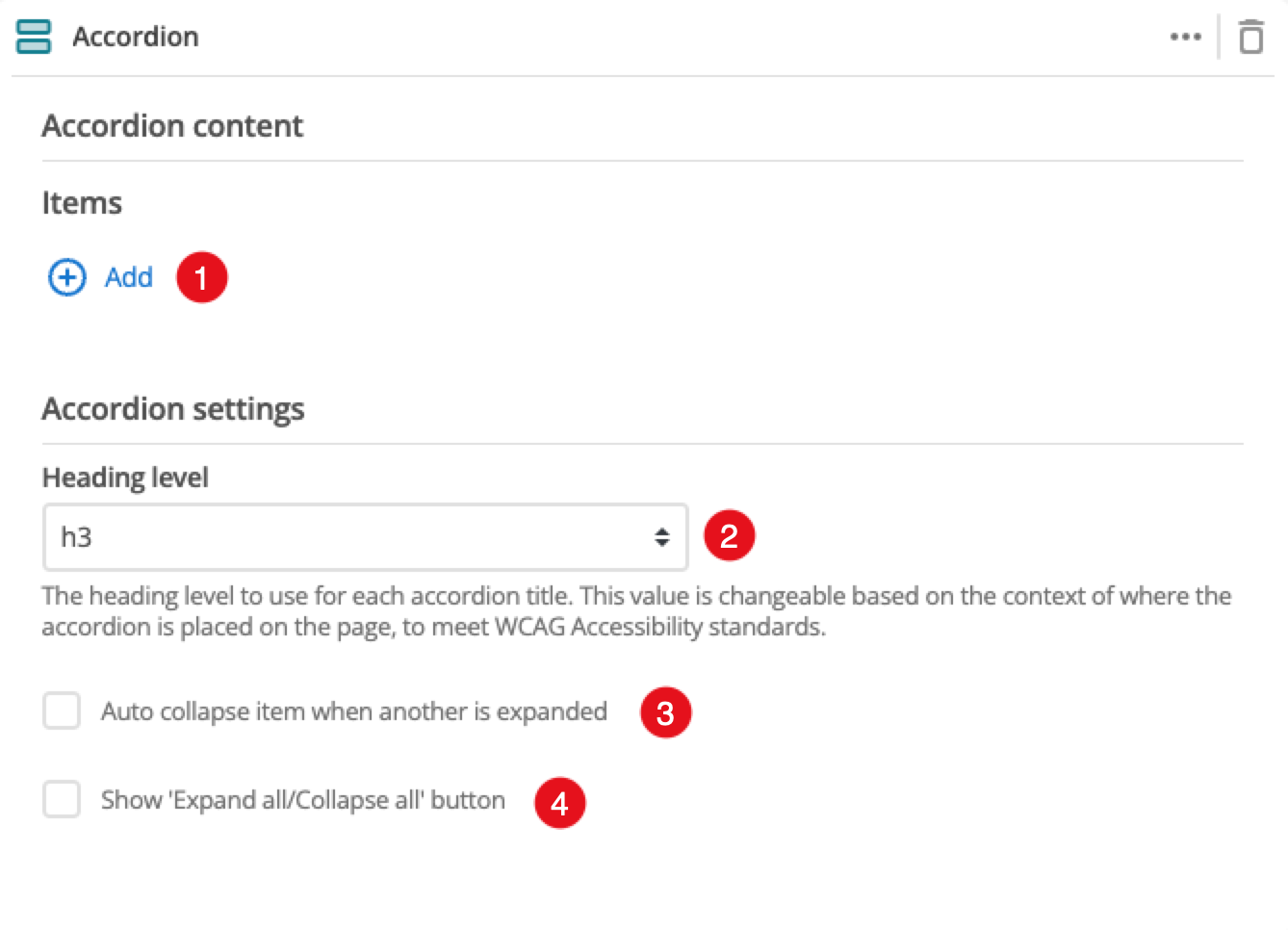
The Add button allows you to add additional items to your accordion. When the component loads you will have an unpopulated item that you can fill in. This is covered in the Item configuration section.
-
This allows you to choose the heading level for the item title.
-
This controls whether or not other accordion items automatically close when a different item is selected.
-
This controls whether a button for opening and closing all accordion items at once is provided.
-
(Optional) This allows you to add a unique ID into the HTML markup to the instance of the component so that you can add custom styling and functionality using CSS and javascript respectively.
-
(Optional) This allows you to add a class into the HTML markup to the instance of the component so that you can add custom styling and functionality using CSS and javascript respectively.