Features
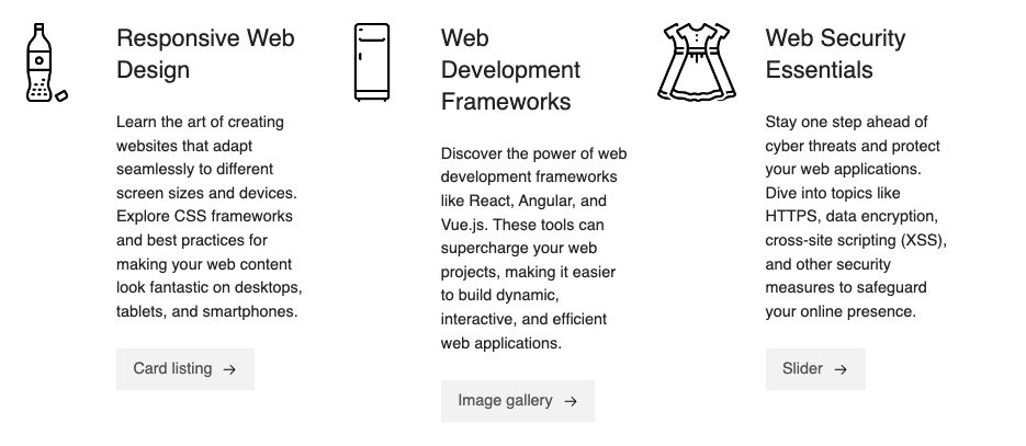
Use the features component to highlight the most important features of your product or service.
Add the component to your page
When you are editing your page using page-builder:
-
Optional step. Add a content block to your page by clicking the button.
-
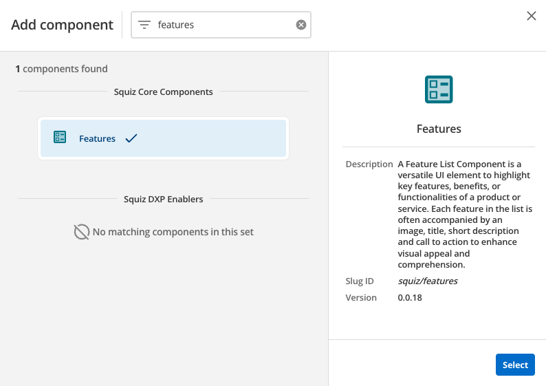
Add a component to your page (or the newly-added content block on your page if the optional step above is taken) by clicking the Add component button.
-
Locate the features Squiz core component within the component browser and then click the Select button.
-
This will add the features component to your page.
Configure the features component
-
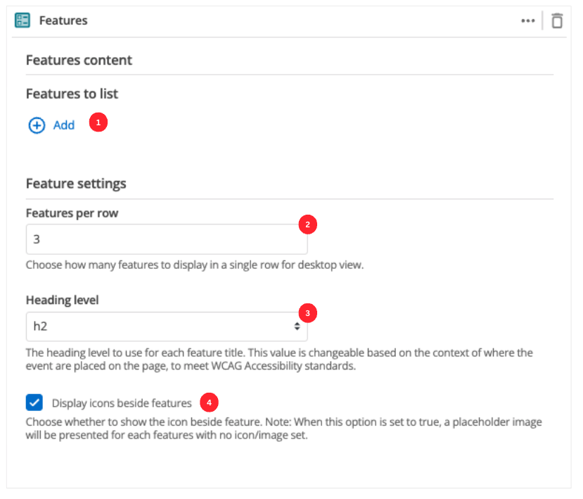
The Add button allows you to add additional items to your list of features. When the component loads you will have an unpopulated item that you can fill in (see Features configuration)
-
This setting defines the maximum number of features that will be displayed in a row when viewing your page in a desktop browser.
-
This allows you to choose the heading level for the feature items.
-
Specify if the icon or image should be displayed for each feature item. If this option is enabled, a placeholder image will be used for any feature item with no icon or image specified.
Features configuration
-
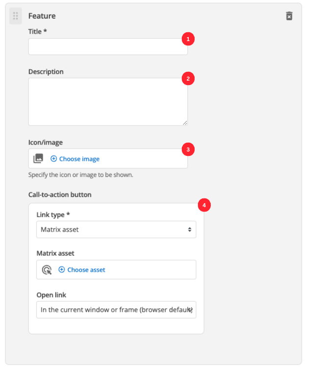
Enter the feature’s title.
-
(Optional) Enter the description that will be displayed for this feature item.
-
(Optional) Choose an image that you have already uploaded to the CMS to display.
-
Call-to-action button:
- Link type
-
Depending on the link type selected, you will see two or three fields to specify your link.
- Matrix asset
-
Displayed for Matrix asset picker links. It allows you to choose the CMS page that your feature links to.
- Text
-
This is displayed for user-specified links. It defines the link text.
- URL
-
This is displayed for user-specified links. It defines the link URL.
- Open link
-
Controls how the link is opened when you click on the link.