Funnelback for higher education configuration reference
Introduction
Purpose
This document gives an overview of the configuration options of the Higher Education Packaged Solution.
This document is organised into sections corresponding to features of the search results page. Each section gives an overview of the feature and the terminology used, and lists all the configuration options of the feature.
General considerations
Style and colors
The initial prototype implementation of the packaged solution will re-use the styles (CSS, fonts, colors, etc.) of the main website in a best effort fashion.
Minimum change in these styles can be configured (e.g. changing the color of specific elements, font size or weight, etc.) but if more dramatic changes are needed, a complete custom style sheet file (CSS) must be provided.
Icons
Various Funnelback components use icons. Alternative icons can be requested, either:
-
From Font Awesome icons
-
Provided as image files
Funnelback Integration methods
Funnelback can be integrated with existing websites in two ways:
-
Funnelback only serves the list of results and search controls, and this page fragment is embedded inside the website CMS
-
Funnelback serves the whole results page, from header to footer
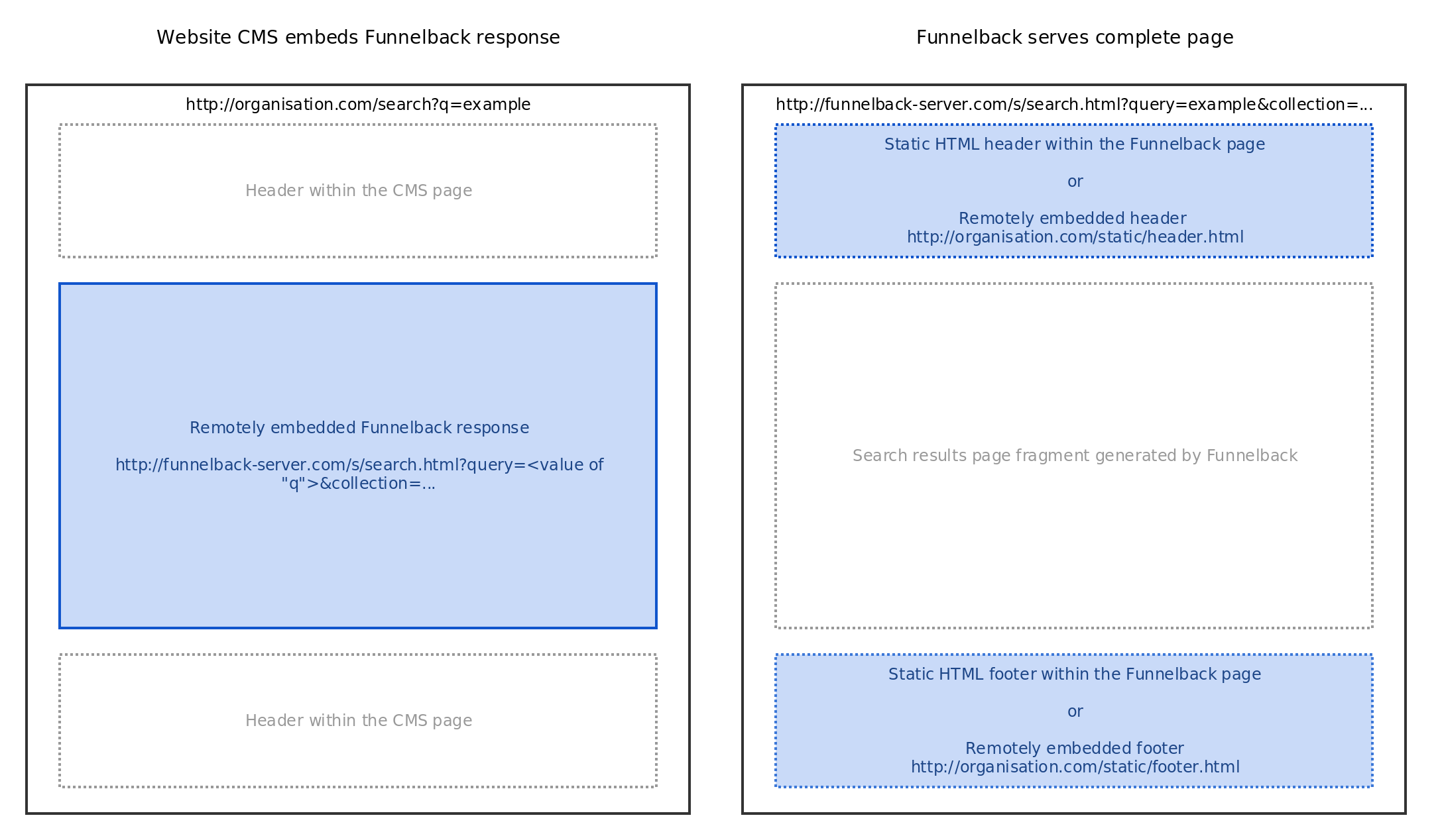
CMS-embedded Funnelback fragment
With this method, Funnelback generates an HTML fragment rather than a full HTML page. The fragment is usually enclosed in a <div></div> tag. This fragment will be embedded as-is inside the page generated by the CMS.
This method has the following benefits:
-
Page layout, header and footer are still centrally managed in the CMS
-
Website visitors only see the main website URL
This method however requires some work on the CMS side to:
-
Perform the remote HTTP request to Funnelback to retrieve the results fragment
-
Pass through relevant URL parameters to Funnelback (e.g. user query, facet selection, etc.)
Funnelback serving the whole page
With this method, Funnelback generates a whole, standalone HTML page. When users search on the main website they’re redirected to the Funnelback server to access search results.
This method has the following benefits:
-
Quicker to setup, as no work in the CMS is required
-
Funnelback is often faster to serve search results than going through a CMS
This method however requires the page layout, header and footer to be kept in sync, within Funnelback, with the main website. This results in manual maintenance over time, although this can be mitigated by fetching the header & footer from the CMS directly (see the header & footer section for more information).
Additional resources
The online documentation contains more details about the different integration methods.
Search results page overview
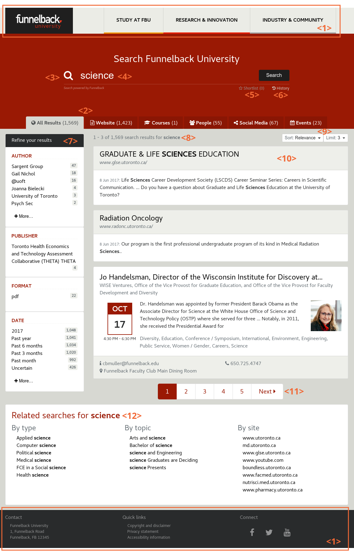
The search results page is broken down in several components:
-
Header and Footer <1>
-
Tabbed navigation <2>
-
Search box and advanced controls <3>
-
Search box <4>
-
Shortlist toggle <5>
-
Search history toggle <6>
-
-
Auto-completion
-
Faceted navigation <7>
-
Search results
-
Summary of matching documents <8>
-
Sort and limit controls <9>
-
Spelling suggestions
-
Query blending
-
Best bets
-
Curator
-
Results <10>
-
Pagination <11>
-
No results message
-
-
Related searches <12>
Each component and the list of configuration options made are detailed in the following sections.
Header and footer
The header and footer are static content block that are always displayed at the top & bottom of the page.
The header usually contains a logo, a navigation menu and the search box.
The footer usually contains additional links, contact details and copyright notices.
For a seamless search experience it’s recommended that the header and footer on the search results page are identical to the ones on the main website.
Header types
Static header and footer
Static header and footer are implemented directly in the Funnelback template, usually by copying the HTML code of the website / CMS inside the Funnelback template.
-
Advantage: Easy to setup.
-
Drawback: Extra maintenance needed when the header changes as the Funnelback copy will need to be updated.
Header sourced from the website or CMS
Funnelback can include HTML fragments to use as header and footer. The HTML fragment can be sourced from a single HTML file (e.g. http://example.org/for-funnelback/header.html and http://example.org/for-funnelback/footer.html) or can be extracted from a complete webpage (e.g. http://example.org/ , with configuration specifying which part of the page to extract as the header, and which part to extract as the footer, based on regular expressions).
-
Advantages: Header & Footer are still controlled in the main website / CMS, and any changes made to them will be reflected in Funnelback
-
Drawbacks:
-
Harder to setup (needs the website / CMS to provide static HTML files, or configuration to extract the HTML fragments from a complete page)
-
If the HTML fragments are extracted from a complete page and the structure of the page change, the extraction of the header and footer may break.
-
Configuration options
-
Choice of static or sourced header and footer
-
If static: The HTML code for the header and footer must be provided
-
If sourced: Static HTML pages must be provided at a well-known URL, or the HTML fragment extraction criteria must be provided
-
Note that this choice will depend on the Funnelback integration method, see the general considerations section for more details.
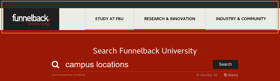
Tabbed navigation
The tabbed navigation allows to view only results from a specific section of the website (e.g. "News", "Events") or a specific source repository (e.g. "Staff", "Courses").

The tabbed navigation usually start with a All tab displaying all results <1>. The "All" tab is selected by default if present. Each tab has a name <2>, and shows the estimated number of results <3> for this tab. An optional icon <4> can be displayed.
Tabs results content
Results get assigned to tabs based on their URL prefix. For example:
-
All results starting with http://example.org/courses/* belong to the Courses tab
-
All results starting with http://staff-directory.example.org/* belong to the Staff tab
Additionally when separate datasources are used for non-web data (e.g. indexing a staff directory as an XML file), the whole datasource can be configured to belong to a specific tab.
Tabs and faceted navigation
The selected tab can affect which facets are displayed. For example it’s possible to display only a Date and Format facet when the All tab is displayed, and only a Campus location facet when the Staff tab is displayed.
Search box and advanced controls
The search box has become an iconic symbol for search in general and is the go-to place for users when attempting to find answers to their questions.
The advanced controls allow the user to refine their results, interact with the shopping cart and the search history.
The search box is where the user enter their search query <1>. It will also display auto-completion / concierge if configured <2> for every keystroke.
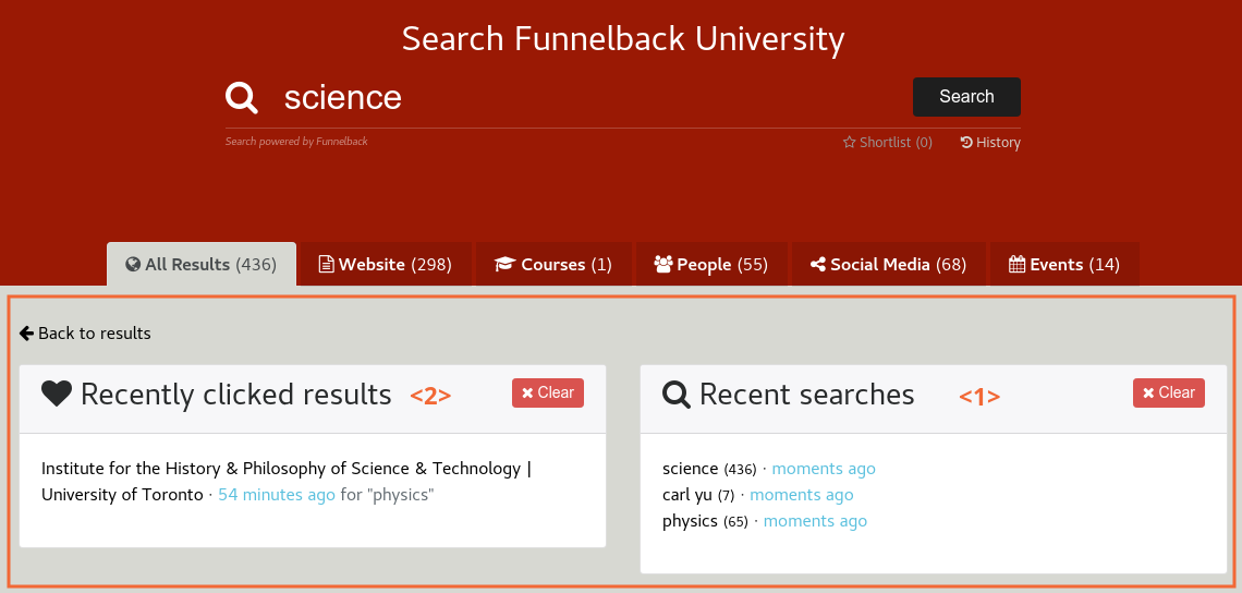
The shortlist <3> and history <4> toggle allows the user to access the results shortlist and the searches and clicks history.
Advanced controls


Configuration options
Search box
-
Search icon (removal, or icon change)
-
Search button text and icon
For details about auto-completion, see the auto-completion section.
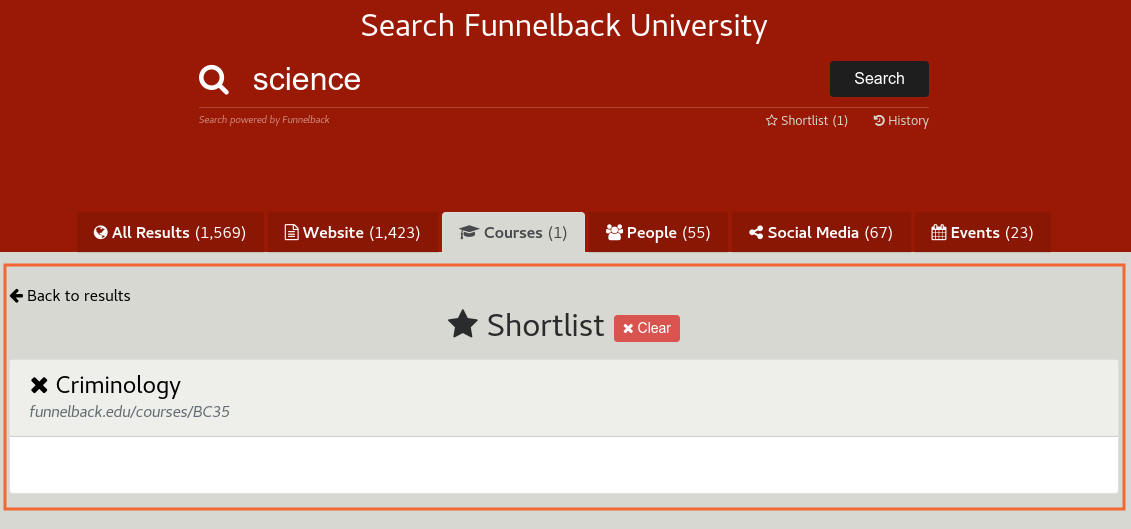
Shortlist toggle
-
Removal of the toggle (if the shortlist is disabled)
-
Toggle label (defaults to "Shortlist") and icon
Shortlist screen
-
The metadata field to display to describe each shortlisted result (defaults to the summary)
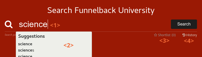
Auto-completion
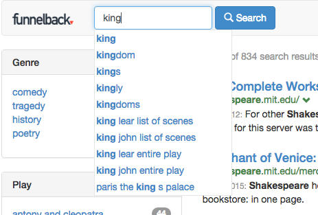
Auto-completion provides the user with real-time suggestions as search terms are typed into the search box.
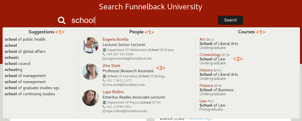
Suggestions are displayed just below the search box. They can be divided in categories <1>, usually corresponding to the tabbed navigation. The display of each suggestion can be highly customised depending on its type (e.g. Course detail <2>, contact details <3>, etc.).
Alternatively, a simpler mode is possible to display only the simple suggestions.
Configuration options
-
Choice of simple vs. complex suggestions
-
For complex suggestions:
-
Choice of categories (dependent of the datasource being indexed, recommended maximum: 3)
-
For each suggestion within the categories:
-
Title
-
Metadata fields (subject to metadata available in the datasource)
-
Optional icons
Faceted navigation
Faceted Navigation allows the user to refine their search based on categories automatically generated from the content or manually defined.
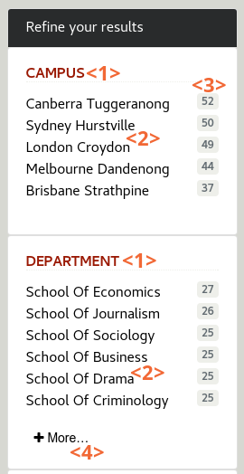
The faceted navigation panel will display a list of pre-configured facets such as Date, Format, Location, etc. Each facet <1> contains a list of categories <2>, or values, with the estimated number of documents matching the category <3>. When more than 8 categories exist, a More… link <4> is displayed to toggle them.
Facets can be configured to depend on the tabbed navigation (e.g. the All tab may show different facets than the People tab).
Facets definitions
The following facets are available out of the box:
-
Date: Create categories for the content modification date, on a list of predefined ranges (e.g. Past year, _Past month, Past 3 month, etc.)
-
Format: Create categories for the content type, for binary content (e.g. PDF, DOC, XLS)
-
URL: Allows drilling down by URL
Additionally, custom facets can be defined depending on the metadata available on the content. For example:
-
On a Staff Directory datasource, facets like Campus, Department or Position
-
On a Courses datasource, facets like Degree Type, Delivery Method, etc.
The ability to configure these facets will depend on the availability of the corresponding metadata in the datasource.
Configuration options
-
List of facets (subject to metadata availability in the datasource)
-
Facet label
-
Metadata to consider to generate the values
-
-
Order of facets
-
Optional: Association of facets with specific tabs (e.g. thee "Events" tab should show "Location" whereas the "People" tab should show "Department")
Search results
Search results display relevant content for the user search term and shows the correct amount of information to allow them to find quickly what they were searching for.
The search results display is broken down in several components listed below.
Summary of matching documents

The summary of matching documents describes an estimate of how many documents matched the user search terms <1>. When there are multiple search terms, a breakdown of how many documents matched all of the search terms versus some of them is shown <2>.
Sort and limit controls
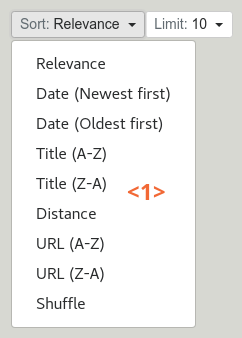
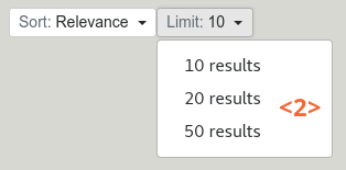
The sort control <1> allows the user to sort search results.
The limit control <2> allows the user to choose how may search results should be displayed per page.
Spelling suggestions

The spelling suggestions will automatically suggest an alternative query term <1> in case of misspellings. Clicking on the suggested terms runs a new search for it.
Query blending
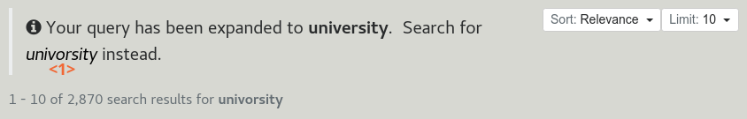
The query blending notification indicates when a query has been automatically expanded and provide a link <1> to search for the original query entered by the user. The expansions include:
-
Automatic correction of spelling mistakes (e.g. "Univorsity" → "University" )
-
Automatic US/UK conflation (e.g. "Colour" → "Color")
-
Configurable list of query blending synonyms (e.g. "F.B.U." → "Funnelback University")
Best bets

Best bet are used to display a featured result or a message when the search query match specific terms. The message has a title <1>, a description <2>, and a link <3>. The link is accessed by clicking on the Learn more button <4>. This message may be configured to stand out from search results or to look like an "organic" result.
Best bets are configured via the Marketing Dashboard.
Curator
Curator allows customising the search results page in a number of ways. These customisations includes displaying a message identical to the Best Bet message, or a simpler one (A simple line of text, without description or link).
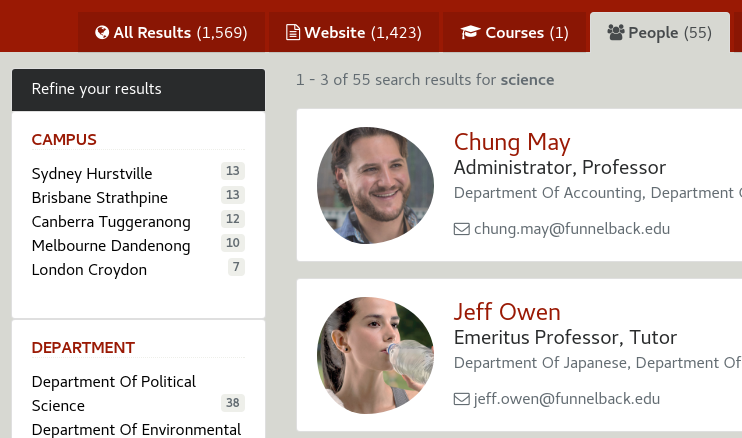
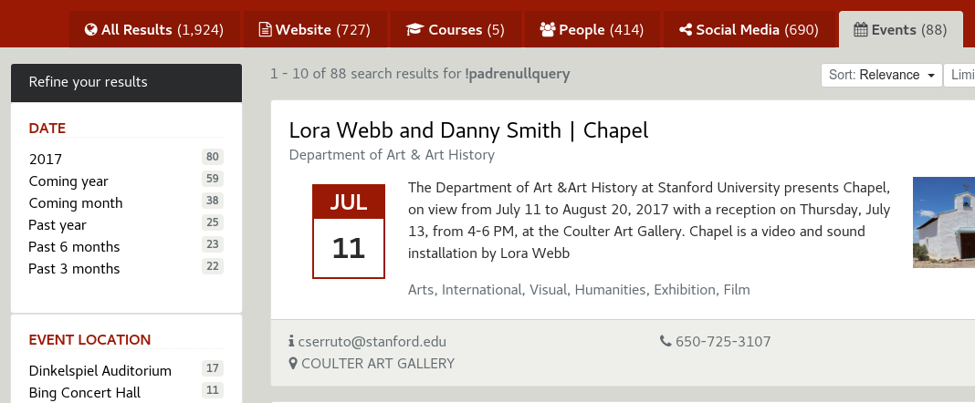
Results
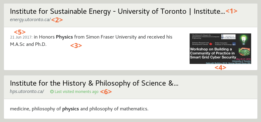
Each search result is displayed with a title <1>, its URL <2> and a summary <3>. An optional thumbnail <4> can be displayed. Additional result metadata can be displayed depending on their availability, such as the date <5>, content author, etc.
A label will indicate if the result link was clicked recently <6> (e.g. Last visited 1h ago).
Result display can be significantly different depending on the type of results, for example contact details for a person, or course details:

Course results can have a shortlist toggle <7> to add/remove them from the user shortlist.

The information to display will depend on the metadata availability on the datasource for each document.
Title and metadata fields
The title can come from:
-
Default HTML
<title>. Recommended for better ranking and to avoid an extra search-specific "title" field in the CMS -
Specific metadata (e.g.
<meta name="…" content="…">)
Similarly, metadata values can come from:
-
Content metadata tags (e.g.
<meta name="…" content="…">) -
External metadata file (A file listing additional metadata to associate to individual URLs)
Default metadata fields include: Author, Description, Date, Description. Additional metadata fields can be defined
in the content (e.g. <meta name="dcterms.author" content="Shakespeare">). Use of Dublin Core naming prefixes is recommended
but not mandatory.
Content snippet
The content snippet for each result can either be:
-
A static string coming from a metadata field (e.g. the description of a course)
-
A query biased summary summary generated depending on the search terms. For example if searching for "science degree", the snippet will show an excerpt of the document containing those terms, and highlight them
Query biased summary is recommended because it gives more context for the user to determine if the results is relevant for the information they were searching for. However when displaying strongly structured results (such as staff contact details) it usually makes more sense to display only static metadata fields.
A fallback mechanism is possible so that if the chosen metadata field is empty, the dynamic summary will be used.
Optional thumbnail
A thumbnail can be associated with each result. This thumbnail can be:
-
An automatic preview screenshot of the target URL. This is only available for HTML documents (i.e. not PDF, DOC, etc.)
-
The URL of an image specified in a metadata field of the content (e.g.
<meta name="thumbnail" content="http://example.org/image.png" />). Twitter (twitter:image) and OpenGraph (og:image) metadata are supported by default -
A specific image from the content itself, located using a CSS selector (e.g.
div.article img.mainto select the image with the CSS classmaincontained within a DIV with CSS classarticle)
Title
-
Source (default title or metadata field)
-
Minor content transformation (e.g. removing a suffix, etc.)
Metadata fields
-
Which metadata fields should be indexed
-
Their source (content metadata tags, or external metadata)
-
Their position in the result display
-
Minor content transformation for display

Related searches
Related Searches allow the user to rapidly discover all topics related to their search terms.
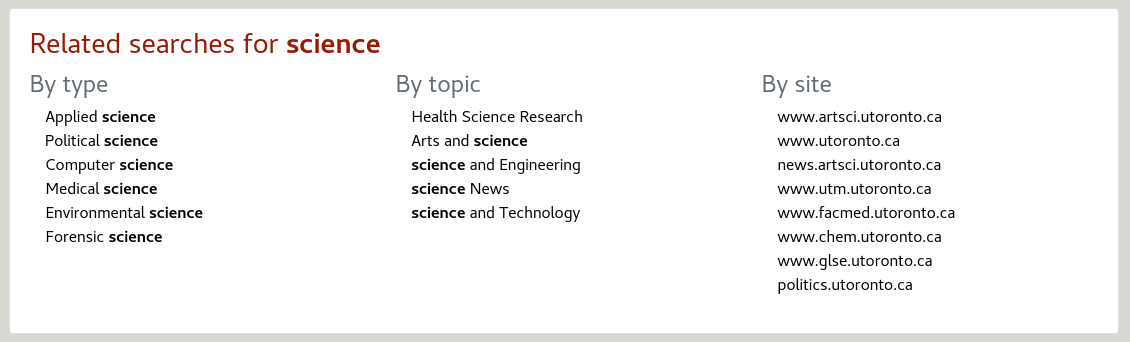
The related searches panel is divided in 3 columns showing related items to the user search terms:
-
By type
-
By topics
-
By site
If more than 8 suggestions are made, a more… link allow to expand the list.
By clicking on a related topic a new search is triggered for the specific topic.
Configuration options
-
Removal of the related searches panel
-
Configuration of the related searches via Contextual Navigation